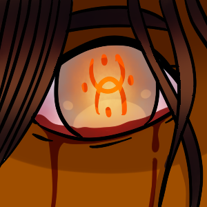
I think right now the thumbnail looks great, but you could always try and "amp" it up to try and make it look interesting.
For example, I feel like a bloody eyeball can be a little bit cliche for a horror comic thumbnail, maybe you could put in some elements that make it "your own", "unique".
Also try playing around with composition!  I know is hard in a tiny 300 x 300 square, but there are always ways to make your piece look more compelling.
One of my favorite horror comics on Tap is Witch Creek Road (sorry no link! I'm on my phone), because of how much story it can tell with just the thumbnail.
-you can tell it's horror genre
-you know what to expect
-it makes you curious- why tf are there two bloody ladies??
Another tip: I noticed that users on Tap like to go for comics with thumbnails of humans and/or human interaction. A symbol/animal/landscape just isn't as interesting.
Well that took me longer than expected. Hope that helped. Good luck!