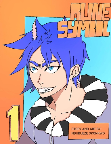
Here is the progress for my comic rune symbol that I had started working of 5 years ago and recently redrew and rebranded. that growth is actually pretty crazy!
Before
https://tapas.io/series/Rune-Symbolcomic link in case your interested
Interesting!
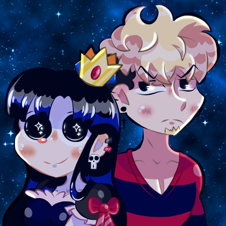
Here are mine!
cool perspective on the seconf one
Does it have to be a comic?
Before (from 2015)
I do have some issue with the second cover (like his hair blending into the background and I wish I chose different background characters). Tho, I think it better represents what the series is.
no i guess not lol you can post whatever you want hahaha
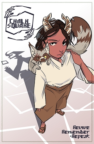
Oh yay! Because my cover has been through a journey.
First
Then
For now...
And I'm totally thinking about changing it again, lol
Very nice and very different from each other lol
Funny this thread came up cause was just working on the inking stage in redo of a old cover for my series.
I have a very hard time sticking to a cover, lol
Really like the first one for some reason. Maybe cause it’s focus isn’t on a humanoid character
Really???? Huh. That's the one I started with because I wasn't sure what else to do, but I never really liked it.
Yeah, in my opinion out of the three it has the most “Novel” look to it in comparison. Think it is also in large part of the size, choice and placement of the font as well which could be a factor into why I feel this way.
Here's a before and after shot of my character's bedroom (although this is a spoiler of the revamp! so no sharing please, lets keep this between us! Like & Subscribe through link below!