Lots to consider, I really appreciate it.
Edit: Jeeze could I have sounded any more lackluster originally? So sorry. I hit a bit of bad burnout recently and it's really showing. I honestly really do appreciate all of the question you've posed and the energy that went into your critique. It really means a lot!
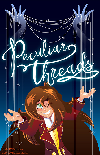
I will definitely take your remarks on the logotype into consideration as well as shading. Because I work with vectors my lines are pretty minimal to non-existent to be honest - even though it's easy to add strokes in Illustrator I find it can cause pieces to look very flat, so I'll need to work at a solution to add lines and definition without underdoing it as I've done, OR overdoing it, which can be pretty easy to accidentally do.
I will study hard at how people perceive/read a piece of artwork as well. I have to admit I've really neglected that aspect of it and many of my pieces.
Thanks again, will go back and work on it a bit more. Luckily the logotype is still raw and easy to edit.
I'll check out your dA, your work looks real cute!