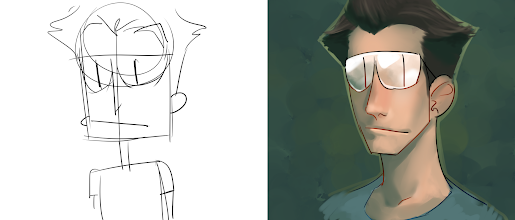
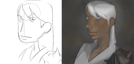
i think the painterly colours to the super simplistic style looks kinda odd - moreso for the first one, because of the eyes. everything else is kinda fine, the drawings themselves had depth and dimension, but the eyes remain as they were, throws ppl off.
id say, stay true to your comics art style throughout your 'packaging' - if your banner and/or icon are in a different style to your comic, its gonna bother people, because itll feel like false advertisement.
that said, if you want to do cover illustrations or special pages in a more realistic, painterly style, go for it! theres a long history of comics having far more detailed covers or 'special pages' where they go all out.