Alright, let's see here...
Overall, this is a definite improvement from last time I reviewed your work, so well done with that. You're moving in the right direction.
There's a general issue with it feeling like you're using texture to fill space rather than to serve a purpose. I think the hair is a good illustration of the issue. You're using a lot of lines in the hair, but they're not really defining the volume, and the lines even sometimes seem to fight against the shape of the outline rather than helping it.
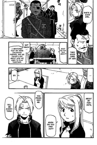
I think studying the work of Hiromu Arakawa would help you a lot, so I'd suggest some homework of reading through some Fullmetal Alchemist (best homework ever if you ask me) and studying closely how Arakawa uses her lines very purposefully to define the 3D volume of a shape, and never uses hatching that isn't doing something specific.
For example:
Notice how on the hair, she leaves most of it unhatched, instead concentrating the lines to the lower edge of the hair and using the curve to define the round volume of the head, or using the direction to show the underside of a flick or ponytail.
Also see how little shading or hatching is needed here because of how those purposeful lines describe the crisp shape of shirts and jackets. The strong straight lines showing the tension in the fabric, and the way she uses curves and outline to really fill out the volume of the body.
It might even be worth attempting a short comic or some sample illos where you ban yourself from hatching to push yourself to rely on purely your lines. I think you'd learn a lot from it. It'll help you to learn not to lean so hard on your hatching.
Another area to work on is to start thinking more purposefully about where you're "pointing the camera" in terms of showing the relationship between character, action, reaction, environment and emotion. I think looking at books on storyboarding can be really good for this one, and there's also a great chapter about it in Making Comics by Scott McCloud. You've got the hang of drawing dynamic angles, long establishing shots and closeups, so now the next step in your development is to start using them very deliberately to direct the audience's attention and manipulate their feelings like a magician putting on a show.
Study movies and comics carefully. Where is the camera/viewpoint? Why is it there? Think about how you can place the viewing angle to show most effectively "this person is looking at this and it's making them feel X". This is the missing piece of the puzzle for you, and once you get this nailed down, your work will take a massive leap up into definite pro territory, so do your best! You are so close!
In terms of writing, this is definitely tighter than The Borrowed Faces was, but there's still a definite issue with people standing around talking about what's happening and it not necessarily being a visually compelling subject for a comic.
If the premise of a comic requires that much talking, it's possible that the premise is too complex for the intended length of the comic, or that there may have been a better way to structure the plot so more information comes across visually, perhaps using flashbacks or cutaways or something. Always remember that in a comic, most of the time, the pictures don't decorate the words; the words supplement and add specific detail to the pictures, which should be doing the heavy lifting telling your story.
Overall, definitely a jump forwards, so just keep it up because you're improving with every new comic. You got this!