1 / 12
May 2022

Slowly but surely I've been working on my contest entry for the call to action contest and I'm struggling to settle on a cover. I have a couple ideas, but I'm still not sure. I also created a title logo, and while I like it, I still want to get a second opinion on it. I'd appreciate the help.

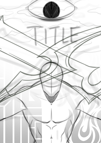
Here's the cover I thought I was going to go with, but it felt a little too stiff given it's an action comic. The eye sketched here seems pretty prominent, but in the would be finished cover, it'd be more faded and hidden behind the clouds.

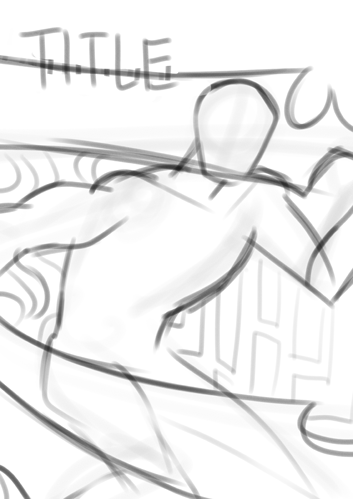
And these are simple sketches I made recently:


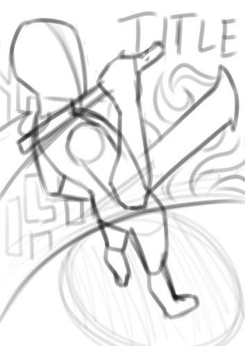
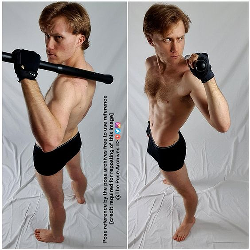
I traced over this reference for the last one:

And now for the title logo. Again, I (tentatively) like it. I made a few different mock ups before settling on this one, but I'm willing to take notes on it.


I made another post with a few other ideas, but they were critiqued on, for the most part, for lacking a connection between the character and viewer:

Thanks for the help :smile_01:

  • created

    May '22
  • last reply

    Jun '22
  • 11

    replies

  • 594

    views

  • 8

    users

  • 16

    likes

Ooooh, this is looking great!

The logo looks really polished, so honestly so long as it's going over a nice light area that's very plain so that the dark logo pops and the finer text is readable, it'll look awesome.

I actually think the first cover design is very striking. I imagine the hero will be staring up intensely at the reader from below the cool swords. The eye is cool too. I don't think it looks stiff, even though it's not an action pose, the downward angle and the diagonal blades and how it all draws the eye in to the face, and the sense of tension, like the swords are really heavy make it feel dynamic. Personally, I think you should stick with that one.

Really? Thanks! That makes me feel a lot better about it; I really thought it would be too stiff.

The way you draw these covers looks so cool.

This might be just me but I prefer the first one where it is centralized. It's very eye-catching to me (no pun intended).

The others are cool but they seem more fitting on comic panels or wall papers.

Nevertheless, I really love the pose.

Insanely envious of your logo skills :heart_01: it looks really awesome!

@faisalhussein394 and @Manyana Thanks! Seems like people favor the first cover so I guess I'll go with that one. And I might use one of the other ones for promotional art, so thanks for that idea.

@migxmeg That's so nice of you to say! Believe me when I say that there was a lot of trial and error to land on that design. Still thinking of making some slight adjustments but we'll see.

Gorgeous work! :heart_01: I especially love the sharp edges of the logo, they really give that sense of motion and action.

I may provide a little feedback/suggestion for the logo. The gradient is very subtle. I'm not sure if that is what you are going for(?) but maybe you can try a lighter color for the gradient/some metallic highlights/effects to make it pop out a little more.

Thanks for the feedback! Yea, I was going for a subtle gradient. I can play around with changing the finish of the letters however, so thanks for the suggestion!

I also like the first the best, 2nd fave is the third one because it has a nice swagger to it.

I agree with other that the first one is good. My eyes are drawn to the prominent focal points.]
The logo looks great as well, balanced and easily readable; fits the theme to boot.

1 month later

closed Jun 13, '22

This topic was automatically closed 30 days after the last reply. New replies are no longer allowed.