With this critique, I was only able to put time towards viewing the first and last episodes. I won't be critiquing the dialog itself aside from a one thing and it's not plot based.
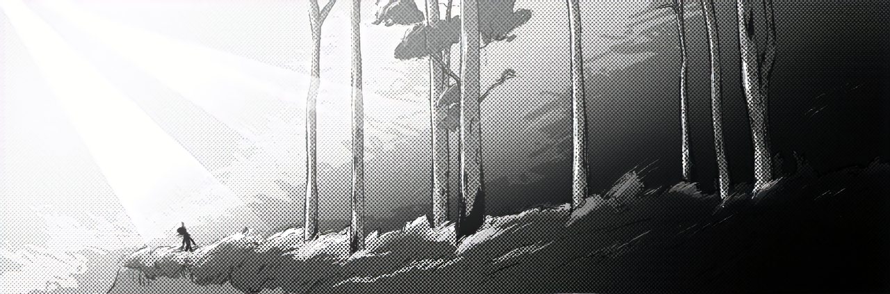
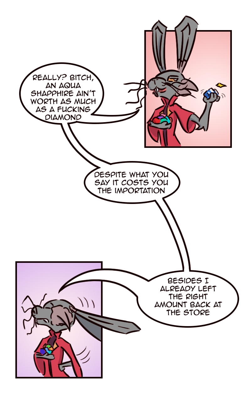
First of all, you have a cohesive look which is great! The use of greyscale tones is well thought out and varied enough to create a strong look for the comic. The conversion to color works well for the latest episodes as well. Also, I can tell who is who on every panel so the consistency with drawing is there which is great!
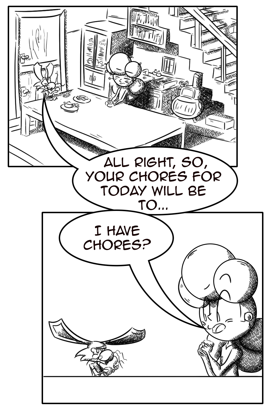
First issue for me, I am viewing on web-browser, the episodes are small in width. Are you making the pages under the 940 px width recommended size?
The inking seems quite rushed as well or lacking in the use of stabilization on your brush. Not sure if it's intentional for the style of the comic.
Especially in the first episode the panels feel quite small. Not as much in the last posted episode, but some panels are still fairly tiny. I think you could push the size of your panels to be larger. Again, if you're under the 940 px width this issue might be solved with upping the page size.
The language used and choices of wording with your dialog is a bit strange? I'm just guessing you're going for an other-worldly style for the character with the hat in episode one but just using 'thou' and 'thy' with more modern language around them makes for a stilted read. The other characters speak like English may not be your first language. It's not unreadable just some lines are not the way a native speaker would word things.
Final critique is for the dot tone. It seems a bit random. I can see that it's being used in the mostly the same places across each character but it might be too much? The scale is off for some of the panels as well. I'm not sure if you're adjusting to the current size of the character or just using the same dot size for everything?
Overall, it's a very cute looking comic and seems like a great read for those who love the adventure genre!