Hm... Crosshatching is indeed very hard, I still struggle with it myself... I personally am a fan of making shadowy spots in Comics in a really strong black and then maybe pull it out a little with hatching/crosshatching - this is what I do in my webmanga Remember:

I also add screentones to it to make it more threedimensional, but tbh, it might not be everyone's taste ^^"
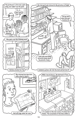
When I look at the example pages you posted, I have to say: The first thing I noticed about the left page is that there is literally no contrast at all - even the characters are kind of floating, because they don't have any shadows on them (again: I'd put some thick black shadows in there, but I don't know if it would fit your art style, which in total looks pretty great! =) )
The right version with the simple gray shadows is a lot more pleasing to the eye - at least for me - but I'd still recommend some stronger shadows behind the books or under the table for example. Maybe not solid black but with a sort of hatching? A parallel hatching, maybe bordered by a single like (like I did under the chins of the characters on the above page) to accentuate the darker places in the gray areas? Oo
Let me know what you think about it =)