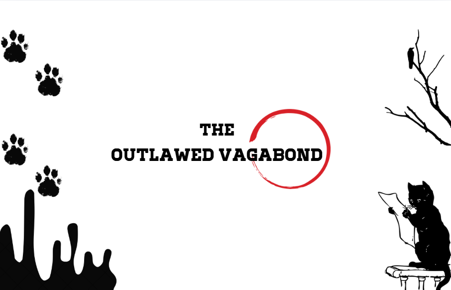
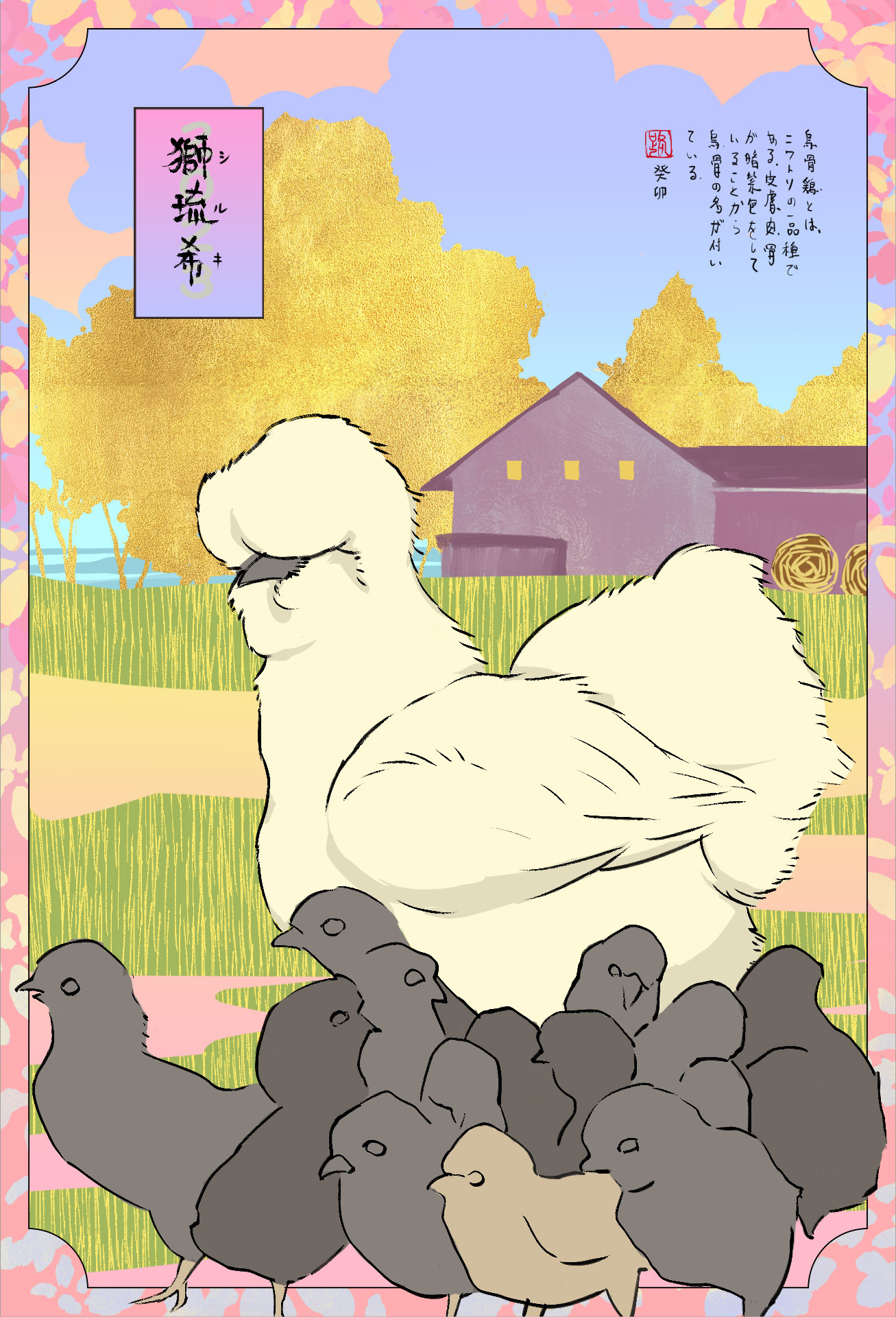
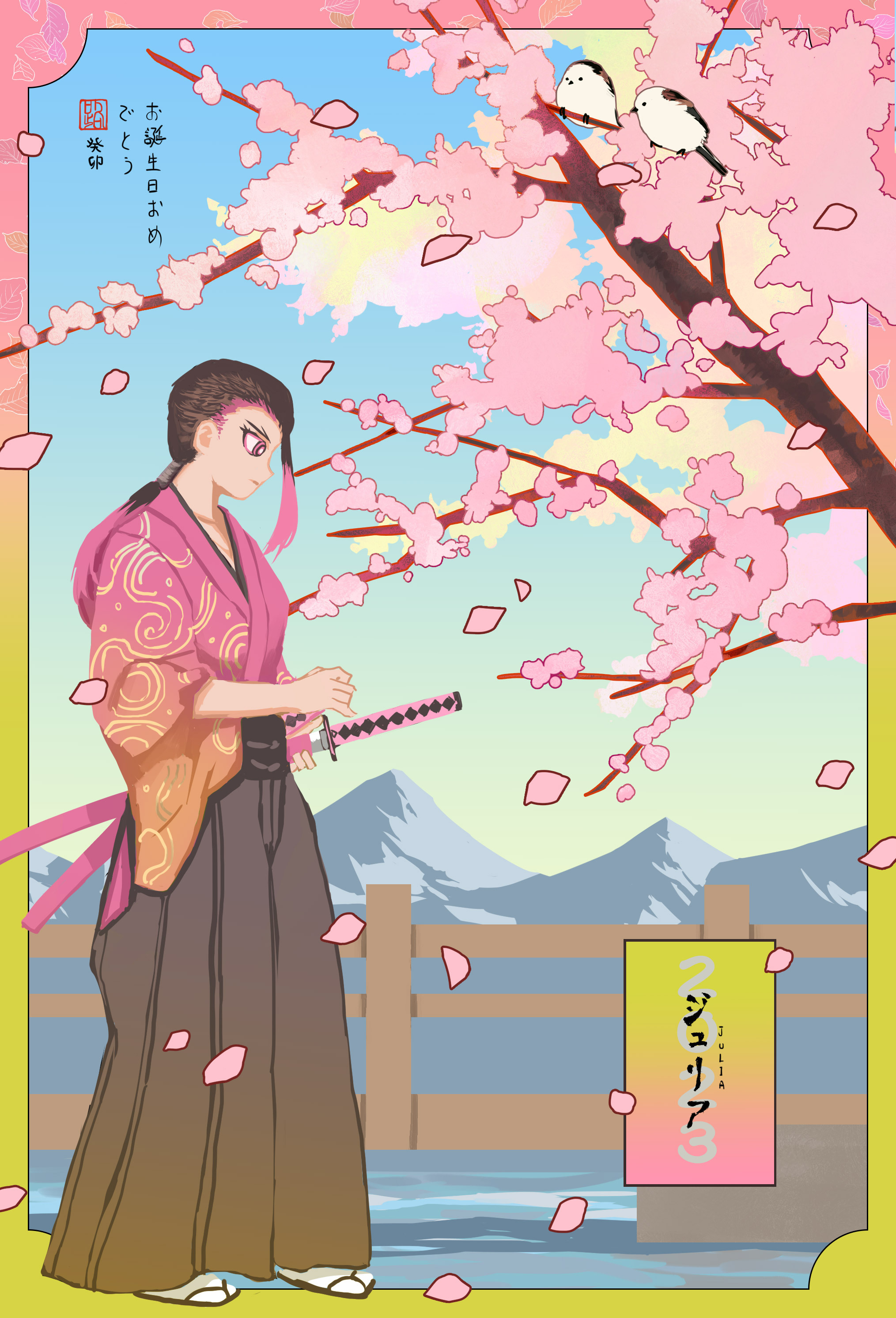
The images in the four corners, along with the text in the middle, look somewhat disconnected, lacking overall unity in the design.
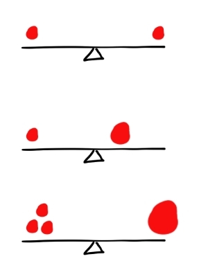
Although graphic design indeed emphasizes "balance," this balance doesn't necessarily mean placing objects of the same size on both ends like a scale (as shown in Figure 1 below).
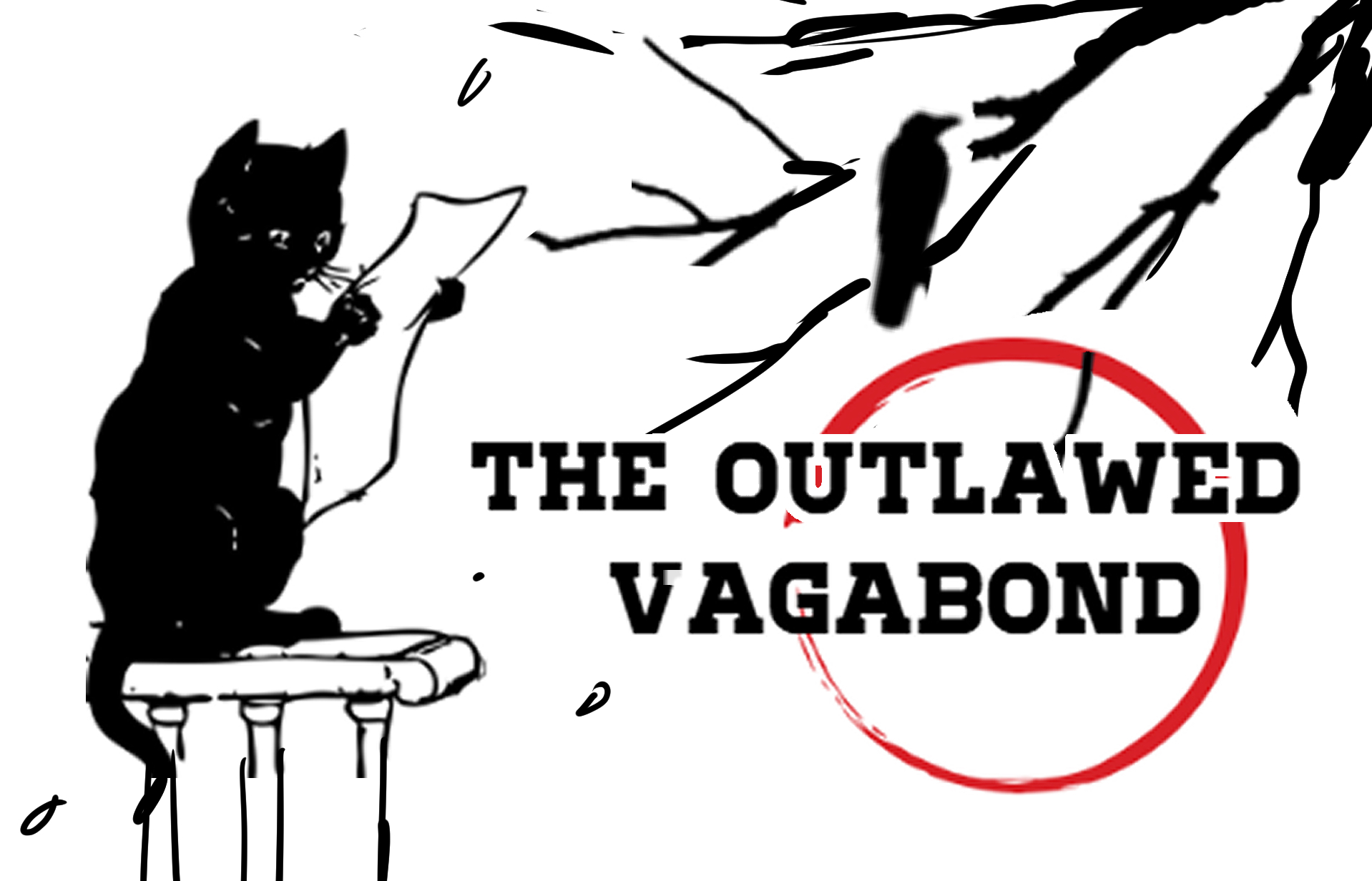
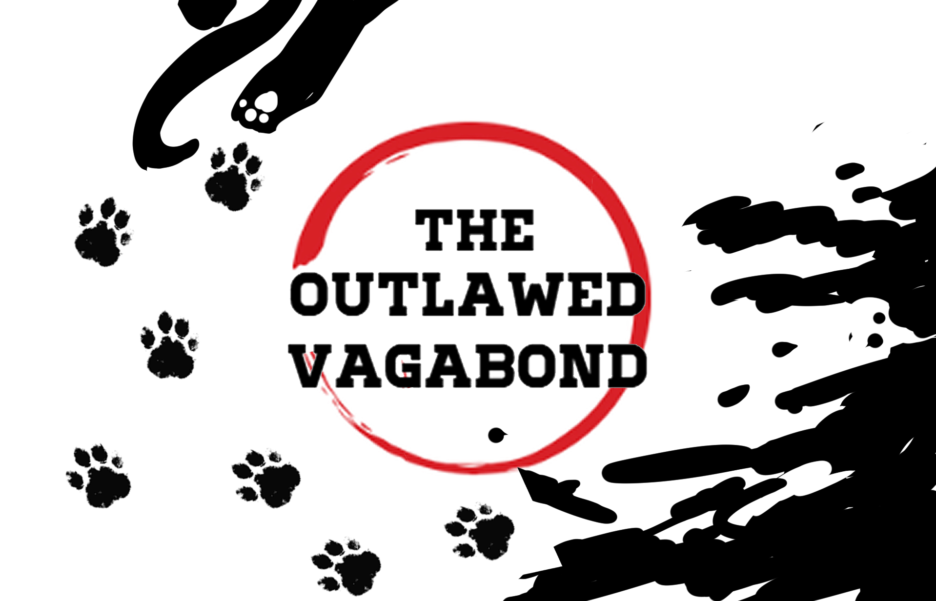
We can also use other methods to achieve visual balance (as shown in Figures 2 and 3 below - there are many ways, of course, you get what I mean)).
Make good use of contrasts, such as density, size, and light-dark contrasts, to prevent the composition from being too rigid. Below are five designs I created for your reference.
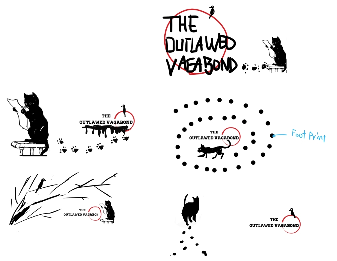
By the way, sometimes you actually need to make choices about objects - you don't have to put all the objects in the composition.