Here mostly cuz of Niah's mention (THANKS FOR THAT) BUT I figured since I'm here I'd mention a tip of my own!
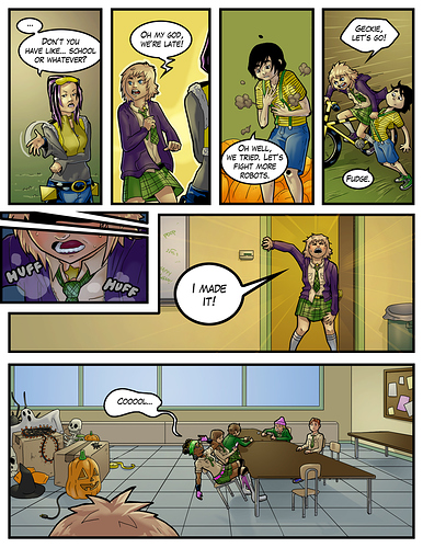
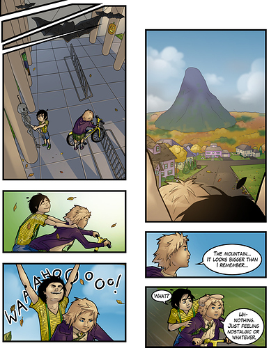
When I'm paneling a scene that's supposed to be tense, I start making panels a lot smaller and cramped to help enhance the tension and when I want something more open, I might drop panel borders entirely. When a character is confused and then realizes something the next panel, I might utilize this to kinda help enhance this as well by having panel borders nice and tight in the first moment, and then drop them for the next to show their mind being open in a way.
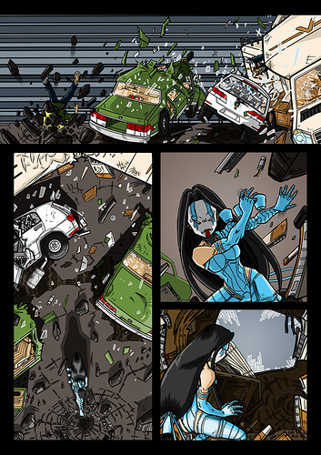
On another note, stable panels will equal stable moments, chaotic uneven panels will equal chaotic moments and action. Sometimes tension will also get this treatment on my pages.
I TRY to apply this same treatment on both my vertical and standard comics but it doesn't always work out since I haven't been doing vertical for too long and it's not always easy to switch my brain since both need treated very differently.
AND SECOND TIP specifically towards vertical comic creators: you don't need to space panels out too far, ESPECIALLY if you're still in the same scene. If there's too much space it really kills the flow and makes reading really difficult (and I dunno about other people but I tend to stop reading these comics really quickly). You don't have to put things as close together as I do in my comic Niah linked up there, but try and avoid moments where your reader's screen is completely blank at any point when scrolling down, unless there's a very good reason for it (like maybe a scene transition or an emotional moment, or something like that). Just imagine spacing things out like slowing your film down, and squishing them closer like speeding them up, because that is the pace your readers will be getting through. (Unless you're trying to appease the webtoons "too short" audience, then space 'em out as far as you think you need to in order to trick them into thinking your episodes are longer than they are )