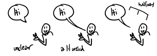
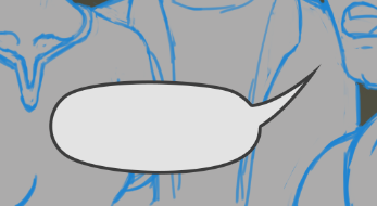
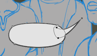
If you have a lot of text for a bubble I also recommend breaking it up.
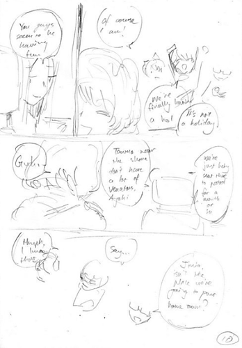
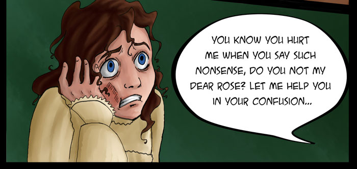
This could have been broken up into two bubbles, and it would also have been more comfortable to read. (Also don't do tangents like this!!)
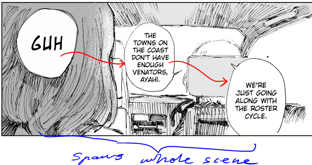
Like here were I've broken, what could have been a few bigger bubbles into smaller ones. It can help to indicate pauses in speech, and pacing.

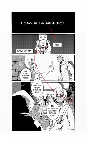
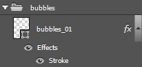
Another tip I have is changing the textbubble colour to fit the colours of the scene, if you are doing colour pages. I personally find it more relaxing to look at than pure white speech bubbles in a coloured page.
Changing the colour can also indicate another person speaking if they are not in the image, or as here, a flashback.
@niah146 I love these tip threads!! <3 Do you take requests? I would love to hear what people have to say about movement lines and such.