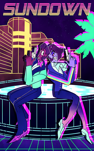
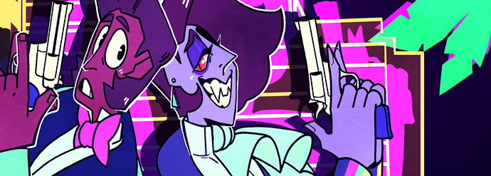
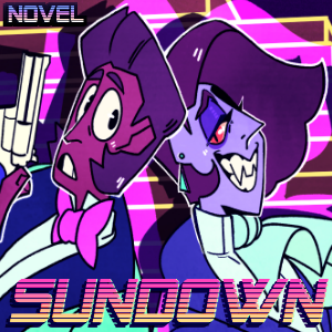
might redo it but heres the cover i drew for sundown!!
The Cover for my writer's camp novel 'Silence'
This cover art is awesome! It really makes me want to check it out. Simplicity is beauty! (Ф∀Ф)
I used this piece of art for the thumbnail, though I think I might change it to something more clean in the near future. : )
In my case i decided to make a cover very much alike the ones i saw in a brazilian book series that run here when i was a teenager. It is simple and i changed the blood to blue to not be too much violent to the kids that could end up seeing that.
I don't have the money to commission art for my covers, so I had to resort to downloading creative common illustrations: This is my cover by using both Paint and PicsArt:
Wow! Thanks for sharing!
I took mine from canvas though
Here are mine:
**Though, with What You've Given Me I have 7 other cover versions, but this is the one I decided to go with.
Here's the cover to Part 1 of my series Canticle!
My extremely simplistic novel cover, originally intended for a podcast. Vector art can be fun!
I had some help with mine, since I suck at typography. It wasn't my initial idea for the cover, but I loved the sparkles so much that I decided to go with it.
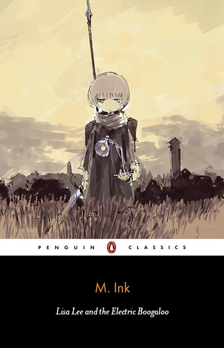
Novel Cover for 'Lisa Lee Kills the Witch'--this was something I wrote within the span of 16 hours, and I'm still astounded that it exists.
Here's the meme version:
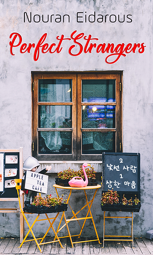
Perfect Strangers
Another one I just re-post it after major editing and changing its cover.
The Infinite Duo: Bennu Effect
Returning to share my updated novel cover!
Here's my cover:
I was originally annoyed with the tiny square for cover art, but I have to say, some of these covers are gorgeous (the full covers too) and lately I've been enjoying the simplicity of these little boxes. I only have one at the moment, so here it is:
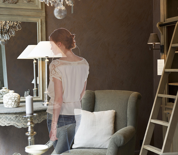
Here's mine~The thumbnail is a crop of the top half and conveniently cuts off the heroine's bum lol
My covers are just like my writing.
Cheap. Corny. Stereotyped. Boring.
But guess what, It has neither stopped me from writing nor from torturing your eyes by posting them for all to see. Suffer from the overload of mediocrity. Suffer.
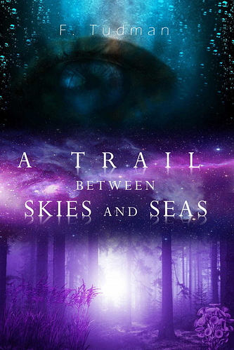
I actually think this is quite beautiful!The only thing I could see making it better is putting 'A' centered on it's own line above 'Trail' and making your by line more visible (a thicker font maybe?)