@KeraShr
First of all, not Comic Sans.
Second of all, make it larger. Be proud of it. In some views, that's the only title the reader will see (some views don't have the title underneath).
Color the font with a color from the picture - but choose wisely. Play with a few until you get the right one. You want it to be readable.
To choose a font, I suggest looking up book covers in the genre (even better, subgenre) you're writing. I get a lot of ideas from published books.
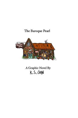
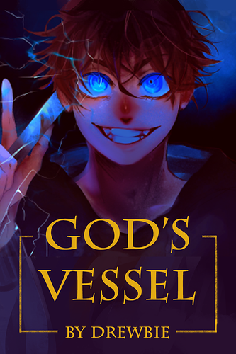
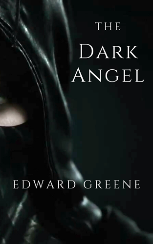
This one looks like fantasy so I went with a fantasy font.
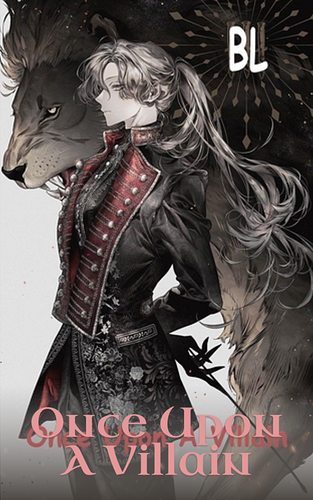
I used Uncia Antiqua font (but you can go with a stock font if you don't have other options). For color, I used the color from the guy's jacket. I added a gradient fill to the text box to make it more readable.
Btw, I love the detail on that jacket.
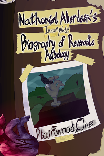
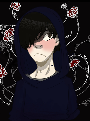
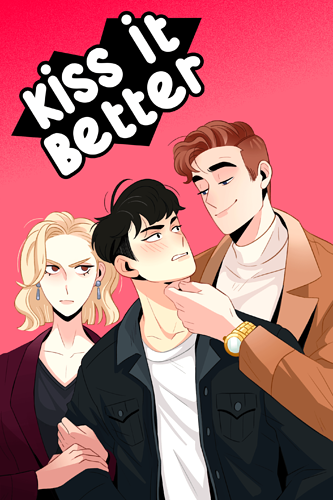
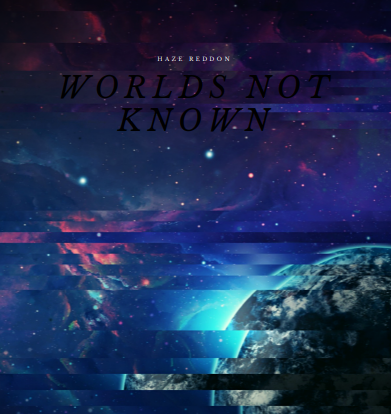
This one looks like a cute romance, so I chose a romantic font (this one is Great Vibes). I put it on top since anywhere else, it was messing up the art.
Use a simpler font for your name (this is Cinzel).