Both of them look absolutely amazing!! I really like the perspective in the second one!
Old
New
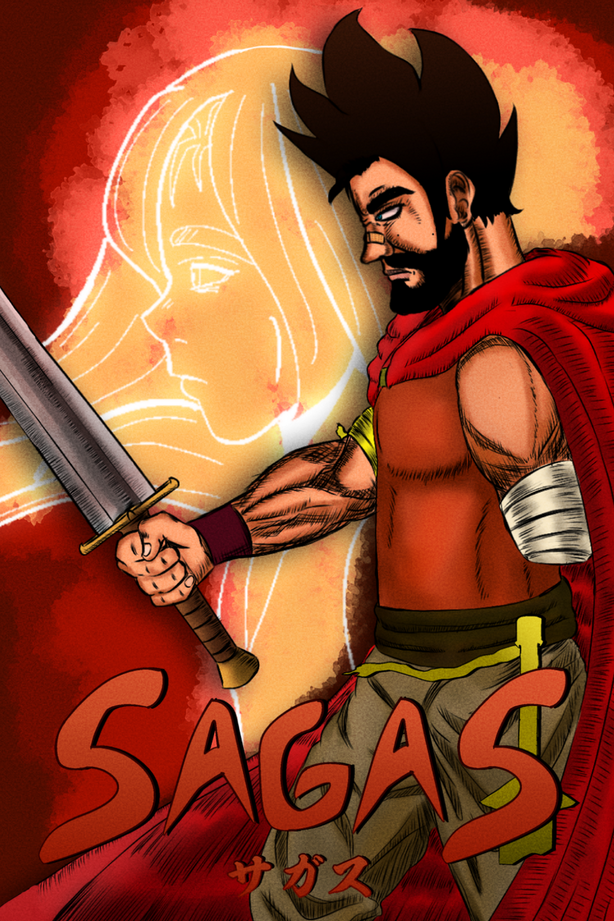
I'm bad at drawing covers vs my panels
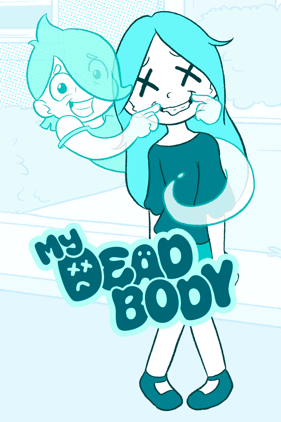
This is my first design from 2021
Then I realized Casey is not the only main character
I went from a generic space science fiction graphic for the first cover to an idea that tries to convey more of what the story is about for the second cover. I realized, I only have one second to grab a viewer's attention, and a provocative title just won't do it. Also, showing characters, showing faces gives much more of an opportunity for a viewer to identify with some portion of the image (and maybe click!).
Old Cover
New Cover
From my latest story, here's my old cover. The story was for a contest so the cover was a little rushed.
And here's the new one I took more time with.
My old cover. My novel had a different name back then.
My new cover.
Each chapter gets a new cover, here's the evolution of them
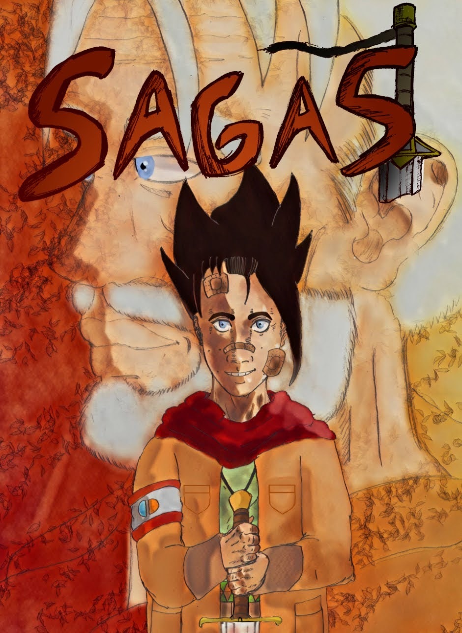
I drew it back in 2011. But digitalized it in 2018. Yes I did the cathedral top myself too. I looked at old black and white photographs I took back in highschool in the 90s.
The new 2025 cover. Got better at utilizing the assets and software in Clip Studio Paint.
Good morning/afternoon/evening! If you are searching for something to read and see, check our graphic novel! Please consider subscribing and giving a like. We also have our own youtube channel where there will be the animated series of this graphic novel, so subscribe please! Its called Unime Studio, thank you for checking. If you comment for a shoutout in the graphic novel, you will be called in a shoutout in the channel! This novel will have realistic and raw situations that happen in real life in actuality!Here´s the link: Please subscribe in WEBTOON, WATTPAD AND YOUTUBE! Thanks for subscribing Before made with ai
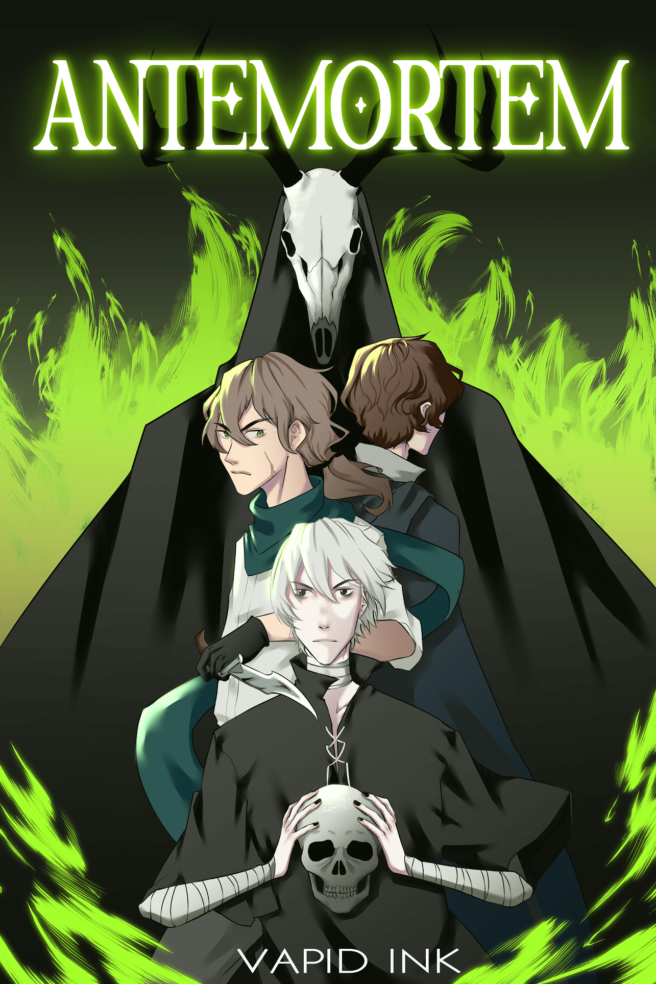
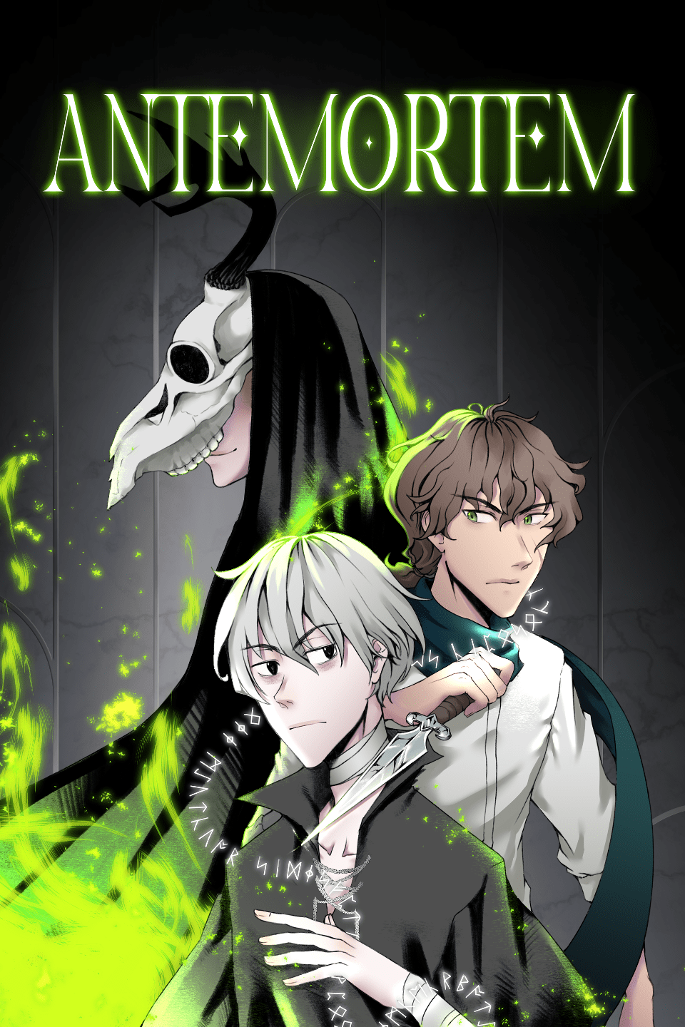
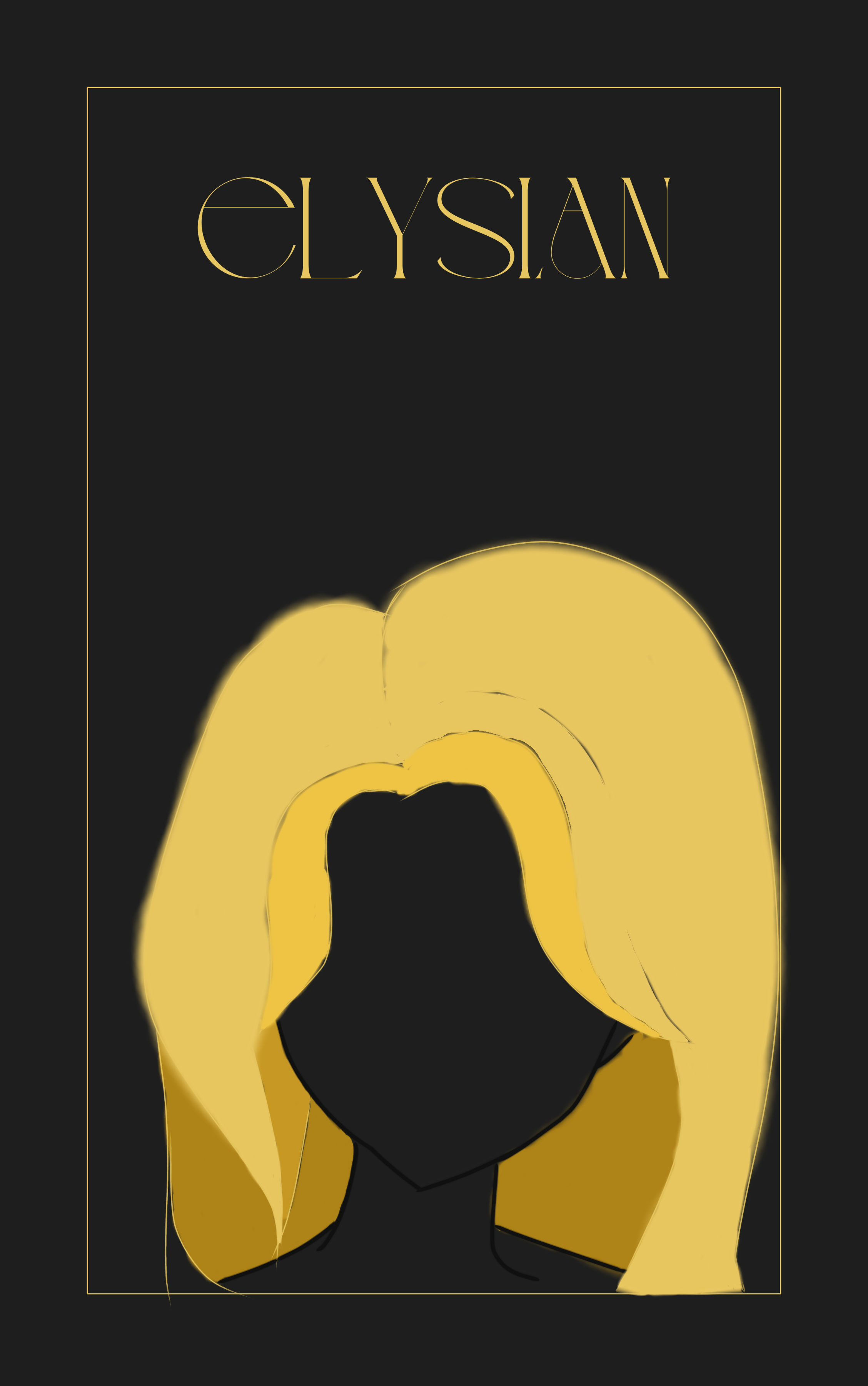
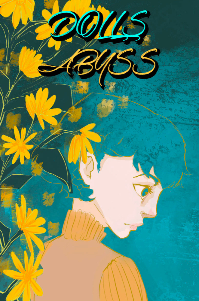
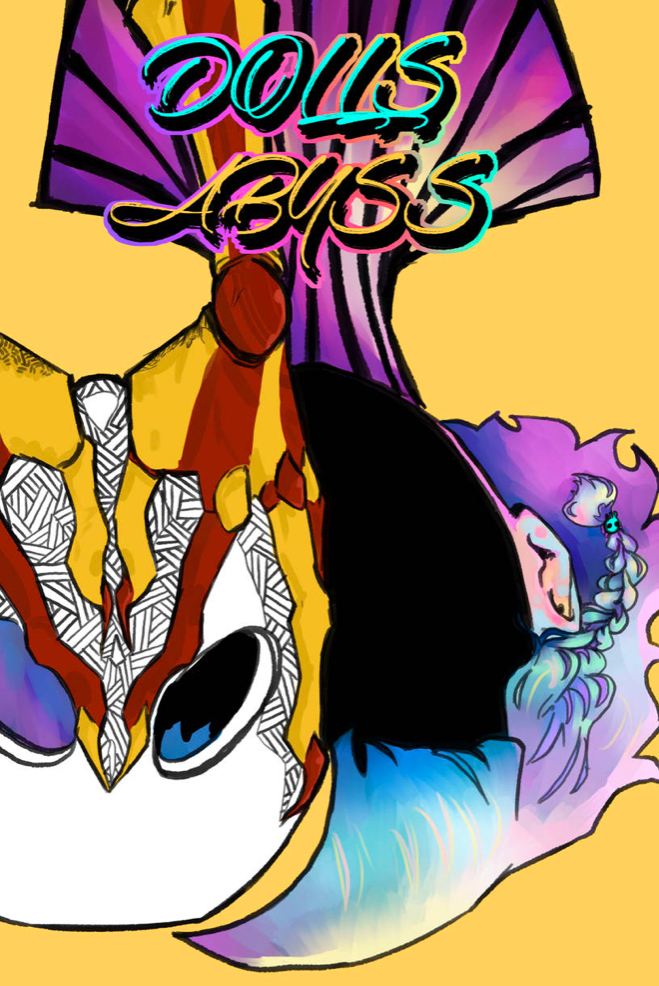
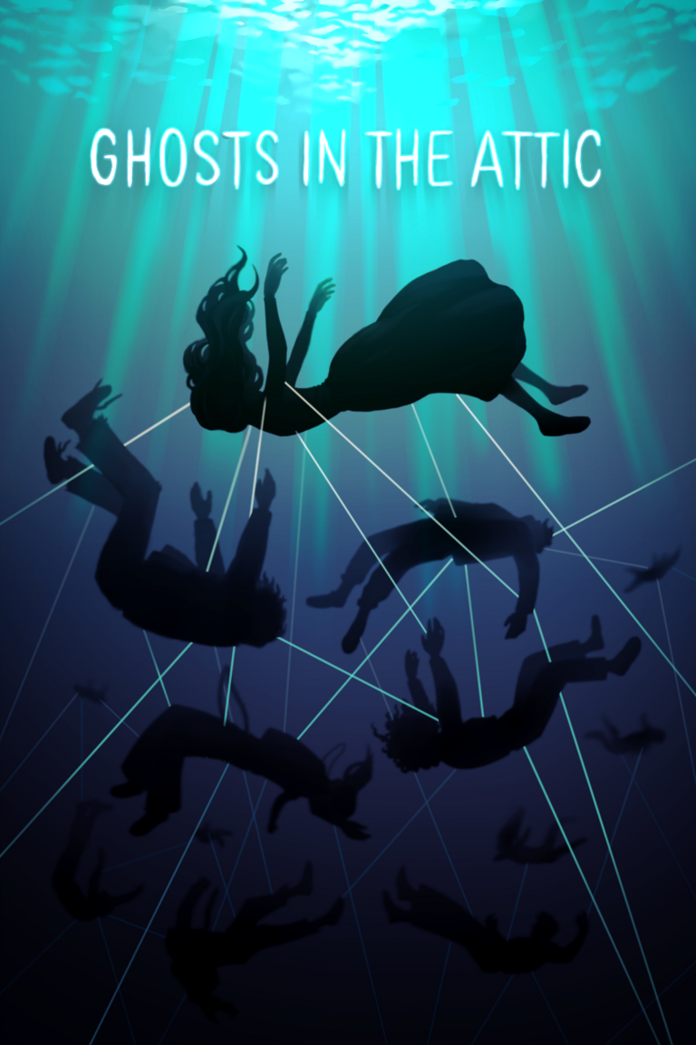
Olds vs New, though i’m playing around with a new cover again.Dolls Abyss
These are my covers! 2022 vs 2024 my style changed a lot haha
Not really big changes but hopefully an improvment.
Old:
New:
Just change the title and font
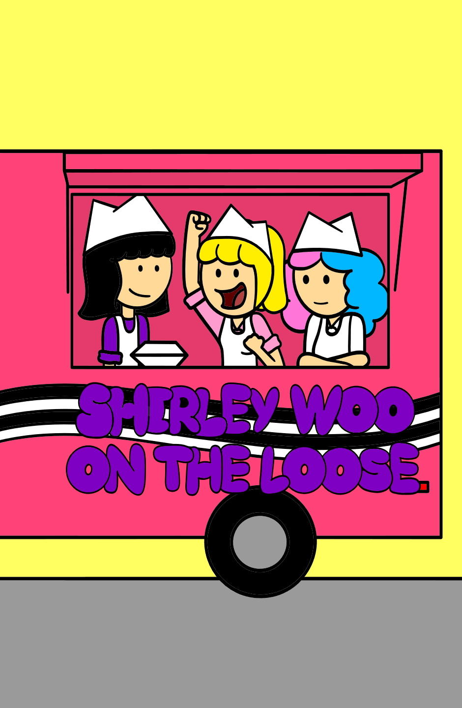
I updated a new cover for Shirley Woo on the Loose.Old:New:
Old vs New!
First ever cover I created:
The current one!
I think your updated cover is really great! The composition is stronger, and the characters are posed more enticingly.
I JUST updated mine today. I'm not super happy with it, but I think it is more eye-catching for Tapas than the old one. Still looking for a composition I like.
OLD (2021-2025)
NEW (2025)
LOOOOVE the new font. And your style is more refined, the colors a lot better balanced. Great work!
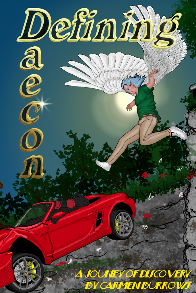
First Cover for Finding Daecon's Way:
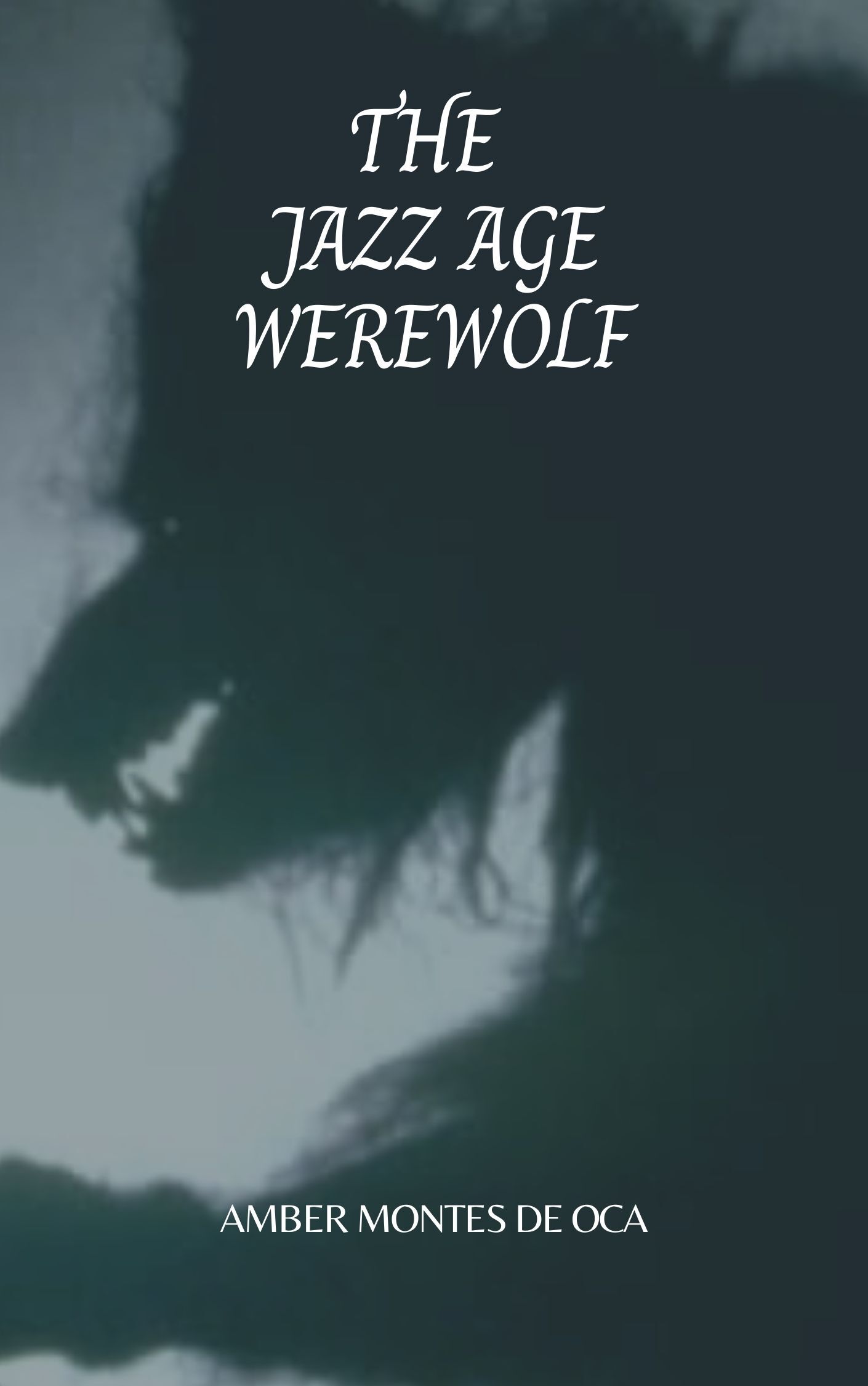
I decided to do a rewrite, and gave the series a new title:
Then a new cover (which I was never really happy with):
...and then finally settled on this one: