1 / 81
Sep 2020

Sometimes readers don't get what you want to show from the poster.
So here's a thread for you to talk about yours.

Post a picture of the cover and tell us the design intentions.
(Tone, use of color, character expression, metaphor/mise-en-scène etc).
You can include the title, or not, but focus on the graphics.
Also post your series links at the end. :wink:

For my comic series 'Maor':

Although my comicpages are in black and white, a series poster without color just looked weird imo.

  1. The cat protagonist (Maor). On the center of the poster shows that he's the center of the story. He's on a crouching position, touching the soil, indicate that he stays grounded, either his lifestyle or his goal. His rather bland facial expression instead of the happy excited shounen-character expression-- to tells the reader that it is NOT a typical adventure type story. It's more introspective. Bonus info: he's doing an 'asian squat'.

  2. The bird character at the back: Important character. They're not NOT facing one another and looked distant. Is the character a friend, or a foe? Do they have conflicts? Also it appears the bird character is standing near to the light, as oppose to protagonist. What does that mean? Here I just want to keep the character's alignment a mystery. Readers have to find out around a few chapters after the beginning.

  3. The backdrop: Plenty of grass and small wooden houses at the back indicates some rural village and probably where protagonist lives in. I choose a sunset timing with a yellow orange sky to give a warm vibe, but also can be a bit sad, which mirrors the main mood of the story.

  4. The pagoda at the back. Pagoda is an eastern tower-like structure that people can enter for spiritual/religious purpose. The floating on the sky, transparent look shows that it's a mental image and it's probably not around the village. This tells the story premise of protagonist's goal to enter the pagoda.

  5. The tilted image. Originally it was just a visual gimmick to fit a bit more backgrounds to the portrait size poster. But think about it: this indicates something is 'off balance' in the story. That kinda works too.

Overall-- through the poster, I hope to tell the readers that It is a serious type of story, with a bit of mystery, some adventure element about reaching the place, and with possible character drama...with warmth but also with sadness. I don't show every elements but I hope I don't give readers too far off the impressions.

Wow I love the color scheme of your series poster and the perspective makes it more intriguing! :smiley:

I'll share my latest novel's cover then!

There are two main concepts here: cyber stalking and a murder mystery. The blue light from the screen, the hunched figure, and the strewn posters on the wall depict the stalking aspect. Red strings connect certain papers, hinting to a murder. And the title font also contributes to an air of mystery. :smiley:

The image used for my cover of my novel, Karana1

Meanings here. I try my best not to include spoilers
  1. One of the main plot point of this series is unraveling the true identity of the main character. Such is probably deeper than the skin that he and everyone else knows, that I draw him as a shell breaking apart as a relation to the identity he knows.

  2. Separated green eye allude to what happens in chapter one. The eye is also an important thing in the story.

  3. Debris refer to the earthquake which kickstarted the events in the story. It also allude to the possibility of everything worsening and falling apart.

  4. Hair strands symbolize leaving the past. In various cultures, cutting hair can means throwing away unpleasant things in the past and moving on, it can also have emotional meaning like mourning. The main character in particular cut his long hair prior to the story.


Cool thread idea!

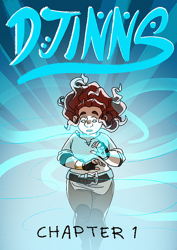
So one of the big ideas I wanted to sell about Errant is: "It's about a group of dysfunctional 20-something year old friends."
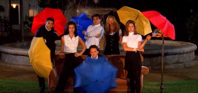
So there was one obvious inspiration to draw from here, a show that hasn't aged well, but for me was a big part of my teens with an iconic opening that evokes that exact idea:

The opening of Friends, where they're all clustered together in these whimsical shots being cool and quirky was the tone I wanted to set.

My main goal is that you should want to get to know each of these individuals and to be friends with them.

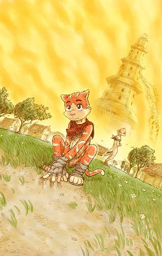
Rekki is in a very traditional "knight" pose, like a statue, kinda symbolising that she's the one tied most to the tradition of being a knight, but it also has some sinister connotations, with Excalibur looming behind her and with the pose not being unlike a dead warrior engraved on a tomb or a Viking laid to rest. Her sword matching Excalibur's position will be relevant in many ways.
Subo is close to Rekki and relaxed, he adds a sort of grounding element to the image, just as he's kind of the character who keeps the team grounded.
Sarin is as far away from Rekki as she can really be while still sitting on those boxes, leaning away with her back turned and barriers set up with her raised leg and crossed arms. There's discomfort and unease in their relationship, and a break in that break in the space. Also there's something by her foot which is definitely totally irrelevant and you should just ignore it. Anyway, moving on!
Jules is mostly useful for this image in that her knowing smile is inviting. She's just lurking back there, knowing something you don't and that's pretty much her role in the story.
Mysterious right hand character is moving with the spirits and seems to be kinda shooting off the page adding some much needed dynamism and breaking off from the static poses of everyone else. The pointing with the sword is kinda like "Let's go!"

The pink/purple colours to the boxes, spirits and Excalibur, plus the pink highlight colour are there to evoke the look and feel of things that I think have a similarity in feel to my series, like Steven Universe, Netflix She-Ra or even Sailor Moon. Like yeah, this is kinda shounen manga and adventure, but it's not necessarily macho or masculine. It has a lot of queer characters and a focus on female friendship and relationship drama, so I wanted to evoke an airy, feminine feeling that would stand out from a lot of the heavier, darker, more red and grey dominated covers in the action genre.

I always envy ppl who have such great imagination and can get in so many meanings in pictures!

My brain feels so dead compared to everyone else haha, also why I was a fraid to make my own comic for ages but then I just went with it because i wanted to draw my characters story :sweat_smile:

Anyway, I dont yet have like a series poster, its just a chapter poster/cover right now, and as I felt clueless what to do I just looked through my chapter to find a panel that might work as a cover and be somewhat relevant to as what is happening in the chapter so I made this for chapter 1 cover/poster.

its a remake of a panel early in the chapter ;

Its what I could come up with that have the main character and a hint of what is happening in the comic/first chapter and might spark an interest, hopefully :sweat_smile:

I like this thread and I like your poster, the colours are beautiful :smiley:

For my novel The End of All Things the tone of the cover is quite dark to match the setting, a post-apocalyptic fantasy world. The purple as the main colour is the royal flag of the former kingdom in which the novel takes place.

The dirty, smoke-like effect and the embers are a fairly unsubtle allusion to past destruction and current conflict!

I like everyone's posters and both the process and meanings behind them.

For my poster, I went for this relaxing design; I went with it because my original cover was pretty much every and busy in terms of art design and principle rules, so I updated it before making the comic. The photos are to showcase memories since things last longer if you take a picture and they hold fond memories, though the one in the middle was chosen to show a star and the story logo star (which is the yellow five-pointed on in the picture's white border); the photo is sorta curved as to be more like a photo. The wood underneath is to show that the pictures are either on a desk, table or counter with the sunlight in the background to show either a sunset or sunrise since this particular one appears around those times. It also matches with the story in terms of colors, which is bright with some dark stuff......not too dark though.


I'll do the first cover only.

The Mood: I wanted to show something light and happy, as the story starts off that way. I always want the covers to not necessarily give away what's going to happen, but to give the reader the mood of the chapter.

The Characters They're the 3 princesses that you'll be introduced to in the first chapter and the title of the series is attached to those three.

The Positioning Laying on the grass with your friends, is something you when you're relaxing or just having fun. Having them holding hands like this was to show a strong friendship as their linked by something important. As well, as it spoke to me from a game we used to play as kids "Red Rover". You hold hands and call someone over from the other team and they have to try to run through the link. Sometimes they can't, because the link is too strong, but other times, they get through and the link is broken. Which in this case, fit for the story perfectly.

I've got a few. Honestly I don't really think about composition at all when I'm drawing :sweat_smile:

Well for one. I really like Silver Age comic covers. They're always so bombastic.
So I use poses like something Jack Kirby would draw.
The above cover is for the first prologue arc, so I have my main powering up, while being advanced by some shadowy figure.

And this one, kind of strays from that whole Silver Age aesthetic to show a young Rip, pondering what his parents look like. As they look down on him from a lofty position, indicating they're unavailable to him.
Spotlight says he's alone.

Links are in my profile.

Being...how to put it best?... Being a person who writes because they have no other talent in which to express a story in any other medium, my covers are far from the works of art other folks have shared here.

For the figure representing the main character in her magical-girl form, I used a magical-girl character generator and took the silhouette of a character I whipped together, because character generators really can't make exactly what you have in mind for a character. The golden sky represents the realm of Solis, a parallel dimension that plays a role in the story. The falling feathers that darker towards the bottom of the cover? Surely they're meaningful in regards to the plotline of our bird-themed heroine...

(Basically, "it's designed like that because that's the best I can do". :upside_down:)

Heya~! So I'm a novelist that's writing my novel with a bunch of artists friends who help me draw my characters (I really appreciate them so much!), this is one of the art (The cover art) of the book, made by one of them.

So let's start off with the MC, in the story, we have three MCs (And a few more, however I won't get to that part since it is a spoiler), the guy on the left, Eric, the middle, Ryan and the right, Sarah.

The representation of this cover art, is that the three are in battle mode holding their weapons. They have each their own expressions to indicate their seriousness/takings of said battle. Who or may I said 'what' are they fighting against? Find out in the story :3

The characters expression indicates their stance of the battle, with Eric being excited, while Ryan and Sarah being serious.

As for the backdrop, it was a simple one, the backdrop shows glass shattering as the three characters headed in for battle. There's a reason why the colour of the glass is purple, to break through the facade of corruption thus 'breaking the glass'.

Besides that, that is it. Overall I wanted to show my characters through the cover, showing that they are fighting against the forces of evil, 'corruption'.

I really like this idea! :smile:

For my cover, I chose a very common sign used by most K-pop idols (if not all). It creates a heart shape using the thumb and index finger and is commonly shown as a sweet gesture to their fans or vice versa. The main thing I wanted to get across here, aside for giving the appearance that the hand is gripping the title and making the finger heart more subtle, is that “Super“ relates to someone or something in the realm of K-pop idols. As for the hand itself, it’s tinted blue to represent death.

This is a great thread! If I am perfectly honest I just wanted to draw my MC making out with an ex, which I tend to have a series of images of that do just that.

Its one of the things I love drawing, soft tender kisses of my MC, with various beautiful women as so, I deffo have more but i don’t wanna spam up the thread :joy:

The cover of my novel Jade Kingdoms is meant to show the rising of one's own strength, even as your world crumbles apart. The crystal around the main character is known as the Jade Construct, a manifestation of thought, memory and emotion. If one appears, it is never a good sign, for its a metaphor the user's mental state has succumbed to its turmoil.

The main character of the book, Suren, is depicted alone here. Mental health battles are done alone, no matter how much you're surrounded by inherently good people. In Suren's case - a highborn princess - she is met with animosity and ridicule concerning her mental fight, and so are many of her kin. It's a cultural poison that doesn't go away. That poison is why the colour green is so prominent...

....but its also prominent because Suren wants to heal. And the road to recovery is never a pretty one, no matter how it is romanticized. It's why I also drew the crystals as if they are about to entomb her. Suren is treated as a prisoner, objectified everywhere.

Love this thread idea 🥰

My cover actually has a morphing symbolism depending on where you are at this point in the series.

At first, the cover represents the main protagonist and the main antagonist to show their connection throughout the story.

Later, the reader comes to find that the description of the antagonist is very similar to that of another character in the story and the cover could easily become about this new relationship instead. It is also a specific scene in the story from when those two characters first officially meet.

The dark waters represent the emotional turmoil of many of the MCs. And the position of the bodies themselves in white clothing and light represent duality and also simultaneously sameness because a huge part of the novel is the idea that no one person knows everything and that no one person's story is right or wrong. "Blank spaces" (Lacuna in English) can only be bridged through creating mutual understanding. Which is why the book is also written in multiple points of view and why the two characters, regardless of who they are interpretted to be, are directly opposed and still connected.

And on that note- I put way more into this than I thought. :joy::joy::joy:

Here is my poster.

I was going for something with some combat elements while also having a comedic tone. It shows what the general series is about and what the main source of conflict will be. I don't weather I've managed to pull this off but I'm proud of this work none the less.

Yes, I love topics like this! Everyone has such cool answers. :heartbeat:

So, this is the cover I painted for volume one of my series... "Red Shift" tackles several different topics with two of the major ones being government corruption (how that destroys lives + civilizations) and the concept of individual reality viewed through the lens of dreams. The story takes place on a hell-like, industrialized world that is ruled by fear and manipulation. If you subdue the masses from birth, the idea is that they won't revolt... At least, the ruling party of this world believes this to be true. (They won't even allow most citizens to fly hovercraft because they are sure citizens may enact domestic terrorism! Maybe they just want to get a drink faster?) Anyways, the lava is there because the world is quite literally molten. It has a dense atmosphere and reddish hue because their twin planet planet permanently eclipses their pocket dimension's star, Binaria. (Yes, the two worlds + Binaria exist in a pocket dimension that moves through the membrane of all realities. I'm using a fictional version of the real physics theory M-theory. I won't get into that too much here.)

The horned cutie is one of the major female characters: Stellar. She is her world's (Apokolips) primary astronomer who scouts out other worlds for the military to invade. Later on, she realizes how wrong this truly is even though everyone around her screams that it is righteous. She knows that she can't fix what she has done. Sometimes you can't fix things no matter how badly you want too. Sometimes "sorry" isn't enough. Anyways, Stellar is dreaming on the cover. Hence her not being boiled by the lava. She and the other major character, Steppenwolf, have persistent odd dreams. Steppenwolf can't ever remember his even though they are trying to warn him about his future. Stellar recalls hers but believes her mind is responsible for stitching together visions of far away worlds. She is neither here or there: She exists in her own little world and is presently too scared to see beyond her own due her past actions.

I'm sorry if that was too long winded, I love talking about my concepts! >.<

You guys sure did put in a lot more thought than me.

My head was empty when drawing this, doesn't mean there's no symbolism here! First of all the land is bathed in red which I did for cool lighting but it certainly gives the whole thing an ominous feeling. There's something bad about this scene, something wrong. There is also a barren tree and rocky hills. The world is barren and lifeless. Anna is very close to the viewer, I wanted her to feel intimidating. But only half of her is visible, she only allows a part of herself to be seen. This is pretty accurate to the characters untrusting nature. There is also a cats eye looking over the land but it's also looking down at Anna. This is the gemstone symbolizing the royal family and is featured on Anna's sword and The Tiger Kingdoms crown. Her royal lineage/status hangs over her head, watching her, judging her.

Anyway that's what I think is going on! I make a new one of these every chapter so I could talk about the other ones cause it's very fun to talk about them but I don't wanna spam this thread ha ha. Anyway if you wanna see the other ones heres a link! https://tapas.io/series/The-Tiger-Queen/info


I honestly have no idea. I was originally just working on a portrait of one of my characters from the comic then I just decided to slap the title on it, and wa-la.