Ooo I really like your cover! Cute cat-boy. ^^
I just decided to re-do the cover for my webcomic/comic "Scion of Loki". I wanted to give potential readers a little more insight on what they can expect from the story as it progresses. On the left is Rune, a mysterious, eccentric sorcerer. On the right, is the "hero" of the story, Brok, a Viking. They'll eventually team-up and fight side by side. I decided to have an aurora borealis in the background since the "cursed island" that they live on is probably floating somewhere close to Scandinavia. https://tapas.io/episode/18869541
I'm not very good at translating my "artistic decisions" into words, but I'll do my best.
The protagonist on the top (Apollo). He's surrounded by bottles and empty cans, along with a cooler sitting next to him, indicating that he is/has been drinking. A bonfire behind him showing that he's possibly at a beachside party or some kind. He is looking up at the moon in this vast night sky, possibly longing for something else that is far out of his reach. The waves showing a little rockiness in his life.
The second protagonist at the bottom (Julian). They're in a fetal position, surrounded by blackness, heavy handedly showing they're in a dark cold place. Eyes the same colors as theirs staring in entertainment, possibly indicating their own mind playing tricks on them, and causing feelings of insecurity and paranoia. The blood symbolizing injury, maybe physical or mental. If you look closely you can see hands coming out of the darkness touching and pulling at them inappropriately, mental trauma from unwanted physical contact. Their posture and eyes being closed shows they're trying to protect themselves from their surroundings. Their lack of attire shows their vulnerability, with their small, boney frame showing fragility.
Character positioning. Apollo being on the top, looking away while Julian is on the bottom facing forward shows Apollo turning a blind eye to what is happening under the surface throughout the story.
The colors and setting. The nighttime setting with the overall darker color pallet shows a feeling of sadness and emptiness. Apollo himself showing to not be happy by turning away from the warm fire to stare into the cool night.
Overall I wanted to give readers an idea that this will be a serious character driven story, with a heavy tone and drama. Even though the themes of trauma and mental illness aren't obvious in the cover I hope readers get a bit of an idea from the cover.
.
The original version i had crazy ideas for it
1. The shadowy silhouette characters in the background are the main characters of the series but you don't know what they look until you read the series.
2. the moon looming over the title of the series giving you the impression that you're not on earth anymore.
Although nowadays this cover became really outdated. And even though it's my current banner of the series I still cringe at and I'm still blaming on replacing it.
At the moment this is serving as my current cover for now until I finish with my new but that will have to wait until I got some extra time. Dx college is barraging my time more than anything. And I reused one of the drawings I did back inktober of last year and just slapped on the title and my name on it. But it also stands out because:
1. the mc is walking through the rain setting up the tone of the journey he's gonna go throughout the story.
2. Wearing a black cloak and wielding a claymore sword on his sword shows what he has become.
3. i like it when a character is walking through the rain.
But that is my take on this I would love to hear your guy's thoughts about the original cover and the current cover. And which one you like more.
A lot of creative covers here
The first two characters to appear, Spring and Winter, stand back to back, showing off their tattoos that represent their significant season.
I tried to make the background cloudy looking to represent their weather powers.
The gray cloud represents Spring showers while the white cloud represents Winter snow.
The protagonist is behind a window because she's been homebound for so many years.
Blue and yellow. I adopted the colors of A Starry Night. Color scheme is mainly blue because story is more on the muted side.
Protagonist had hands over mouth. Docile for most of her life and only now given fully the chance to break out.
Second cover I'm considering
Protagonist sits on a broken mirror. Mirror is the self-image
Protagonist holds a wilted lily to her lips (pardon my skills). Lily is usually a symbol of purity.
Not really discussed in-story, but her wardrobe is a bit excess on modesty, since either the bodice or the scarf can be worn because both served the function of modesty and she's wearing both. Her sleeves are closed when sleeves can be let loose.
Slight outline of a birdcage behind her. Referencing her fiance's story of a bird.
Bittersweet flowers and Chrysanthemums on the edges.
She's holding a plume in her right hand and there are ink stains below. Referencing her advantage in knowing three languages. The object is also connected to one of the first things she does in the story.
The series is mainly about the characters trying to live their lives as the world around them burns down and tries to suck them into the drama, so I thought it would be a good idea to have the two main-main characters just doing normal teenagers thigs, like getting ready for school!
And I really like manga, so I commissioned it to be black and white!
Ohh this sounds like a lot of fun!!
Here's mine! So far the only one I got.
The overall design was inspired by classic (shounen) anime posters, featuring the main characters and their partners. Since this is a story about characters, I wanted to feature them very prominently, of course with Toby in the middle, since he's kind of the protagonist.
But in the end, it's about a whole lot of characters and their different stories.
The first that is featured is Toby's story, and the next will be either of the four featured behind him.
Check it out <3
Ooh, I love this prompt! I'll just use the Tapas cover, the main cover has some spoilery symbolism I don't want to explain.
- The composition: I studied this from similar stories and fantasy comics in general. Showing important characters, but only a few of them, to indicate action but also drama with their placement and expressions. The whole thing creates a bent diamond with everything making your eyes travel between each one.
-
The characters: Elise being Mike Wazowski'd is deliberate. She's already a shy person with secrets, and disappeared in the timeskip, but the sword points to Dark Lord Nycticorax far in the back; confronting the villain might give answers.
Nycticorax is the only one with their back to the viewer, cape-wings spread wide and almost blending with the background - partially, a source of everyone's problems, but also with another objective. Veriesin is the most normal one, making a generic action pose, and also looking at the viewer dead on, because she's the one with most confidence in this shot.
And finally, Mortimer, at the bottom and partially covered by his black magic and the logo, but with a glow that partially obscures everyone else. He looks at the reader with fear, both having something to hide but being unreasonably wary of the audience that he can't see. The magic he's using is nothing like the spells behind him, and it appears to even caress his face as it dissipates. And finally, Mort's black magic wings, a defensive spell that he'll use a lot in the comic, showing that he's willing to put this "evil" magic to use, but it might act unexpectedly. - The colors: Red is the thematic color of the whole comic, fading into dark purple with light pink highlights like the black magic effects. It gives urgency, anxiety, but also passion. Everyone in the cover has something they want to get done, and as soon as they can, even as the red starts to engulf them. As extra, Mortimer is the only one who doesn't have a layer of transparent red, so it's clear that he's the main protagonist.
- The backdrop:It's an abstract gradient background, with veins that look like cracks descending down. Another theme of the comic is mirrors, adding into the anxious feel of the picture - it's an image that's splitting, or something that's overwhelmingly all around them, all pointing at Mortimer even as it passes through the rest, though this is more visible in the thumbnail.
I designed it like this to promote the future of the comic more. My art style was changing and so was how I was approaching the story so I didn't think the Chapter 0 title page was quite as representative anymore. I'm actually coming out with new ones soon for Chapter 1 to even further update the aesthetic and feel of it. They're also going to be available as wallpapers on my patreon, like this first one This one is actually my current computer wallpaper
I usually hate doing covers, because I can never really figure out what would catch people's eye, but I'm actually pretty happy with how this turned out.
Even though the novel is more fantasy than horror, I was going for mysterious and blood-curling.
Luric is the MC and that's him with his back to us. I was hoping the cape + capelet would indicate the Victorian era-like worldbuilding, but the action itself takes place mostly in a small rundown mountain town.
As for that behemoth - well, that's a spoiler
@Mane I like that cover. I definitely have a preference for covers that seem to allude to a specific scene. Even if this specific scene doesn't happen it looks like it could. Good sense of depth and good title too.
My title is definitely a scene from my novel. As my protagonist is a she-orc, a non-human I liked the cover showing her as being in trouble with the threat looming over her. She's not fully defenseless, her spell is in her hand, but the cover emphasizes that she probably isn't in a good position to use it.
The overall composition is similiar to what I've seen in many comic book covers. The looming villian over the fallen hero is a staple.
It is a novel though not a comic series, but I love reading comics as well. As such I illustrate an new image every other chapter.
https://tapas.io/series/The-Turbulent-March1
We've been obsessed with "South Seas" adventures since almost birth. There's just something magical and romantic about the setting, and we've all seen those type of movies where the beauty of the islands clashes with the brutality and ugliness of Western civilization.
It hardly ever ends well.
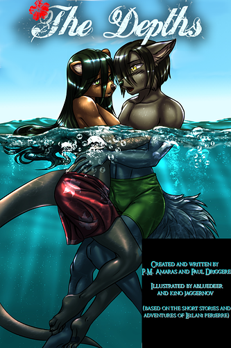
This poster is actually a page from the comic itself, where Leilani has just saved the wolf, David, from drowning on the ocean floor. it's title is "When Their Eyes Met..." and it fully encapsulates, we feel, the love, and unfortunately the deadly dangers, they will experience in the depths below...
But it's not just water. The title also symbolizes feelings and emotions within the depths of souls, threatening at any minute to rise within them and erupt...
Even though it's quite mature and censored, we hope folks will give it a try.
Oooh, nice, I just made a new one for (Semi) Super too~ I make a new one for every new book.
This round is this one:
Okay so here we have Joon and Nova arm wrestling cuz that's the kind of thing Joon would suggest and Nova would agree to do because of pride... She's also winning and he hates that.
We have Marisol (Joon's girlfriend) cheering for Nova because Nova is gonna win and we all know it.
Julia in the background was trying to not get involved but now is very emotionally invested.
And Kamal is off to the side trying to drink tea like the sophisticated man he is... While keeping an eye out to see who wins.
I just want to highlight their personalities when they're not fighting bad guys with this one. Sure they have powers and kick butt, but outside of their powers, they're just goofy people trying to figure it all out.
I'll try to keep it spoiler-free.
top left, Ravenlord the titular character.
middle, reflection in a sword's blade: main characters. Axelott, a swordsman, and Joanette, a mercenary.
bottom right, In the battlefield, Brokenbone Mercenary war banners.
A comic with comedy as one of its genres, why the sad/uncertain faces? Well, it's a note that there's a relationship between humor and depression.

the comic:
Fantasy/Action/Comedy
I dunno, I just wanted to picture all four main characters like a cool superhero team. That is why the viewer looks at them from below, as if asking what is it? is it a bird? or a plane? The heroes themselves stand on the edge of roof (only Diego is floating, showing his power) against the background of the sunset, epically looking into the distance and patroling over the city. Also Diego in the foreground as a leading character. And I also like the color scheme: I am a fan of warm colors and this cover just comforts me day after day.