Hello Everyone!
The wait is almost over! After our recent site overhaul in the beginning of March, we’ve collected your feedback and worked tirelessly to add many of the features that you have requested. Some beloved functionalities will be brought back in order to provide a seamless reading experience for all of you.
Allow me to share a more detailed description of some of my favorite updates with you - a full list of updates can be found at the bottom of this article. These changes will be available to you around Mid May!
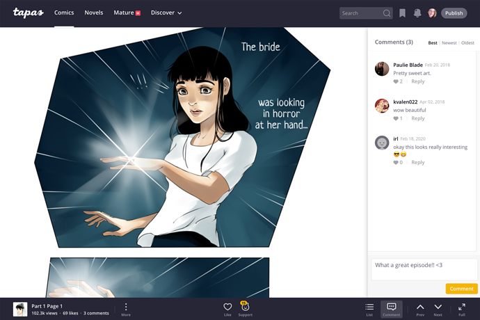
It just keeps on going - Endless scrolling will return!
The most requested feature is going to be back again! You will be able to scroll at your heart’s content, with nothing stopping you! With the endless scroll being back in place, some other changes were made in order to improve the reading experience. Comments will be shown in the Comments list on the right, so you will be able to add a comment at any time while reading an episode instead of having to scroll to the end.
Credit:
The White Queen by Ka-Ren
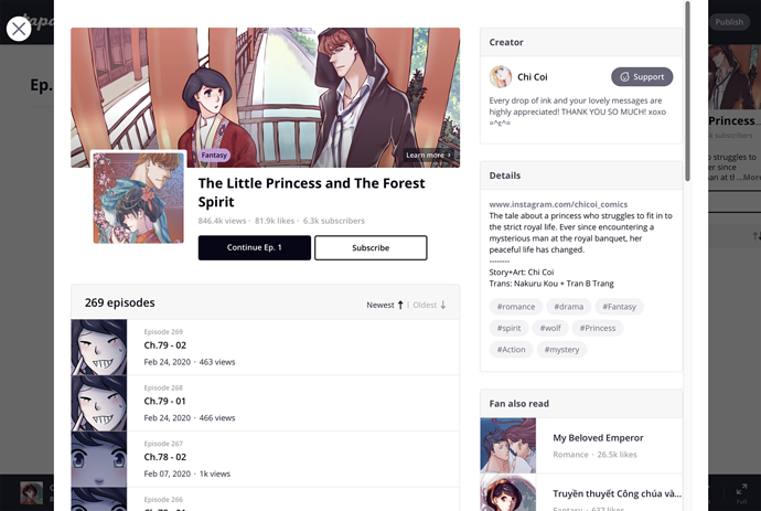
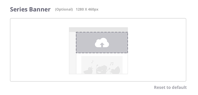
Series Banners will be back and are greater than ever!
That’s right, you read correctly! Often requested and greatly missed, our series banners are making a glorious return! They will be visible in the chapter list while reading, as well as on the series page as pictured below.
Credit:
The Little Princess and The Forest Spirit by Chi Coi
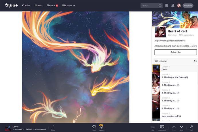
Looking for that classic Tapas feel? The Episode Page has been overhauled!
As mentioned before, the updated Episode Page will now contain the series banner, but not only that - the ‘Subscribe’ button is also impossible to miss! Since you’re going to be able to toggle the Episode list on and off based on your preference, you will be able to enjoy the best of both worlds.
Credit:
Heart of Keol by Keii4ii
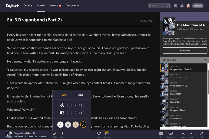
Is it too bright to read? Different reading modes will be available!
A white background can make it difficult to read, so our team added multiple reading modes for you to choose from to the novels section. The options are gray, sephia, dark and white and can be selected in the Style menu located on the toolbar.
Credit:
The Mortician of Avalon by KR Williams
These were just my personal favorites, but there is much more. Please see the list below that includes the most important changes that have been made and will be available soon.
Episode Page Updates
- Episode page navigation has been updated.
Old: Series cover -> Old Episode list page (requires one more click to start reading)
New: Series cover -> New Episode page (begin reading instantly)
This change reduces one step you have to take to get from a series cover or your reading list to the actual episode. From the Episode page, you can toggle on series info to land to series view.
- Episode page design is updated. Bottom toolbar is designed to cater towards both readers and creators.
- Toolbar animation is gone - Toolbar will no longer hide while reading.
- Comment location updated to the right side to allow for comments to be added while reading instead of only at the end of an episode.
- Infinite scroll is back
- Top banner is back (On Content page & Series page)
- Top banner supports links on the Series page again.
- Support banner is back at the end of your episodes.
- Support button is more visible (exists on toolbar, and highly visible on Series page)
- Soundcloud BGM is upgraded with more intuitive design. The music will stop playing once you scroll to the next episode.
- Bigger and more noticeable subscribe button
- Episode tags are back. They’re visible underneath the Creator’s Notes section in each episode.
- Full screen mode has been added. This will take over your screen so you can fully emerge in reading.
- Novels are now supported by different reading modes: Gray, sephia, dark, white.
Series Page updates
COMING SOON!
More updates are already in the works and will be announced when they become available! One of them will certainly be exciting for many of our creators (Hint: One Genre is just not enough).
On behalf of the Tapas Team I would like to thank all of you, creators and readers alike, for your patience and dedication to the site. We’ve received a ton of useful input and I invite you to continue to share constructive feedback for this announcement via this form and on this forum post.
If not all features you were looking for have been mentioned here, don’t fret! We consistently improve our site based on your needs. Our goal is to provide a seamless reading experience at all times, while catering to both readers and creators alike - as you can imagine, that’s quite a balancing act! We’re looking forward to sharing this update with you and can’t wait to hear what you say!
Thank you,
Isabell, AKA Ratique
Creator Happiness Manager