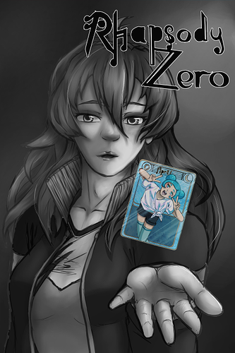
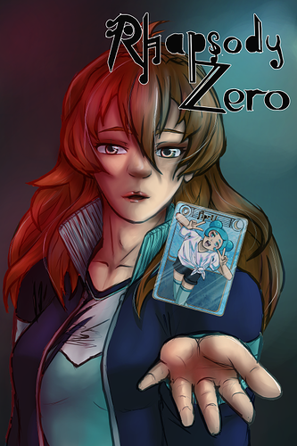
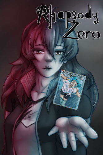
So the title says it all really. I'd love a bit of feedback for a couple of variations on a potential cover. I'm not too interesting in technical art advice like anatomy and style ect. If you wanna drop some art critique feel free, but that's not really what I'm here for. I'm more interested in what works and doesn't for the covers. For instance, I quite like the desaturated ones, but I'm not sure they stand out enough, most of Tapas is colour and I don't want make people think the comic is B&W when it's colour, but I think the title seems to stand out better on the desaturated ones.
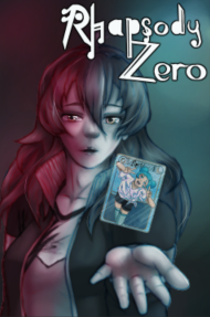
Cover A
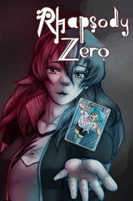
Cover B
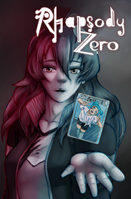
Cover C
So, please let me know your general thoughts and anything from one of multiple that works or doesn't or could be combined (or if you just hate them all together and I think I should scrap it and work on a new idea, I guess) or anything else. And thank you in advance to anyone who gives me their time.
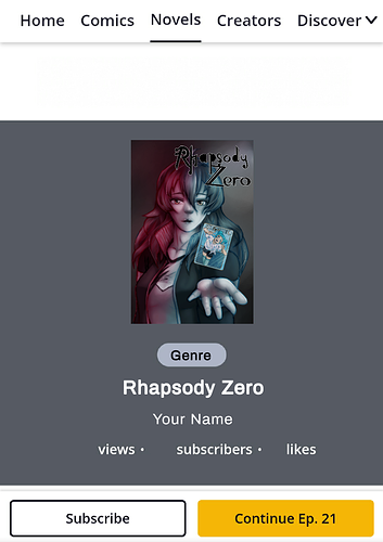
EDIT: A new variant mixed between a few different covers and some feedback has been created.
Cover D