Sakura Fujio here! I'm a shoujo mangaka! (*⌒▽⌒) I draw classic shoujo manga and I'm here to show the cover I made for Chapter One which can be read here https://tapas.io/episode/686493
It looks cute, but a bit sharp and blocky. It's difficult to read the title logo as well. I like the grass and leafy background. Is that a brush or some kind of tool?
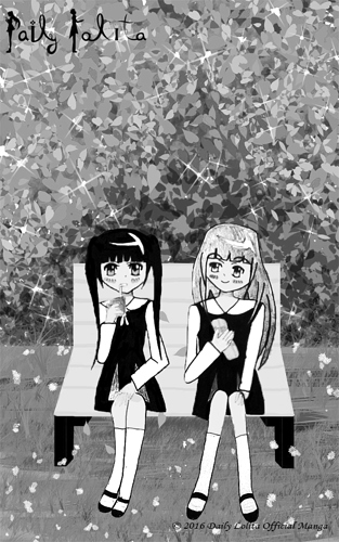
First Image- Good the shade of color usedThe thing I'm worried about perspective of the seat looks. With the second image tooI can tell that your Characters are drawn with pencil and then digital ink. It's not a common style, but I believe it'll be unique style to try. Plus the characters in the second pic are stiff in proportion wise and doesn't match up with the perspective of the bench. Although the characters are cute and I can't wait to see how you draw them in future.What I "recommended" (although you don't have to take my advice)Is try drawing and studying anatomy.This is the website used it as reference https://line-of-action.com/Even this maybe a manga and usually exaggerated art style. Just try to do a 5 minute drawing anatomy body.Here is 2 tutorial by Nsio (which I learned a lot from)Explainingperspective and Distortion in PerspectiveYour Covers in both pictures is a really cute:slight_smile:
It's a cute cover, get's the point across really quick to.