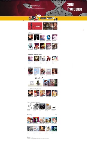
And alot of you are probably thinking, to yourself,
"man, I'm used to this, It showcases a bunch of comics, including the free ones!" but, I think this is quite part of the problem, especially when you compare this layout to webtoons, or the obvious Lezhin influence. The problem here is that Tapas wants to be able to both show the community (free) comics and the premium (paid) ones at the same time, without much foresite on how a new reader will just stay on to top page and only pay attention to the top of the page, this is possibly why people outside the site aren't even aware that free-to-read comics/novels exist on this site! The fact that you even need a community tab is insane to me.
And heres the part where i show you the old layout for comparison:
it's a bit easier to digest, isn't it? Not to mention They're used to be "Spotlights" which where when tapas used to devote an entire front page to one comic (often community comics) which where vastly more useful than a community tab 7 tabs deep into the front page.
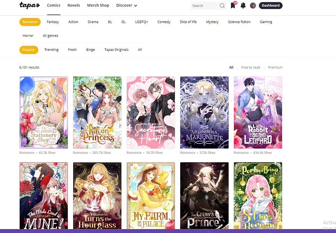
tapas's weird layout has effected the visibility of many comics here, I'll show another example, this time inside the comics tab, in the romance section (this is the automatic tab you see in the modern site)
New tab:

is it on purpose to push paid comics over the free ones? maybe, I understand how hard The staff works, and most of this is the direct result of being brought by company with an insane backlog of romance comics, and the contract prehaps makes tapas promote these comics first and foremost. but there is a clear solution to this, My opinion is that they should just have a "canvas" like tab in the top of the front page, it'll definitely improve user experience on both sides, because as it stands, it's making these free comics practically invisible. and making the front page, far too much to look through. lol