I think I kinda of like that dog
We were talking about the forum logo tho. And there's no doggo on the forum logo. Sadge
Sorry, but hey won't you agree that that dog is cute
Why this change? What do they get out of it?
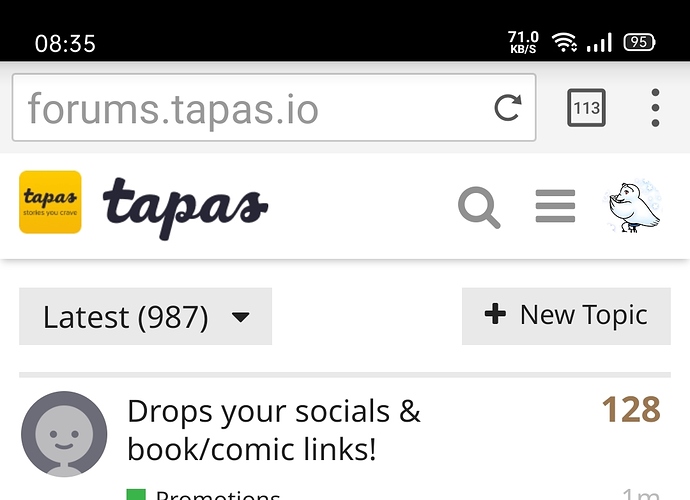
Wow! I actually can't see the logo... I literally just thought it was that yellow icon only!
I wonder if Tapasmon (or whatever their name) was part of the previous company's copyright. Or maybe the new company just prefers the dog.
My theory. People's been pointing out that the forum is being killed slowly, so as to not make the forum users feel inclusive they changed the logo to fit the main site too.
Maybe. I dunno. It's just a theory. The tapas forum theory. ¯_(ツ)_/¯
the new tapas logo sucks. it lacks the fun look the last one had, this just looks lifeless and corporate
I've been here for a short time, I hope the forum doesn't die. I really like this community.
The logo change almost feels karmic!
no worries lolcaps lock letters make your comment better/funnier
It changed? I mean, I kinda was expecting that, but the weird thing is ... I still have the old one appearing for some reason.
EDIT: Just checked on a different browser and yeah... it appears. I literally can't read "Tapas" anymore.
gasp
They changes it again XD
Mods was probably watching this thread hehe.
Just kinda weird to have two logos saying 'tapas' side by side...
i think that last part is whats confusing. when it was the mascot and the company name that made sense vut the double logo branding just feels redundant plus it doesnt stand out as much as before
maybe thats just my own design preference but its just weird
they are overestimating the power of repetition and underestimating the power of iconography
Now I know how dark mode users feel when they accidentally turn on light mode......
they did it again folks
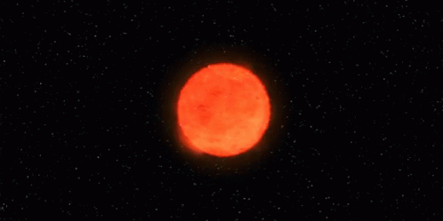
QUICK!!! Everyone run for cover! I think TAPAS Forums are about to go supernova on us all!
ಥ ◡ ಥ ???