So.... random factoid. Your brain works one of two ways. Light to dark, or dark to light. Some, very few, can operate both when painting but MOST of us fall into one or the other.
Kazuki Takahashi mentions this in his "DUEL ART" artbook for YuGiOh that was released. One thing that really changed his coloring and art is going from traditional to digital. (He used to pencil draw sketches, then a copy machine to make duplicates, then ink, then more copy machine tweaks, then would ink that. Very low tech and lots of pages of the same bit of artwork.)

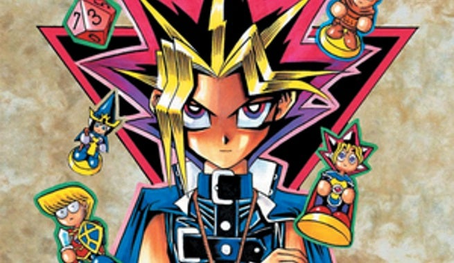
Volume 1, to volume... 12... I think?
To a piece I'm 90% certain was made just for DUEL ART since it wasn't the art style or promo art for that manga volume.
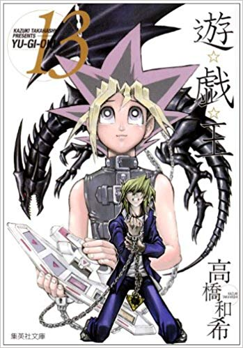
Ignoring the blacks - but look at the skin tone choices for depth of colors. He went from high contrast orange and brown shadows to lighter shadows oddly enough. For that specific last image, it's done to make Yugi (the center in the image) look more washed out so your eye doesn't get drawn to him, and instead focuses on the black dragon and the person kneeling (Jounouchi).  Trick of color washing ftw! His very last image he did (outside of DUEL ART specials) was this, which released on KT's twitter a few days after the ending movie aired in Japan a couple of years ago.
It's another digital piece, as you can see, but notice the color balance between the foreground and background and where your eye leads. Your eye should be drawn to the center by the colors (and lines that are made, but that's another post of mine). You could put this image into grayscale and still see the contrast as what's pulling your focus.
 Just a lil food for thought on improving contrasting. I personally, can't do it while drawing the piece. I habitually like softer gentler colors of shadows like this art here
And while it's cute and I love it, I recognize that the hue for contrast to be a piece that keeps someone's eye (like what a promo poster should do) I just.... can't.... get.... away... This results in my trying to alter stuff later, or having shadows on a different layer so I can manually adjust that darker. Which is partially what happened here with the skin colors.
Just realized I lost my train of thought there. So I work light to dark. I know this based on how I color traditionally. It's really hard for me to get stuff to a flat black, or leave spaces as pure white. KT when switching to digital worked from dark to light, and that's why some of his newer artwork appears colored so much differently. I don't know if you've ever worked with copics, but they're basically the acrylics of the pen ink world- they can be super opaque and basically impossible to make them lighter once that color is down.


:origin()/pre00/fc29/th/pre/i/2017/054/b/f/willypuff_by_watashiveracasan-db052di.png)
/mbe-tree-dark-color-57c736e35f9b5829f4702913.jpg)
