1 / 32
Jun 2019

A thread for sharing what you're working on to get feedback on how comprehensible it is.

ie, share passages from your novel to make sure you're getting across the emotion you think you are, share a comic page to make sure the panels are reading in the right direction, etc. leave your queries below, and respond to others.

go!

  • created

    Jun '19
  • last reply

    Jul '19
  • 31

    replies

  • 2.3k

    views

  • 10

    users

  • 45

    likes

  • 1

    link

i'll start. how do read this spread:

imagine that the red panels are red paper, stuck on over white paper. dont worry abt the comprehensibility of any indiv sketch - i just wanna know what order you read them in. feel free to draw over the image.

two red, then the big panel, then the next two red and then the big panel again, assuming they're two full pages

okay, how about this one? (also, thank you for your feedback!)

also, can i ask - what made you decide to read it in that order? was it the spacing, or the page division, or smth else?

If you need people to read 4 small first, then maybe make equal distances between them (I also read it like two separated pages)

this is what ive had a big issue with - theyre supposed to be equidistant, but bc this is gonna be printed im unsure how much of that space in the middle is gonna go missing into the bind. but... one sec

EDIT:

the reds are now equidistant - hows that?

I would read all four across the top if it was printed. It's only because the space between 2-2 is evident in digital form that it becomes confusing.

Even with the color switch I would read two top, big below and then the next page. I think it indeed has to do with the spacing and how the brain groups objects. It would still be kind of hard to get people to read right because how used we are of reading one page at a time. Maybe you can try separate things by adding a black background behind the small panels.

thank you! i agree. would you say if you saw this without having this conversation prior, youd read the top row first now?

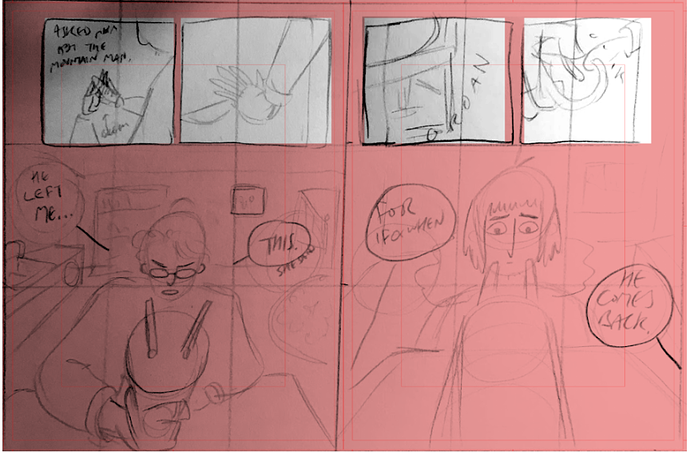
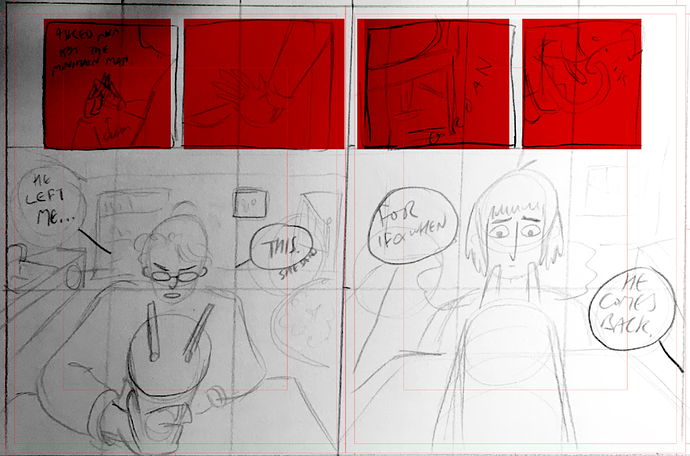
I like the original still. I don't think the flow is particularly challenging, though the black was a nice way to unify thingsvisually. The first of the two alternatives is a good back up, though.

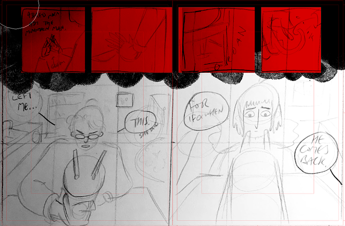
Still. I think given the four panels are centered over all, not centered within each of the two pages, and the printing will eat up the space between panel 2 and 3, it will actually read pretty well in print.

i hope so. thanks so much for your feedback, ill see what a few other ppl think who arent as familiar w comic layouts, in case things are still confusing

I think the alternative is more clear, the one where it’s a profile view of the two people talking at the table. You sort of have to sacrifice the cool foreshortening but at least then it’s clear that it’s a full-page spread and people will read the four panels at the top first. This is coming from someone who RARELY reads full page spreads correctly lol

The one with the four panels on top and the shot of the two characters profiles talking to each other across the table reads the best. I think I actually had a really similar spread in a book that comes out sometime next year!

not replying to add to the convo yet but i like that this is a pretty good parallel to this thread

I like both the first take and the latter one, though I think I would most probably read first the red panels in the one where you show the profiles. If you want to go with the original one, have you thought of blending the edges so there's some kind of union between them so it's clearer for the reader that they are part of a whole?

i think this would cause a different visual confusion problem... though im not sure what you mean?

Oh sorry, I didn't explain myself right. What I was meaning to say is that there needs to be some kind of link between both big panels, maybe if you blurred the line between them they would look less as two separate panels. It's just an idea I don't know if it will look good or not.