
thank you! i agree. would you say if you saw this without having this conversation prior, youd read the top row first now?
@SleepingPoppy @ScreeKeeDee @Noorie
i also have some alternative layouts:

pro: the bottom being one image potentially encourages reading across rather than down
con: dunno if sidelong has as much impact for that moment
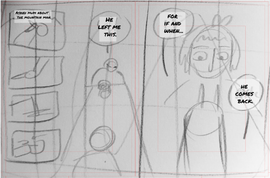
pro: completely removes the sidelong problem, keeps that closeup
con: squashes the first big panel
I like the original still. I don't think the flow is particularly challenging, though the black was a nice way to unify thingsvisually. The first of the two alternatives is a good back up, though.
Still. I think given the four panels are centered over all, not centered within each of the two pages, and the printing will eat up the space between panel 2 and 3, it will actually read pretty well in print.
i hope so. thanks so much for your feedback, ill see what a few other ppl think who arent as familiar w comic layouts, in case things are still confusing
I think the alternative is more clear, the one where it’s a profile view of the two people talking at the table. You sort of have to sacrifice the cool foreshortening but at least then it’s clear that it’s a full-page spread and people will read the four panels at the top first. This is coming from someone who RARELY reads full page spreads correctly lol
The one with the four panels on top and the shot of the two characters profiles talking to each other across the table reads the best. I think I actually had a really similar spread in a book that comes out sometime next year!
I like both the first take and the latter one, though I think I would most probably read first the red panels in the one where you show the profiles. If you want to go with the original one, have you thought of blending the edges so there's some kind of union between them so it's clearer for the reader that they are part of a whole?
Oh sorry, I didn't explain myself right. What I was meaning to say is that there needs to be some kind of link between both big panels, maybe if you blurred the line between them they would look less as two separate panels. It's just an idea I don't know if it will look good or not.
*disclaimer: not trying to advertise just want to find out the legibility of this so please don't flag me
i'm updating my comm sheet and i'm trying to find a proper palette that will grab the eye but also not be an eye sore and i'm absolutely certain this yellow gradient isn't the way to go so i'm wondering what else might work for summer
This is what I have but i could use some suggestions
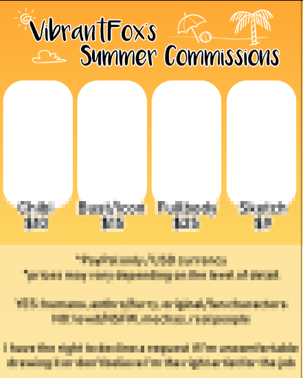
lmao dont worry, nobody will
i spose id have to see it with the commish images in to say if its a good fit? the orange is fine on its own i think, but once those boxes are filled it could be a different story. if it feels too much, try a softer, lighter orange

27 days later

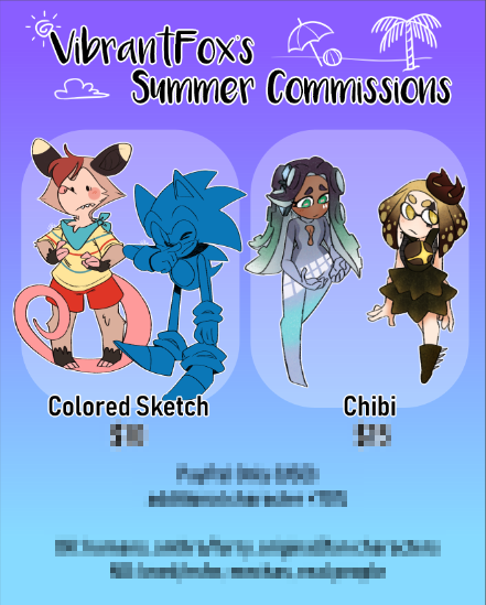

This thread is a very nice idea! I don't think I have much to say on the previous pictures that hasn't been said already.
I've been having a few doubts with a scene progression in my comic, since I don't have many people to read the whole script and see if it works out.
The scene's purpose is to be exposition to fill a LARGE amount of events. There's no better place to put it after a lot of experimentation, and it can't be spread out because it contains information needed soon after.
The framing device is: the character is stressing out, and sees themselves in a reflection. Recalling that they used to retell events to someone else to calm down, they try to remove themselves from the situation by summing up a lot of events in their past that relate to the current problem.
Basically, it goes back well over 10-20 years. They talk about their first major mistake, what they did to fix it, how it got worse, and what happened from there, finishing up saying that they're still trapped in a situation and they feel at a loss. This would be illustrated with various flashback pictures to attempt to sum up the dialogue as best as I can; but meanwhile, another character who isn't listening approaches them, leading into the next scene as the just ignore the person in distress to talk about something else entirely.
What I'm asking is, would this work as a scene, or would it still feel like the plot was pulled into a grinding halt as a ton of things are explained at once? I've rewritten it a bunch to make sure it fits the character and doesn't feel forced, but I'm still unsure about the pacing would feel like.
hmmm... thats an interesting one
how long would it be? what have you given your audience at this point to make them invested in this not-flashback? does this flashback answer any questions youve got your audience asking (ie, have you set up any of the info youre laying down?) does this technique of retelling to calm down come up later in the plot?
i think really you need to draft it out and see. do you have proofreaders at all?
No proofreaders. I've asked friends to check it out but it's the usual response of 'looks fine and the dialogue works' which doesn't quite translate to a good page progression in the comic. I reread it to shave off any unnecessary lines and making it sound natural every few weeks to see it with a fresh set of eyes.
It's looking around 10 pages, more or less depending on how the pages will go. It's halfway through chapter 1, after introducing most of the cast and after the prologue, which clearly estabilished the character in the past in stark contrast to how they are now; once feeling like they'd finally done something amazing, but now feeling unwanted by everyone.
I hope it'll answer the time gap between the prologue and the first chapter and set up that this is a "story after a story" so to say, showing some snippets of an adventure that everyone's seen a thousand times before that happened in the past. Good versus evil in a fantasy world, good won, but no one made any attempt to clean up the underlying issues and people aren't happy with their current situation. I didn't want to linger too long on the "fake" start as people would think it was indeed a generic story, so the prologue goes from a confrontation between the two sides directly into the current events.
It does come up again, but a few chapters later and not in the same scale. With the character already estabilished to ramble on their own, it just comes up every now and then that they get stuck in the past.