
Now i can't unsee that xD
That's supposto be thick moss xD
Anyhow, next stop, group of trees ^^
Shatterjure, depends on your characters I suppose. In my opinion characters will always take the focus away from the background. Looks good enough to me.
Here's a page from my webcomic: Planet Thundersnow 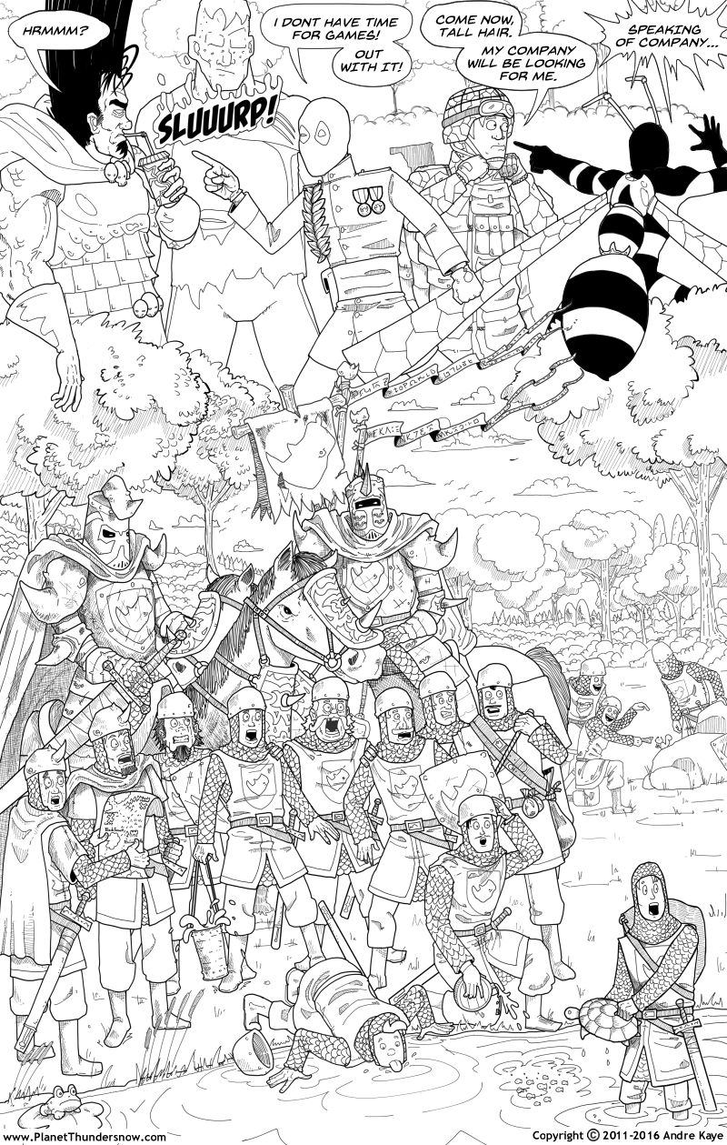 4
4
Trying to generate interest, but it's just not happening. I think I should have uploaded a page a day instead of all at once. Perhaps I'll re-upload the pages as I color them.
Anyway, let me know what you think!
Heyo! I'm new here and eager to start doing stuff. I saw this topic earlier and thought it was a perfect chance to ask people what they think of this current style

This took me an hour or so, I'm still learning/nervous >.<
One other thing, just in case someone is confused; Those red things are NOT blood drops or scars or cuts, its a rash 
Just thought I'd clear that up 
Anyway I'm really happy and excited to finally be here. I'm looking forward to any helpful hints people may give me 
Ok, well, one piece of advice i could give you, is move the head a bit forward, because now the neck is kind of coming from the chin, even tho its a side view.
And another piece of advice would be this: At least TRY to shade a bit, it will add so much more depth to the drawing.
I guess that's all.
Hi, I'm new here. I'm currently working on a comic called Shadows tell stories: Witches.
https://tapastic.com/episode/4400201
Do you think this art style can work?
I'm using Medibangpaint pro, which is also free. I looove it as it has cloud storage and autosave among other things  And thanks for the advice!
Could I perhaps get some technical advice? I'm unsure about my font, its size, and the coloured borders of the speech bubbles. 😣
I'm still working on the art style, but I think I'm experienced enough to be able to experiment myself (over 12 years). c:
I'm working on the series banner for an upcoming comic of mine; could someone please tell me if it is legible?
Thanks!

Your logo is a bit difficult for me to read. Overgrower?
I like the idea and the colours of the leaves and flowers are looking great. You've put in some fantastic little details in the branches and twigs and it's looking super cute. Unfortunately, logos will often be shrunk down to fit business cards or link banners and these details can either disappear or become clutter. 
One option for you could be to use pre-existing font as a guide. This will keep your design level and the letters even in size so you can focus on arranging the plants in creative ways while the font acts as a sketch underneath. Then you can delete the font afterwards to reveal your clearer design. (Make sure to not follow the font like a cookie-cutter of course.)
Or, if you prefer to keep it more organic (pun intended), just keep the plants closer to each letter. When the leaves and flowers get too close to one another, my eyes get confused. (Especially around the OW. The leaves make me think it's an AW... and I'm not certain it's an ER I'm seeing at the end.)
Overall, it looks very cute and I'm liking the sweet and gentle atmosphere of your logo so far. Hopefully that helps! 

Hey guys! I'm sketching up this panel and I'm not sure if the perspective is working. Or if it's working in general. I need some fresh eyes on this sucker. What do you think?
Hi. I'm working on a manga at the moment called Devil's Day1. Its just in the beginning phase and it's an action, shonen manga. I'm just looking for some feedback on whether it looks enough like a manga you would read in Jump. My inspiration for the art is Boku no Hero Academia.
Heres the before. It looks a little more sketchy and has more pen strokes for the shading. 
And here is my latest page. I made the shading a little more manga like and it's a little bit smoother. I'm wondering if i should stick to my previous style or the new one. Do you think it looks mangalike and somewhat professional. Also am I using too much tone ? Please let me know your thoughts ^^

bwomp how does this banner look so far??? im looking now and theres parts i should tweak but it looks charming
So I'd really like an opinion on coloring styles, for a particular character. See, the background for my comics, are made with a particular sharp, almost crude, design. See here:
Now, do the characters contrast a bit too much with their surrounding environment? I don't want to venture into digital painting territory just yet. Uncanny valley isn't a destination I can hop over. So I hope to keep the characters this kind of line/style but the wolf to me looks a little flat. Therefore, I hope I can get an opinion on which looks better:
Left or right? Personally, the right looks a little too sketchy/unfinished for my taste but the left still rather flat. Any thoughts on how to reach a midpoint?
I think both look great, but I personally think that the second one looks more like a professional manga that could be in Shonen Jump. To be honest, if I didn't know better I would have thought it WAS a page from Shonen Jump!
Also, I love the amount of tone you're using. It's darker than some manga I've seen, but that's not a bad thing. I think you should leave it the way it is.


