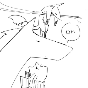
192 / 238
Jan 2017

That's a good change, changing the shadow to blue - that's how most things are in real life.

You're in the right direction

Should the characters have mouths or no mouths?
The original idea was that their expressionlessness would add a strange touch to the comedy, but I'm starting to doubt myself.


I prefer the first one [it reminds me of some children books by the way] the atmosphere seems eerie, I like it ! ^ ^)b

I published today the first episode of my new series Dark&Lya and Fluff Division, is the pace good? I've already gotten feedback from a friend and it was positive :3 (not asking for advice on art, I'm currently training lining, so it's gonna get better, I'll ask for this in a few days/weeks :3)

There have been some ideas inside my head recently, but i'm still not sure how to execute it. Some stuffs also coming up so maybe i wont be doing these anytime soon. So everything i'd done was just some sketches. Would like to hear some input though.

1

2

2

1

@Ra_tifuu
The characters look nice, though the anatomy could use some work. Example, the girls head in the first panel is a bit too big for the body. The layout is a bit messy because I dont know which panel is the next one.
If you want it to look less amatuer-ish add some background and interesting perspective. Also, the lighting can help with the emotional depth.
Eg

1

I really hope you continue your comic and develop your characters thoroughly. Please dont break this heart of mine by making a cliche shoujo ai blush

Looking forward to see your comic on tapastic

Thank you
Yep it was just spur of the moment sketch, never thought of making panels and stuffs and i wasnt really thinking of a story lol. Before i knew it, i continued making the second page but then i'm lost. It's right to left btw
I usually play with tone, like on my previous manga panel practices. (http://sta.sh/21dref51zqe9)
But yeah tone or color, either need good skill to bring out the atmosphere.
Totally, anatomy is the first thing i should really fix. Thank you for the input.
It really helps smile

1 month later

I'm unsure, about my backgrounds. First I drew the lines with the same tone as the characters. Because I feared, the characters get lost I made the lines more dull. But now I'm unsure, that might be too much. So I need some oppinions on this :/

Background version 1

Background version 2

Because I'm improving and still have a lot to learn, I'm glad about any tips or constructive critique ^^ So if someone is realy bored and want to help me improve:
Here's the rest of my comic.

I like the second version as the contour lines on your background objects are much thinner and suggest distance. Everything is quite bold in the first. In the first background it's hard to tell which objects are important.

10 days later

I just recently created a new ad page for the Mallory Bash comic, and season two will feature color where season one did not (until the very, very end of the last comic). I'm asking about two things with this:

  1. How does the color look, stylistically? This will be very similar to the color in the comic.

  2. How is the ad page overall? Is it "too much" to look at all at once, or does the composition look quirky and fun?

1

Hi :slight_smile: newbie web artist here! Could anyone give me some feedback about my script/artwork in my series DOODLE SOUP? I released this webcomic recently (last week), but haven't been gaining many subscribers.. does anyone know if there's something I am doing wrong in my work? :open_mouth:

PS. I am going to continue to improve my comic, but would like to know if there are any ways to promote it better (I joined tumblr, but somehow I can't search for my own posts??).

Actually anyone more digital-coloring inclined got a hot minute? I've been trying something new with my colors from this bit onwards and I'm still not sure what I think of it; I dont have much formal training in working with digital painting programs, so what's come out of it is basically a weird workaround of photoshop, paint tool SAI, my tablet and graphic design techniques. Multiply layers over flat colors for shading, all that. I'm still not sure what I think about it and would take anyone's input or assistance as a huge help.

3

I may be talking nonsense but it seems like the traditional page has a little more texture to the pen strokes unlike the digital and it may be a weird but you may have too much detail on the digital page. It will work if you did it on the traditional side because the lines wouldn't be very simpler in sizes because of the digital brushes. Hope it helps!