
I'm not a specialist, but I also like the first version more. It might be a challange though but it sure makes it unique.
I like the second version as the contour lines on your background objects are much thinner and suggest distance. Everything is quite bold in the first. In the first background it's hard to tell which objects are important.
10 days later
I just recently created a new ad page for the Mallory Bash comic, and season two will feature color where season one did not (until the very, very end of the last comic). I'm asking about two things with this:
How does the color look, stylistically? This will be very similar to the color in the comic.
How is the ad page overall? Is it "too much" to look at all at once, or does the composition look quirky and fun?
 1
1
Hi  newbie web artist here! Could anyone give me some feedback about my script/artwork in my series DOODLE SOUP? I released this webcomic recently (last week), but haven't been gaining many subscribers.. does anyone know if there's something I am doing wrong in my work?
PS. I am going to continue to improve my comic, but would like to know if there are any ways to promote it better (I joined tumblr, but somehow I can't search for my own posts??).
 4
4
I tested clip paint studio and here it is.
Actually anyone more digital-coloring inclined got a hot minute? I've been trying something new with my colors from this bit onwards and I'm still not sure what I think of it; I dont have much formal training in working with digital painting programs, so what's come out of it is basically a weird workaround of photoshop, paint tool SAI, my tablet and graphic design techniques. Multiply layers over flat colors for shading, all that. I'm still not sure what I think about it and would take anyone's input or assistance as a huge help.
 3
3Hello I was wondering if anyone would mind please looking at my illustrations. To see how well they are made. I don't mean to promote... but reviewing art kinda the point of this thread.
Sorry @Zannen00 This was meant as a general post but this is my first time posting. So i replied to you by accident.
I may be talking nonsense but it seems like the traditional page has a little more texture to the pen strokes unlike the digital and it may be a weird but you may have too much detail on the digital page. It will work if you did it on the traditional side because the lines wouldn't be very simpler in sizes because of the digital brushes. Hope it helps!
I was wondering. I'm quite new to creating comics and I've been experimenting with different styles and was just wondering if this comic's tones are a little overkill? https://tapastic.com/series/Were-Family-fter-all3
Anyone got any helpful advice?
Improvement? Also... the clouds look like clouds?
Old: 1
1
New:
And someone can help me in how to paint a city? >.<
18 days later
Do you think this looks fine? i mean i know its not perfect ( i draw with paper then i have to upload the drawing, then i have to paint it) it looks kinda blurry , but also i think it looks quite unique in a way, i like it somehow, the whole idea of the comic is about freedom, fights, rebels, i mean the "graffiti " kinda represents all that in a way...
I cant upload images for some reason (it says:"there was an error uploading that file, try again" every time i try), this is my comic https://tapastic.com/series/A-Crimson-Star1. i'm new in tapastic and it's my first comic.
I'd like to know what you guys think of the website for my comic Oliver And Trouble! They have just received their US Trademark and we're working on a short animated film that will be completed this summer. Give me a shout and let me know your thoughts.
10 days later
I like the site a lot, there's an excellent use of animation.
The only thing I notice is that some of the text doesn't have enough contrast to really pop against some of the background image / animations. Some of those backgrounds just have too many colors for you to be able to find one color that will contrast well with everything.
One solution would be to add a semi-transparent background behind the text, so that you could mute the background colors a bit without totally hiding the visuals/animations.
I like your strong use of color. Very nice and unique. I also like the atmosphere. I thought of one thing. It seems a little stretched out horizontally. I don't know why, but to me it looks a little bit stretched out. Very nice idea for a comic. Keep it up.
1 month later
Well I can't seem to post pictures on forums, but can someone tell me how the thumbnail of my comic Axis4 looks like? This is the fifth one I've gone through haha . . .
4 months later

Defiantly one of the better pages; full web comic here: https://tapas.io/series/Vandibus2
13 days later
I've never really that great at layout, but I've been looking for ways to make backgrounds moody or atmoshperic, while at the same time, find a way to churn them out as fast as possible.
I have two versions of the background at the moment. I'm kind of leaning towards favouring the second one.
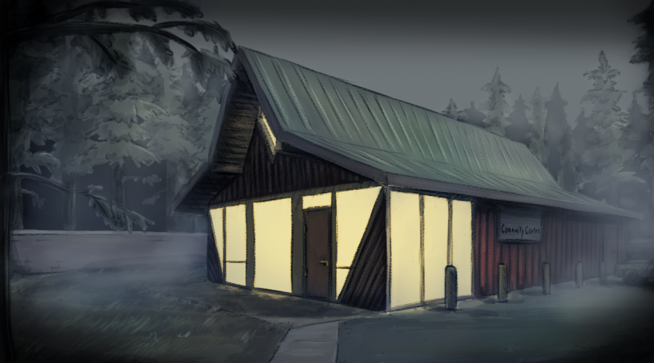

The problem is, this took way too long to do, and that was with me half-assing the layout. Granted, I was kind of learning as I was going. But still I'm not sure how much faster I'll get once I improve.
What I'm considering doing is making most scenes in Sketchup, and using them as a basis for my layouts.