Improvement? Also... the clouds look like clouds?
Old: 1
1
New:
And someone can help me in how to paint a city? >.<
Improvement? Also... the clouds look like clouds?
Old:1
New:
And someone can help me in how to paint a city? >.<
Do you think this looks fine? i mean i know its not perfect ( i draw with paper then i have to upload the drawing, then i have to paint it) it looks kinda blurry , but also i think it looks quite unique in a way, i like it somehow, the whole idea of the comic is about freedom, fights, rebels, i mean the "graffiti " kinda represents all that in a way...
I cant upload images for some reason (it says:"there was an error uploading that file, try again" every time i try), this is my comic https://tapastic.com/series/A-Crimson-Star1. i'm new in tapastic and it's my first comic.
I'd like to know what you guys think of the website for my comic Oliver And Trouble! They have just received their US Trademark and we're working on a short animated film that will be completed this summer. Give me a shout and let me know your thoughts.
I like the site a lot, there's an excellent use of animation.
The only thing I notice is that some of the text doesn't have enough contrast to really pop against some of the background image / animations. Some of those backgrounds just have too many colors for you to be able to find one color that will contrast well with everything.
One solution would be to add a semi-transparent background behind the text, so that you could mute the background colors a bit without totally hiding the visuals/animations.
I like your strong use of color. Very nice and unique. I also like the atmosphere. I thought of one thing. It seems a little stretched out horizontally. I don't know why, but to me it looks a little bit stretched out. Very nice idea for a comic. Keep it up.
Well I can't seem to post pictures on forums, but can someone tell me how the thumbnail of my comic Axis4 looks like? This is the fifth one I've gone through haha . . .
Defiantly one of the better pages; full web comic here: https://tapas.io/series/Vandibus2
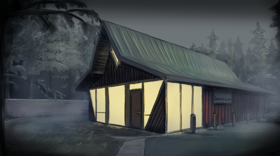
I've never really that great at layout, but I've been looking for ways to make backgrounds moody or atmoshperic, while at the same time, find a way to churn them out as fast as possible.
I have two versions of the background at the moment. I'm kind of leaning towards favouring the second one.
The problem is, this took way too long to do, and that was with me half-assing the layout. Granted, I was kind of learning as I was going. But still I'm not sure how much faster I'll get once I improve.
What I'm considering doing is making most scenes in Sketchup, and using them as a basis for my layouts.
I like the top version cuz I like seeing all the detail you put into it but I like the bottom versions atmosphere a lot more ;oo!
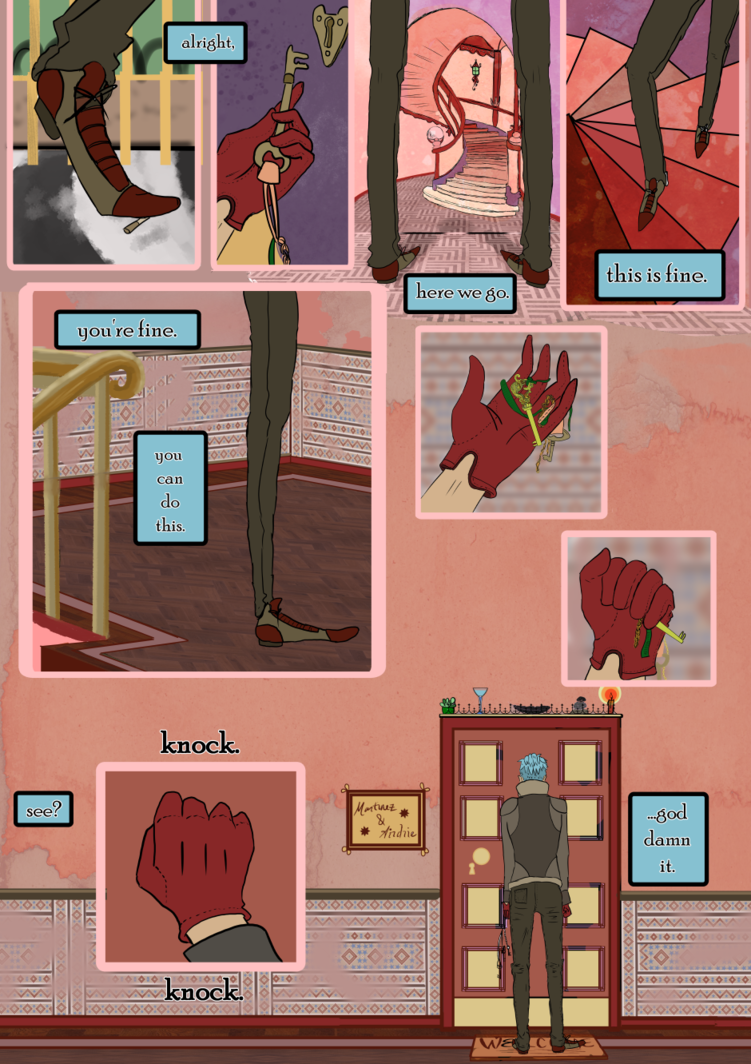
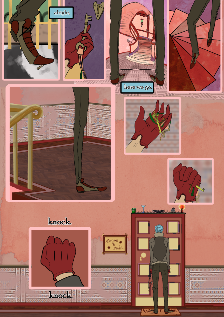
Hi friends! I am in need of some feedback for a page I'm working on, and I could really use your help!
I can't decide which text version is more effective. The character is on his way to meet someone who might have vital information, but he is reluctant to see them (even though he's sure it's necessary). I don't know if the "silent" page conveys that well enough, but on the other hand I'm worried that the added text takes away from the tension of the moment because of the humor.
version A
version B
advice for the first two images:
start with a light sketch and then add more shadows (good technique when paining in B & W), and when there is too much shadow add more white there. because currently it looks muddy and i'm not really sure what it's supposed to be.
advice for the 3rd image:
i'm not sure what you are asking and are the lines meant to be streets or where you want to place the buildings. I do like the design you created looks very beautiful and interesting to look at.
before you design a character you need ask yourself:
also from these 4 questions you can derive more that help guide when character designing. right now it is very vague what the armor is for, but maybe i'm just late to the party, but with the questions above you can ask yourself.
hope i could help, great drawing by the way 
pretty much the same thing @leonardeojr said.
but if you are lazy like me and just hate having to draw proportions for complex, dynamic poses. you should get clip studio it offers 3d models that to be honest can save lives. (it sure as hell saved mine)
if you really don't want to have to create the same environment from different angles every time, i advice you create a 3d model (colored and as detailed as you can). it pretty much would take you a day or two to make, which is just as much time as it would take for you to redraw an un-half-assed background. it is wort it and all you need to do (if done well) is to add fog to your renders out image. (that's what most people do).
but really your background doesn't look half assed, i normally just stop at sketching and leave the rest to fairies to finish. or do a 3d model.
start a comic!!! clip studio has its program now available on apple iPad by the way. so yup you can now make a comic. your style isn't bad, but it isn't good, it's currently in limbo, it's not accurate enough to be bad or good. so start a comic, it is a great way to improve your skill as it...
1. motivates you to draw everyday
2. allows you create something that is yours and entertaining to others
3. and it could be great to look back to see how far you have improved. and laugh.
(i won't sugar coat it, there would be sometimes where you get frustrated with your art and comic and go on hiatus for a year or more, but you just pick up that pen and keep drawing)
goodluck.