
I just got a 2nd hand tablet not long ago ... and that leaves me thinking "Should I stick to vector or not?"


And also any tips and suggestions are welcomed!! 
I just got a 2nd hand tablet not long ago ... and that leaves me thinking "Should I stick to vector or not?"
And also any tips and suggestions are welcomed!!
I can't really decide on how to Draw Tronald Dump. Sometimes I make his face very fat and squishy and other times it's very taut and rigid. Also I think I draw his hair differently every time... what do you guys think?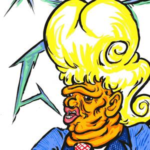


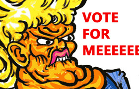
I feel like I should settle on one style, but I'm not sure which to settle on.
I am guessing the lower pic of "random stuffs" is vector based. It looked more clean and the shapes are simple to catch. While the two above looked kinda sketchy. Since you mentioned that you just got a tablet not long ago, I am assuming you still need some time getting used to it. =) I do have the same question as well myself. But to pick one of the 3 picture displayed, I would prefer the art in "Random Stuffs", because the lines are smooth and not to say it has distinctive colors. Hope this helps.
Actually "random stuffs" is fully vector ... as in the whole page is vector.
Hmm ...I get what you're saying ... I guess than I'll have to improve on my stability (of my hands) or continue with vector ...
Thx for helping 
First of all, props to OP for making this topic, it's really cool of you.
Second of all, my comic isn't up yet but I'm planning on next Monday or Sunday to get it up. However I've moved from LINE Webtoon (because I found out that cursing is allowed ayy lmao) so I'm unfamiliar with the format so there's a chance it'll take until Tuesday, but I'm very adamant on making the style synonymous with the genre of the content, as not having a set style is kind of my strength so I gotta use it? You feel me? No? Anyway.
I'll put the picture first and the genre afterwards.
Before
After
Okay I know this looks a little fanservice-y but that's not what it's about and this is LITERALLY the "worst" it gets. Anyway, the genre is romance with lots of action, there's a lot of cussing, humor, and innuendos, and it's aimed at a 17 and above female audience but anyone that can see past the naughtiness or appreciates that kind of humor can appreciate it.
As long as no one feels the art I posted isn't alarmingly out of place with the genre it's fine.
personally, I prefer the first one. They both look nice, but there's something very appealing about the simplicity of the pink + white combo.
damn it xD i literally spent like four hours drawing the rest of it in the second style.
But I'm very thankful for the feedback; the truth is I'm gonna HAVE to have color in it anyway so it was unavoidable but I'll definitely keep that in mind for chapters where there may be a flashback/silly scenes in which I don't require color at all and I can just pull that off. Thank you!
you're welcome! Like I said, they both look good, so don't sweat it. If I had only seen the colored one, I wouldn't have thought "dang, I wish this were in only pink and white..." the colored one is cute too!
Heyy so I'm looking for some feedback concerning paneling and moments. I don't know how to explain it, so here's my thumbnailing snippet. Sorry it's kind of messy >.< that's what thumbnails are for, though, right?
here's the scene: The girl pictured (Max) has decided to stay awake all night outside her house guest's door to make sure he doesn't do anything bad (e.g. run away, steal things, dress up as a vigilante and gallivant through the night, etc). Of course, she falls asleep in the chair. I can't decide between situation A: we see her falling asleep over the course of 3 panels (and then the page ends) and situation B: page 1 ends with her vigilant watch and then on page 2 we see that in fact, she fell asleep.
I want to decide while I'm still in the thumbnailing process to save time later ^.^' what do you think is more effective?
you're very welcome u w u
regarding your styles, I like the second one! It pops a lot more, and though the first one is more distinctive, it could also make reading the comic a lot harder, because the ink is so bright and vibrant, it might be a little hard on the eyes, and hard to register what's happening in scenes. There's a lot more depth to the second one, which is important if you're going to be drawing backgrounds in your comic behind your characters.
Also, I'd suggest making the text lines a little thicker; in both cases they clash with the colors and they aren't thick enough to read easily.
Either way, whichever one you choose, pick the one you like and works for you! The second one is nicer IMO but it will also require a lot more upkeep and time compared to the first one. Good luck! <3
Thank you so much for the precise review! I'm happy to say I tackled the problems mentioned (thicker text and trying to balance the colors), here's the result: Absolute Purgatory2
I'll definitely remember the advice given in future episodes. Thanks again! ♡
*raises hand*
Hello! I'm the creator of a webcomic that's called Kurumi's After Hours. I got a drawing tablet yesterday after months of working with my mouse and paths in Photoshop, and as a result, I'm planning to shift my gag strip series to a long-form comic. So, uh, well, here's my least crappy product from my first test runs of my tablet earlier tonight. I do hope I didn't completely screw it up.
Also, I guess I should start looking for a graphics application that has pressure sensitivity and squiggle correction. In any case, any advice is highly appreciated!

Personally, I would recommend MediBang Paint Pro, it's a free program that has both those things as well as clipping and grids for drawing circles, straight lines, squares, perspective and curves. Also, if you create a free account with them you can save your work to a cloud. (I don't have much history with clouds so I don't know if it's the cloud, a cloud or their cloud sorry)
p.s- Your drawing looks super cool! 
Helloooo I'm making yet another comic just because I can and I kinda can't stop making new ones but I'm debating whether to go with the typical boxes or leave them out for a bit softer feel. Comic is romance so in a way no borders would be nice but the comic will be going through some hard topics so the boxes would give the rough kind of feeling to it. Please help by giving your opinion \;0;/
So this is my first comic, and it's kinda cringey but not as cringey as the first time I drew it. 

Should I keep using this style or this one:
I tried Medibang Paint Pro as @YoungAdventurer recommended more than a month ago. I really liked it, and I hope I got gud since. Same OC, btw.
Any advice, of course, is highly appreciated.

Hi there! I just uploaded my first comic on here. My boyfriend mentioned he wasnt a fan of the linework I used but can you guys give me some feedback too? I wanted to go for a more childrensbook-ish feel to it but maybe it is too sketchy looking? What do you think? My comic is here: Rin 'n Pip1
Or you can take a look at this!

