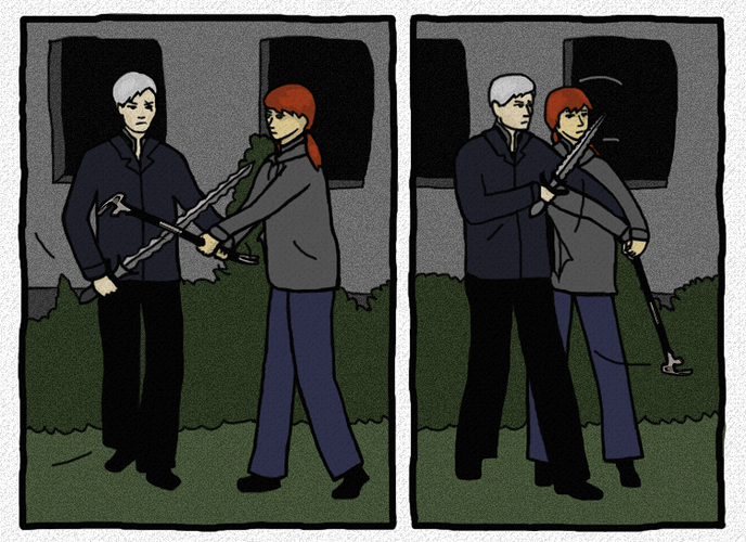
The panel layout.
Back when I did my creative writing coursework I used to do a LOT of fancy footwork with paneling. Funny-shaped panels to mimic the mood, inserts within panels, whatever. I got fantastic grades and positive feedback from my classmates in workshops, but I honestly hated it. It took so long to figure out, and it was my least favourite part of the entire comic - even more tedious than drawing the same background elements! Because you have to sit over it for so long to make sure that there's a clear visual direction and that the readers can figure out what's going on. So I said, if I do my own comic outside of the classroom, I will do it in the style of storyboards. Originally I only had one panel shape, but I've diversified it... slightly. But they are still all regular shapes, no overlap, no inserts, 3-6 panels per page.
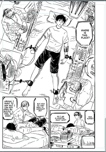
So I'm now I'm 10 pages into drawing it and I realized that hm, you know what? There's a good reason for all those fancy panels ^^; If you use the same panel size for everything, it's harder to draw importance to actions or scenes. It also makes your story WAY longer, like a good 20% longer when it comes to page count, because you can't "double-up" on real estate. I'm not changing it for the next 40 pages (would be 30... if I didn't insist on this layout...) though, because that all tells one cohesive story and I want to maintain visual consistency. Once that arc is over, I will consider fancying up the layout... slightly.
I honestly still just want to stick to storyboard-like appearance. It's just so much easier. But I MIGHT use some inset panels.