I'm makin' a new comic with a new artist alongside my other comic, That Stick Figure Isekai.

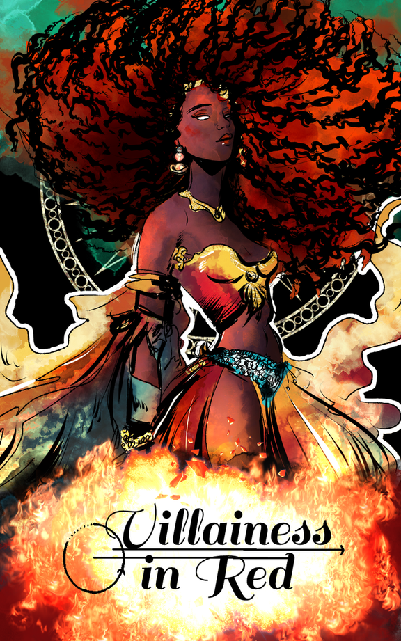
It's called "Villainess in Red". It's about a celestial being (called the Red Giantess) competing with her twin sister as the two attempt to indoctrinate the universe in their respective religions. Along the way, other beings begin showing up to challenge their authority.

We're going for something elegant? Especially since the Red Giantess tries to make herself out to be graceful despite being the biggest idiot in the universe. She has to resort using cheap tactics to reach the top i.e. using her looks to seduce beings and all that.

But yeah, what do you guys think of the logo? What should we change and how can we make it more interesting to suit our plot?

  • created

    Nov '23
  • last reply

    Nov '23
  • 1

    reply

  • 488

    views

  • 1

    user

  • 1

    like

The logo looks nice, but I think it may use some refinery? Like the circle here is not 100% round, the arrow point could be more long and elegant and of course, right now the arrows itself have this uneven glitch...but I suppose it's just a sketch for now. The bottom one also clashes with the letters in a weird way. If you decided on this font, maybe make some parts of the logo more bold to suit it.
You can also try and use this patterned circle behind her on the cover to make a more interesting circle and maybe it will look more unique as it seems related to character.
The whole cover feels a bit art nouveau, so maybe get some inspo there?