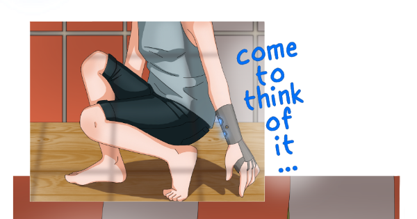
Thanks! I’m actually quite aware of that general rule of thumb, but I struggle with spacing with just 940 pixels in width to work with, so sometimes it’s a tad bit more cramped. (Not to mention that I just really enjoy using space, I don’t mind when other artists have lots of space but when I do it, it doesn’t feel quite right)
Also it’s a little tricky to get the line thickness the same as the text, since I made a font of my handwriting and it’s always a little different.
But I’ll definitely keep all that in mind, thank you so much!