** frantically searches for comic pages I've done that actually look good **
Hm, a lot of good points have been made already...maybe I can say something more general...
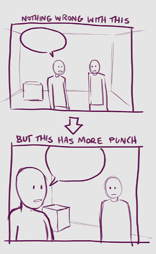
Doki's Golden Rule: It doesn't hurt to break the rules
If you're saying to yourself, "my comic pages look so bland and uninspired compared to other people's...what can I do to make them better??"
One general strategy I've found over the years is to take at least one routine you use when doing art, and let it go.
Excessive rule-following will kill your art-- at the very least, it'll box you in, and make sure you're always doing the same things (and always making the same mistakes...). It will prevent you from seizing opportunities to make your art look fantastic when they come up, because you will have trained yourself to ignore them.
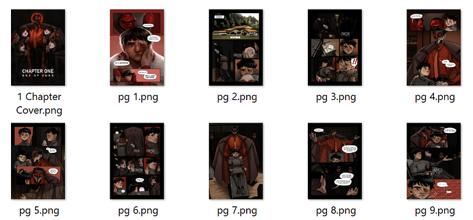
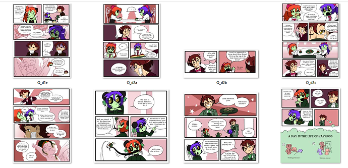
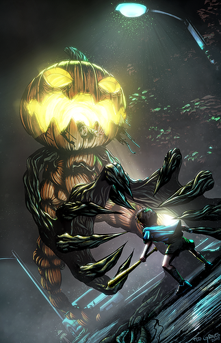
Exhibit A, from DotPQ's first season:
...Passable work, but could be better.
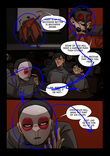
Two panels stand out to me, in terms of immediate visual appeal: the third panel in the top left page (Q_d1e) and the third panel in the page below that one. If the whole comic looked like those, I could've been a lot prouder of it, I think. ^^ And I knew those panels looked particularly good when I drew them.
But I ignored what they had, because they broke the 'rules': Rule 1, minimal shading on characters; Rule 2, no gradients in backgrounds; Rule 3, as few colors as possible in backgrounds...rules followed by most of the panels, as you can see.
These rules were designed to make the comic easy and quick to produce, but I think they actually did the opposite, because they played so hard against my strengths, it was a struggle to get the panels to look even this decent. I spent hours obsessing over them in an effort to make the rules work, instead of just making the art work.
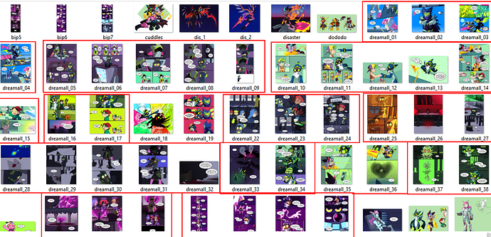
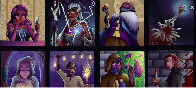
And now Exhibit B, from the 2nd season:
There are really too many changes to list; everyone's bound to improve in 3 years. But I hope you'll at least notice that I've done away with the old rules, including one rule in particular that I think held my work back a lot: the limited color palette.
I LOVE colors. ^^ But until recently, I never let myself explore and play with them (thanks to the Rules), so I never thought I could be particularly good at using them.
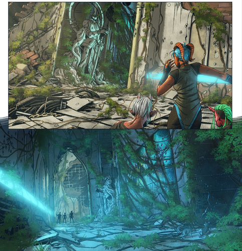
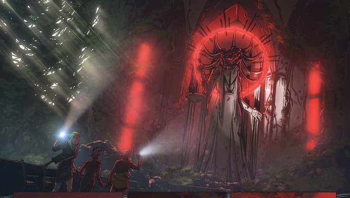
But lo and behold, Exhibit C (a fancomic):
Really, this is just the beginning of my journey in learning to truly emphasize color in my comic work. But it's already a big step up from what I was doing before-- in this case, you can even separate most of the story beats by color, as shown by the red lines.
But what's best about this new style is that it's flexible: if I do something well in a certain panel, I don't ignore it; I learn from it. If it doesn't work in a different context, I change it-- even if that means making some kind of change in every single panel. My main goal isn't to follow rules anymore; it's to play to my strengths and make the art look fantastic...because if you do that, you'll naturally end up with an appealing comic. Maybe it won't be perfect, but it will at least be filled with things that make you proud.
And this can take a lot of different forms depending on the artist: maybe you force yourself to use too many colors, and breaking that rule will entail limiting your palette to something that's easier to work with. Maybe you force a ton of character expression into every panel, and breaking that rule will entail letting some panels be subtle, to introduce balance and a sense of gravity.
Maybe you focus on constructing backgrounds when your true strength is in characters and dialogue, or maybe you focus on faces when your true strength is in using the setting to evoke emotions...only you can determine the rule you need to break.
The point is, you probably have a lot more skill and talent than you realize...you just need to give yourself a chance to actually use it. ^^;