Some critique.
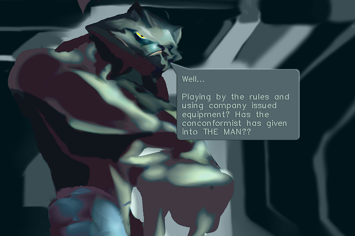
1. I find the font and bubble style somewhat inconsistent with the style of the art in comics itself. So I've made some suggestions about a bit different bubble style and different fonts options and illustrated them.
Summary
First of all, I've applied the Bevel/Emboss to the bubble ( not sure, how exactly this photoshop tool is named in english version ) to make it edges look more organic - at least, in my opinion. Then experimented with fonts, trying to pick these ones, which would fit art style, for example:
- Lithos pro font
- SWSimp font
- SWTxt font
If you like some of them and will decide to seriously using these fonts in your work, I'd suggest to check terms of using these fonts in creative works attentively. It would be inconvenient to redo all letterings if it will suddenly appear that you've violated terms. I haven't checked them, they are just some random non-standard fonts, likely appeared at my computer with some piece of software, but I don't remember for sure, where are they from.
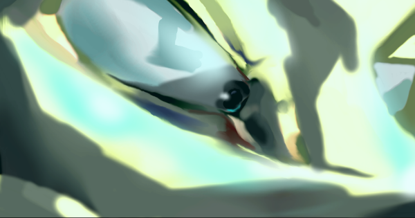
2. Such a blurred style of art make understanding facial features and expressions much more complicated task. I had to gaze into each picture to understand them, and still not always succeed.
3. Too much text, with mentioning too much unfamiliar things at once, to my taste. Some people may feel intrigued with it, but I (and many other people in the similar cases) feel overwhelmed because of it.
Some positive feedback.
1. Despite your art style makes things less distinguishable, in the same time it makes them look more dynamic.
2. Worldbuilding seems promising. Unfortunately, I don't remember much from your series before relaunching, so I can't estimate possible changes in worldbuilding. But it seems that you treat this aspect thoughtfully, and good setting always makes stories more interesting.
Good luck!