Would someone be so kind and check out my new comic update? And maybe also criticize me really hard 
Also, feel free to post links of your updates 
Webtoon
Tapas
created
 Aug '19
last reply
Aug '19- 14
replies
- 966
views
- 5
users
- 16
likes
- 14
links

Would someone be so kind and check out my new comic update? And maybe also criticize me really hard
Also, feel free to post links of your updates
Webtoon
Tapas
I see a lot of potential from a visual standpoint. One thing I would day is your icons have this really vibrant hue and sharp refinement that would look really good in your panels. I like the style and I think just building off what you have would go a long way
Salutations! Well, I did as you asked, I checked out your comic and looked at everything you have up so far. I've some feedback for you that I hope is helpful. I'm going to break this one up into two posts: One for writing/Dialogue and the other for art (that'll help compartmentalize stuff). Without further ado: Writing/Dialogue!
The first real snag I hit while reading your comic happened immediately: The dialogue. Your dialogue suffers from a number of issues, one of which is the easiest: Misspellings. You've got a few of them (Such as "Pineaple" instead of "Pineapple") so, my advice going forward is to run your dialogue through a spell check before you place it, that way you can catch any misspelled words that try to sneak by.
Now correct me if I'm wrong but the way your dialogue is written seems to me that English might not be your first language? (If English is your first language, then the writing issues here and there can probably be traced back to your inspirations or influences, which is a thing that happens sometimes so, don't worry, that's just how it goes sometimes.) If it isn't your first language, I will just say: kudos for translating it, I can understand that dialogue would be particularly difficult in this case so, I'll do my best to make examples that are helpful.
The next two parts, with regards to dialogue, are a little harder: Structure and Content. These are things that can be hard to master and take some time with regards to learning so, it's okay not to get these right away. Your characters have the problem of saying too much fluff that isn't required to get the point across, thereby reducing the amount of space you have for your artwork and making the characters sound less and less believable as they continue speaking. I'll make an example to show you what I mean.
In the scene from your third episode, your young hero says this:
Original: Hey you, smile! Look, you'll live another day! You should also close that mouth or the fly will get in there!
First off: there is no fly in the scene, so the fly joke makes no sense visually. If you had a panel without dialogue showing a fly landing in the bystander's mouth, that'd be different. Now, taking the context of the scene into consideration: a battle with a crazed magic user killing innocent people; a child enters the scene intending to fight. The way the jovial tone was used feels out of place. It undercuts the scene and any semblance of a threat from this initial villain or any show of strength or skill from the brother, later comes off as flimsy. Dialogue has the power to make or break a moment and in this case the way it comes across weakens the scene as a whole. Now, that's not to say you can't have a jovial hero who is unafraid of the situation, you just need to pair down. Make what you say more impactful in the moment. So, with that scene in mind, imagine this dialogue instead:
Edited: You're free to get up and run any time now!
Since the person who was attacked is stunned, snapping him out of it by bringing him back to earth and reminding him that he's still in danger, is what a person trying to save another human being would do. These brothers stepped in to defend this guy, and being that there's still a magic wielding psycho on the loose, getting the imperiled man out of the way, (since they stepped in on his behalf to begin with) would make more sense. There's also another thing dialogue like this does: it establishes atmosphere. If your main character impresses urgency on this poor bystander, the audience in turn will FEEL that urgency. Part of writing dialogue is to evoke emotion from your audience and if your characters display that urgency, your audience will register it as well.
This second part of the edited dialogue that I wrote is that it can work with the visuals. If someone smiles and waves a hand in front of the stunned man's face and pleasantly tells him he can run for his life, you can then inject urgency and joviality. There's also a third quality this adds: confidence. The main character comes off as more confident because, while giving an urgent message, he can still smile and wave, so we establish three emotions to build on atmosphere and we do it all with a single line of dialogue. I know I've gone on at length about this but there's a reason: the problem with this small snippet of dialogue from your comic, is endemic to your entire comic thus far.
You have long swaths of dialogue that don't need to be nearly as long and in fact, detract from your story. These two brothers are supposed to be these imposing strong characters that walk up and trounce a guy who is destroying people and property as if this is just another Tuesday. They're supposed to be young and unassuming but, because they're so dialogue laden, they come off as trying too hard to be impressive, rather than being what the story wants them to be: mysterious to a point and a force to be reckoned with. I'll make another example.
This scene right here2 perfectly illustrates what I mean. The Big Brother character (I couldn't find anybody's names so, I'll have to go with Big-Bro and Lil-Bro for now) has a long segment of dialogue that makes him sound like a child trying too hard to be scary.
Original: In fact, I am planning to break much more. How about your hand, leg, head? If you don't move out of my way, I'll do it so well that people will be able to make elephant skeleton out of those pieces. I'll say this only once, keep your psychopathic tantrum to yourself and move your ass.
He does not need to say nearly this much to get his point across. I know the elephant imagery he's talking about is supposed to be funny but, it just feels like too much. You can still make this scene funny and say roughly the same thing with more punch and less drag.
Edited: I charge an arm and a leg for taking out trash.
Now, I know that the dialogue I've done for this scene is short each time I pair down, but there's a reason. You're in a fight situation, long swaths of dialogue ruin the pace of your scene and slow it down. As a reader, when I end up in a long fight scene where everybody is just posturing at each other with dialogue, I get bored and put the comic down. When I read a visual medium, I want the visuals to do a lot of the talking: body language, atmosphere, details in a scene and so on. The dialogue doesn't always have to be short, but knowing what scene's require more and which ones require less, is important. Now, these are all things that come with time and practice, so it's perfectly fine if you don't know them right away! It's all a learning experience and so you're picking up more skills as you go, and there's nothing wrong with that. To help you along, here's a resource on dialogue for comics2.
Dialogue can be a wonderful tool to establish your character's identities, world view, what makes them good or bad, the works. It just takes some time and lots of practice and I know you'll get there! Your story has an interesting premise, we haven't been introduced to the in-universe Zodiac(s) yet, so there's a lot for you to build on and explore. You've got an intriguing idea so, I hope you keep working on it because I know you'll be able to make an interesting story.
Okay, now I'll write up the next section I promised: Art!
Okay, if you made it all the way through the last post, Kudos! I know there was a lot there but I hope it was helpful! Now I'll continue with what I promised, we'll talk about the art of your comic.
To start, I love that this comic is in color. Everything is very clear and easy to understand visually which is great for a comic. You've got shading, you change up backgrounds to accentuate moods, you really have a good start here. I appreciate that I can tell everybody apart just by looking, and even though the Lil-Bro and Big-Bro have similar appearances I can tell them apart instantly and that's awesome.
Truth be told you've got strong visuals that only need time and practice. I will point out a few things here and there for you to focus on practice wise as you go! I'll start with the easiest on this list: lighting! So, you do have shading in here and so far it's not too bad, but I've noticed that you lack a light source. Now I know that it's the middle of the day so the sun will be overhead, but adding a layer of lighting can make your visuals really pop. It can also help establish atmosphere as, during the day when the light changes, your shadows will change as well, so using the two of them together will make what's already good, great. Just practice some lighting techniques here and there and you'll get the hang of it. Here's a resource that gives a rundown on the importance of light1.
Onward, we have anatomy. Now, your anatomy isn't terrible and because your medium is more cartoon like, you've got a little more leeway here, however your characters tend to be a bit stiff. Now, this is just a thing that happens to everybody, so don't worry. If you practice figure drawing and different kinds of facial expressions1, body language and study different poses, emotions as conveyed through the body, this one will be a cinch. I'd also suggest you learn a little bit more about foreshortening1 so that when you portray an action scene from an angle, you can get the full effect of an important moment. If you want to find a host of tutorials about doing comics, this place is pretty cool too. (Even though their styles are different from yours, their advice is pretty good!)
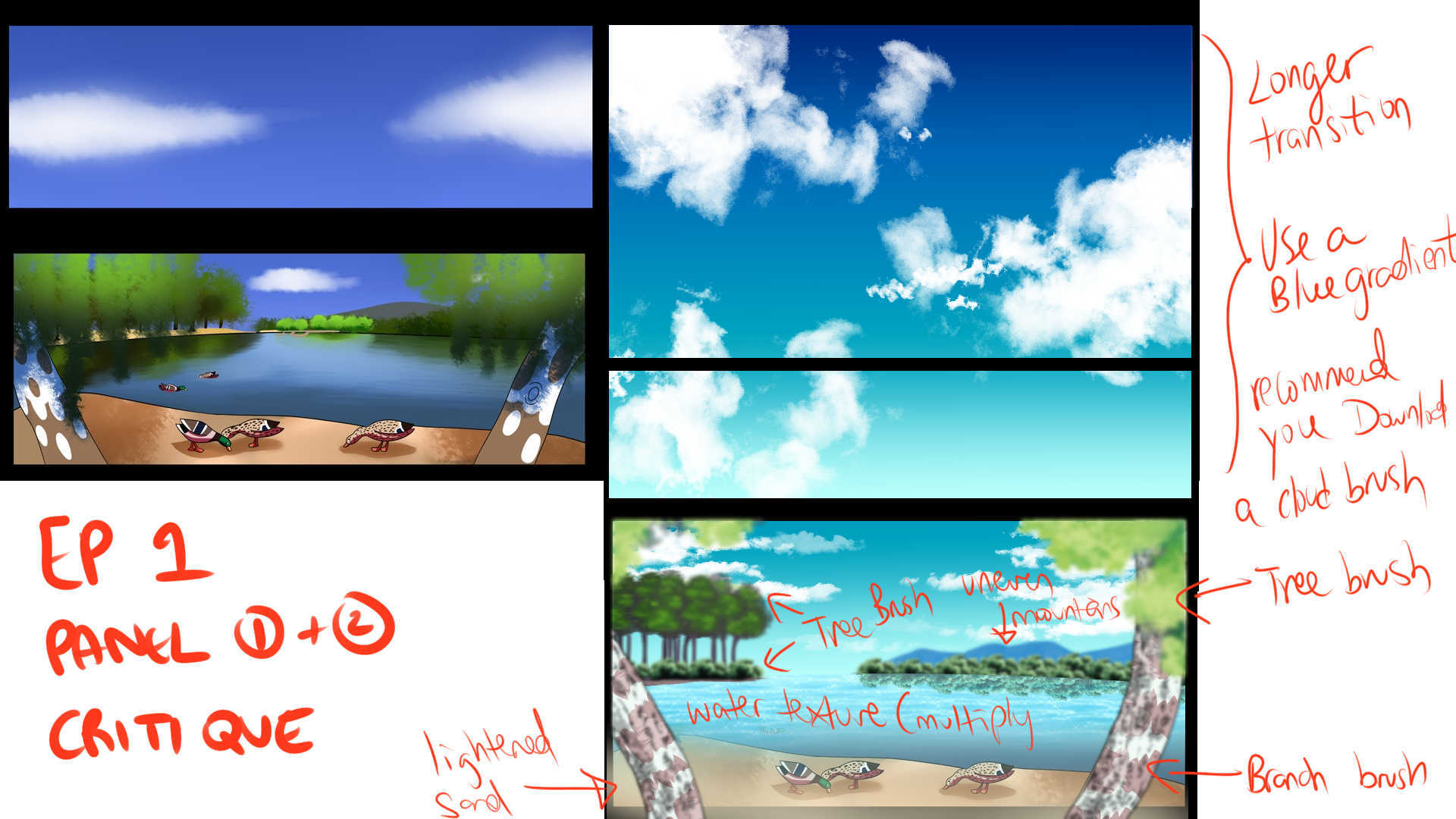
Thirdly we have backgrounds. You're actually doing pretty good with these too, you're working on foliage and buildings, you started with an establishing shot that was good. The only thing really that confused me is, we were seeing a bunch of nature scenes and then suddenly we're in town. Now, obviously that means the ducks were in a park but, the location of that park had me confused for a moment so, you might include a city on the horizon in the background or something to indicate we aren't in the woods. One thing I can suggest with regards to your scenery is to study different types of scenery to polish up the details: buildings1, landscapes etc. Again, this is just something that takes time so, you don't have to try and do all these things all at once. The resources I'm giving you are for using them when, and only when, you need them or want them.
All in all, your visual style is bold and easily understandable from first look. At this point you're already doing pretty well so practicing some techniques here and there will just be par for the course! I hope what I've shared with you so far is helpful and that you're able to make use of any resources I posted. I wish you luck in creating the story you want to tell, you're off to a strong start and I've no doubt you'll only continue to improve!
So it's full color and inked and I totally appreciate all the work that went into this comic--but I will say I want to see a lot more mmph out of all the explosions. The big thing you're selling is action, so don't be afraid to let that action go 10000% like it would in any anime. Let them go full My Hero Academia-style explosions (which is a really great resource for explosions ps as well a great time in general). A weird thing about illustration, is that you must always exaggerate every single body position, weird camera angle, and every single action past where it would realistically be, and then it will look normal. It's kind of weird, but you have to really over-sell any magic effects.
Another thing, is maybe grab your phone the next time you gotta draw hands or draw a weird position and just take a picture of yourself in the position that you need so you have it as reference to draw off of. There's some stiffness throughout because you're relying on your memory for some of these positions and like...I can't remember how to draw a high five off the top of my head, either, it's freakin hard to do. My phone is half filled with reference shots of myself. It takes like 5 seconds to do and it will save you 5 hours of drawing and redrawing.
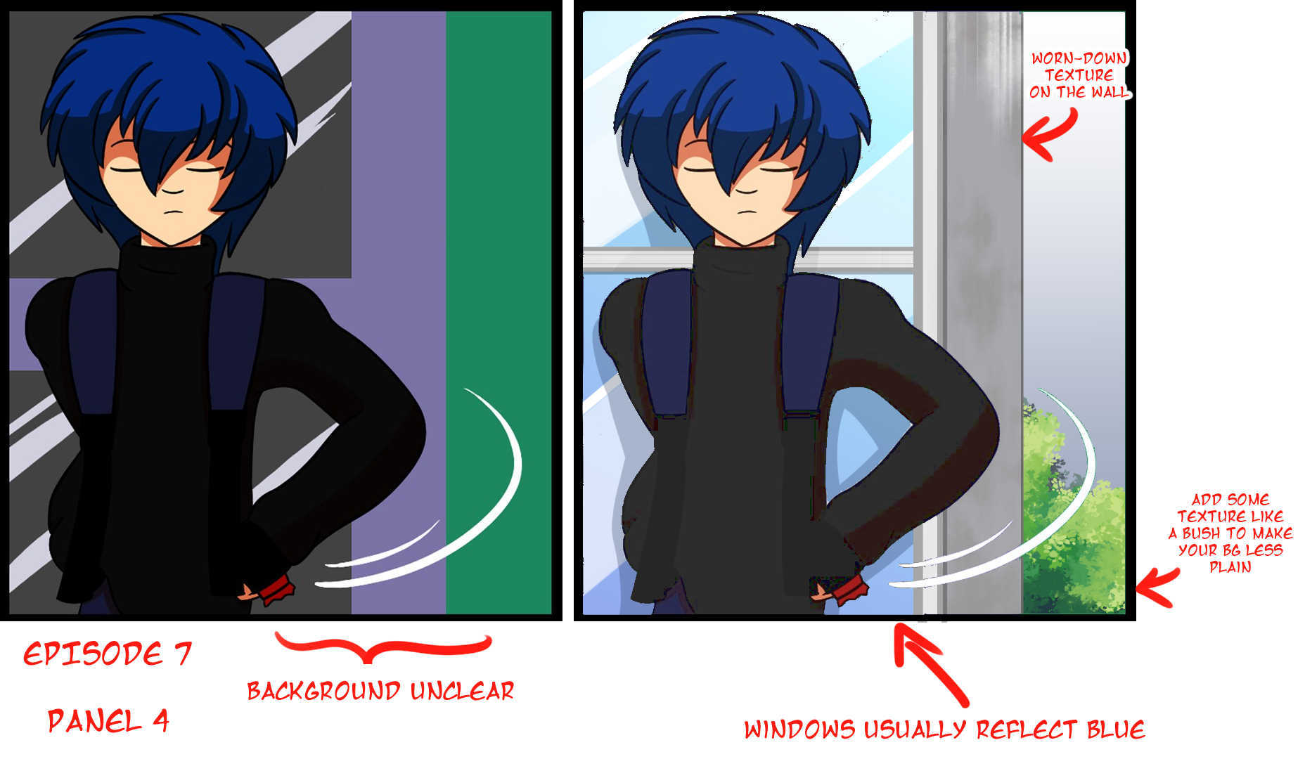
Finally, you're bringing a round stylistic approach into the characters, which is great, but if you go simplified in the characters, your eye must be invited to dwell somewhere else on the page. There must be a focal point an "ooo!" moment on every page that you do, and it can be in your backgrounds (which is a super common Manga trick). Right now you are relying on a simple textured brush to draw clouds and trees in mostly one shade or in a gradient. It's a great start, but it needs more detail. Much like the explosions, don't be afraid to get Way Too Much. At the moment your buildings are squares and that's not enough. Especially if you're dropping swears in your comic, you gotta do more than squares, batman up those buildings and make em grungy if that's what you're going for. I have no idea if they're in a city, a suburb, or a fantasy world.
Overall, I think it has some fun potential, and I like the comraderie between the brothers. It is a little interesting that the bird and the bat creature are the most well drawn and detailed things in this entire comic, but it does make them seem pretty magical because like...look at em. They're cute.
Oh god that was more than I could ever ask for, thank you so much And you are right in few things, like, yeah I am Czech so english is not my native language. I know I still make a lot of mistakes. I guess I would need english beta reader, but I still could not get anyone.
When it comes to writing, I guess I am still not really settled in this story. When the story begins I hope things will click together and it will all calm down and get better as the story goes. Introducing characters right is right so I decided to use words to describe their personality. But you are right, sometimes I also think they should just shut up and be quiet for a while, so the image does the work. I just wasn't sure if people would want that. More text means more contnect, I'll remember that
Thank you so much on art critique. I draw for years, but there is still a lot to learn. I started to draw humans just few years ago, so yeah, I can feel that stiffness you talk about. I am trying to get better and this alsop comes to backgrounds and other aspects of the comic. I will definitely check out the things you reccomend me Thank you so much for such usefel feedback
Also, excuse my horrible writting here on forum ^^,
I know, the anatomy, the bane of my existence. I draw humans just for a short time so there is still a lot to learn, you are totally right about that. I spent most of my time drawing animals, so yeah, I guess that explains why they look the best. I also have folder of the reference picture, nice to know I am not alone on this I try to think for how long I draw humans, properly and I think it's maybe around one year, so yeah lot of space to learn.
I really want to draw a nice background. I never did that before, backgrounds were always one of my weakest points, but I want to change that so I'll keep working on it. Thanks for pointing out the action scenes and things around them. I also didn't think it looks completely right, but you managed to point out what is missing. Thanks!
Find a grammer checker / proofreader.
Download brushes to make backgrounds easier!
You can find custom brushes for photoshop, SAI, or Clip Studio online for free.
I can't really say anything about your anatomy since I have a feeling it's your "style", so I'm just gonna talk about backgrounds and layouts.
I am looking for beta reader, but I still didn't find, I hope I will find someone soon. I am Czech, so none of us here is native language speaker, so I hope someone will be willing to help me with that.
WOW, you made it into remastered versio. That looks so good, now I really want to work better on those backgrounds, it makes such a huge difference.
Ah I'm so glad I could help. It's totally fine to make mistakes, part of the fun of creating is to make them and continue to grow. I can tell you, I've learned more from my mistakes than anything so, they're very useful! I had a feeling you might have a different first language, which is perfectly fine, in fact like I said, it's rather impressive that you've been able to translate your comic, so you should feel happy about that. Now it just comes down to a few little tweaks here and there and you'll have it. I know beta readers are hard to come by and especially if you're having to find someone who speaks a different language. That being said, who knows? Maybe you'll find one when you least expect.
It's totally fine if you're just getting your story started, every webcomic starts by settling in, so you're doing the right thing. Hahah though yes there is a lot of extra dialogue, what you'll be learning as you go, is the balance of dialogue and art and all that takes is practice. You're absolutely welcome and if you ever have further questions the forums are a great place to ask them.
| Topic | Category | Replies | Views | Activity |
|---|---|---|---|---|
| Come and help promote these talented writers books! | Promotions | 3 | 249 | May '24 |
| Anyone up for a sub 4 sub? Let’s reach milestones together!🥰🥰🥰 | Promotions | 18 | 358 | Nov '24 |
| Let’s promote! Promote! Promote! | Promotions | 88 | 1.7k | Feb 24 |
| Promoting Promoting Promoting 👌 | Promotions | 20 | 422 | Jul '24 |
| Sub 4 sub here ! Let’s get 100 subscribers | Promotions | 12 | 315 | Oct '24 |