I think something people overlook when it comes to art styles is that they have layers beyond simply 'how the characters are designed'. The color work, blocking, and even the dimensionality of the characters does a lot to tell the viewer how seriously they should take the story.
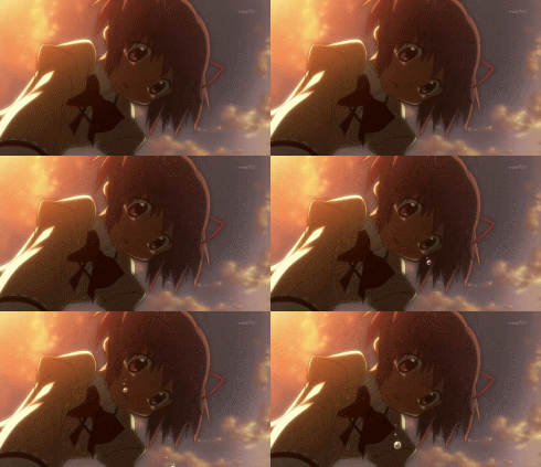
This is why anime can do what it does despite so much of it having cutesy characters with giant eyes-- the environmental lighting is dramatic yet grounded, the physics are realistic and believable. The characters clearly have 3 dimensions, and move and gesture like real people-- these are additional cues that ALSO help determine the tone.


Basically: if you want a simple, cartoony style to be taken seriously, you DO still need one or two serious elements in there to ground it, even if the audience may not notice that they're there. This is a skill that takes time and experience to master, and it's the reason why this:
...CAN and does happen. It's not actually the cartoony-ness that's the problem; it's how well that cartoony-ness is integrated into the art. When it destroys the serious elements instead of enhancing them, the work will usually just come off as childish, 'tryhard' or 'DeviantArt edgy', instead of truly serious.
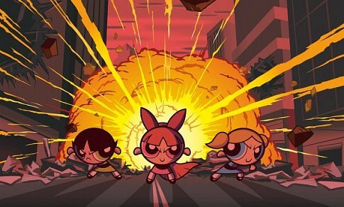
For example, this PPG poster is pretty cool. Despite its simple cartoon style, it really draws you in and feels powerful:

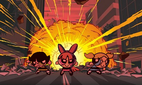
But let's say I try to recreate it, as an amateur who doesn't really understand how this artstyle works, and doesn't know how to draw figures consistently:

...Doesn't look so cool anymore, does it? ^^; Even the dramatic lighting can't save this...professional consistency and dynamic linework are vital elements of seriousness that were working very hard for this piece, but are now no longer present, making the whole thing look sillier. You could still do the PPG Movie with this 'style'...but the audience would probably think it was some kind of parody, rather than its own immersive story that just happens to star a trio of weird cartoon girls.
Meanwhile, if you take away a less important element of seriousness, like the sinister-looking colors:

Doesn't hurt the piece very much, tbh. ^^ Instead of looking silly, now it kinda just looks 'playful', like a story that could still be serious, but maybe with a comedic tone and some abstract-leaning liberties with the art direction. Because we still have the dynamic lighting and poses and the clean linework working to set the mood.
Some people in this thread have mentioned cartoons that do both serious and silly stuff, and those are great places to learn how these techniques work, as you watch the creators weaving in and out of them with the changing tone. Adventure Time is a fantastic example-- even as someone who hasn't really watched the show, just from video clips and screenshots, you can see how a show that looks pretty absurdist-silly 90% of the time suddenly gets its artistry and cinematography ramped up to 1000, when the directors want you to get immersed in an important story beat.
Steven Universe is also really good at this, Over the Garden Wall rocks it, even Regular Show displays a pretty good understanding of how to turn this on and off, albeit in a tongue-in-cheek way.
...I know this was a lot; I'm just really passionate about artistic juxtaposition. ^^ I really wish more people would pay attention to the subtleties in this type of art direction, instead of just trying to brute-force a serious story through an art style that hasn't actually been tailored to support it. A lot of the time, when audiences mock a cartoon/animation and refuse to take it seriously without really knowing why, one of these issues is the culprit...but these issues are actually really easy to fix, if you know what to look for.