maybe its odd of me to say but i still wonder if there's a way to blend vertical format with print layout and still maintain readability.
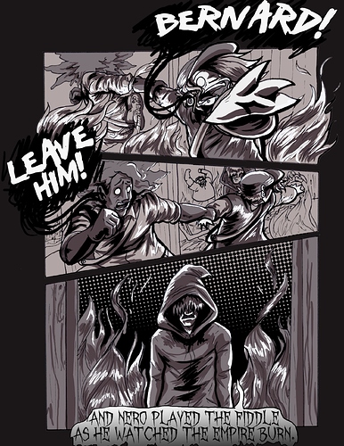
(i probably sound like a broken record bringing it up but) ive always been fond of the panel layout of the sonic the hedgehog comics (both idw and archie) as they've managed to be very dynamic and still easy to follow and it never takes away from the visual details.
im on a phone so i cant quite share samples but they take advantage of some of the things mentioned already and some others:
-skewing the panel or using abstract shapes to create contrast both for content and for dialogue
-speech bubble placement to direct the flow of reading
-using colors to direct the flow of reading and to dictate tone (ive noticed it varies from the way shading is done to using negative/positive space to direct the readers eyes and a lot in creating certain mood or athmosphere)
-overlaying panels (it could be a method that works better in print layout but ive attempted to put it to use though only minimally)
(also with regard to the title i dont think its breaking any rules but its very cumbersome and could be hard for people to understand without a second glace or just clicking into the thing. not that vocabulary is an issue but sometime big words are intimidating especially if English isnt a primary language)