1 / 27
Feb 2019

Does anyone have some tips/tricks for directing eye flow better in the vertical scroll format?

I'm still adapting from the western style of panel flow... and some of those techniques like overlaps and insets are useful for avoiding repetition but with the entry point being so linear... I keep getting fidgety about the lack of variety in how the strips flow.

I've been playing with color to create visual connections but the width of the format is so small.

Anyone got something else they're using right now?

  • created

    Feb '19
  • last reply

    Feb '19
  • 26

    replies

  • 4.2k

    views

  • 10

    users

  • 44

    likes

  • 5

    links

There's some useful stuff about structuring and formatting for vertical scroll. I'm used to the more zig-zagging of page format, but it seems like vertical scroll works better when it's more centered? I find that super weird myself and it's given me trouble. None the less, if you haven't seen it before, hopefully Webtoons little tutorial guy offers some useful insight? I don't think there's been much official advice on how-to vertical yet.

I've merged multiple panels into a single one as someone's falling out of a 4th floor window, that worked nicely.

I'll flip a panel horizontally if I want to do a real widescreen, I like this, I've used it at least three or four times.

I've kilted a panel diagonally to show vertigo.

I think my favorite one though was I had a horizontal and vertical layout layered simultaneously on top of each other kind of mirroring everything as two storylines intersected...that one got me my first feature on webtoons.

I like the vertical scroll format it's much easier to read and you never have to worry about spoiling a page for yourself by accidentally glancing at the wrong panel. But I do a very non traditional comic, it's not the webtoons style. it's called 'cinematic' a lot and that's how I think of it, more like a film that you flip through the frames one by one.

Aaaaand the downside is you have to reformat everything for print. I haven't figured that part out yet.

I have seen that before ( but for some reason the link isn't working for me) .

That centering technique just lets the reader zoom through the story... it's hard to control reader time when you can't trick the eye into wandering or focusing.

I've seen this... probably just me, but it bugs me because I always try to flip the reading device to look at better.. then the screen auto corrects. Urgh!

Can you link please? I would really like to see that.

yeah flipping the device sideways is annoying....so I keep the text reading vertically. don't know if it makes much of a difference.

Here's the link to the double horizontal vertical. I thought twice about linking cause I'm probably a bit more lenient on showing cartoon blood than some people. So warning, there's cartoon blood. it's not particularly realistic, but it's red.

Cartoon blood!!

I might wilt and wither! Ha !

Cool panel at the end! That's a very interesting technique... you nailed it.

I miss the 90s internet. I remember reading this essay by McCloud when he first put it up. it was so avant garde and people tried all kinds of things that failed and were just weird, but now I stumble across some old site every now and again, and that nostalgia...cuts deep...

yeah, try weird stuff, for posterity. it's worth it.

(((( someone wanna change the title of this thread to 'tips on flow in vertical scroll' or something? ))))

i think midnight furies is a good one to look at for vertical scroll inspiration - its originally drawn for a page format, and then editing into scroll, which leads to some really interesting compositions imo

this episode especially has magnificent flow and emotional resonance

I call it that sometimes ... but some cats then think you're talking about an Avenger's sequel. Ha!

McCloud is a genius and such but, as far as I have found, he really never dealt in the nitty gritty concepts of manipulating eye flow within the infinite canvas. If you have something deeper he wrote, please share.

Bah! The title is neither misleading or clickbait (unless you have some weird thesis statement fetish).

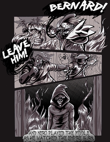
I read the episode you suggested. The initial staggered panels do help establish the narrative of the game with good kinetic energy, but for me, when we get to the emotional scene, the format fails the artist. They open up the panels and subtly switches style to try and slow the eye with more detail. But we keep visually pinballing straight down the scroll at a pace that doesn't suit the scene.

It's one of those cases where traditional methods aren't quite working as well in this form.

It's like we're bringing a standard socket set to a job that has metric bolts and nuts.

me as a non English speaking bird that's still have limited vocabulary

Dat title confuse me to another level. (/ω\)

Ha ha! Well, I'm old so this...

...confuses me. Is it two sticks swatting a testicle pinata? Or what?

I tilt my gutters ever so slightly to try and create a line of sight through panels.

Are you concerned, that on mobile devices, that the reader's eye is singularly focused on the total image and resists the technique?

Σ( ° △ °|||)

No, lol. It's just a hand on ur face because of embarrassment or something but still acting cute (hahaha) kind of emoji. This is called kaomoji. (•ω•)

What?!?

Get off my lawn whippersnapper!

I just don't read....

...as a face. Just don't see it.

Not really, but only because that would require me to be much more concerned about whether or not anyone reads it ever. I just do my best and try stuff.