I was born and raised in the 90s, and the title doesn't look very 90s. It's looks more webcore, however your art doesn't compliment that aesthetic.



There is this aesthetic of the big bright logo. Probably using early CGI technology to give them a new age 3D look. The colors of the image complement the logo, also being very bright and bold.


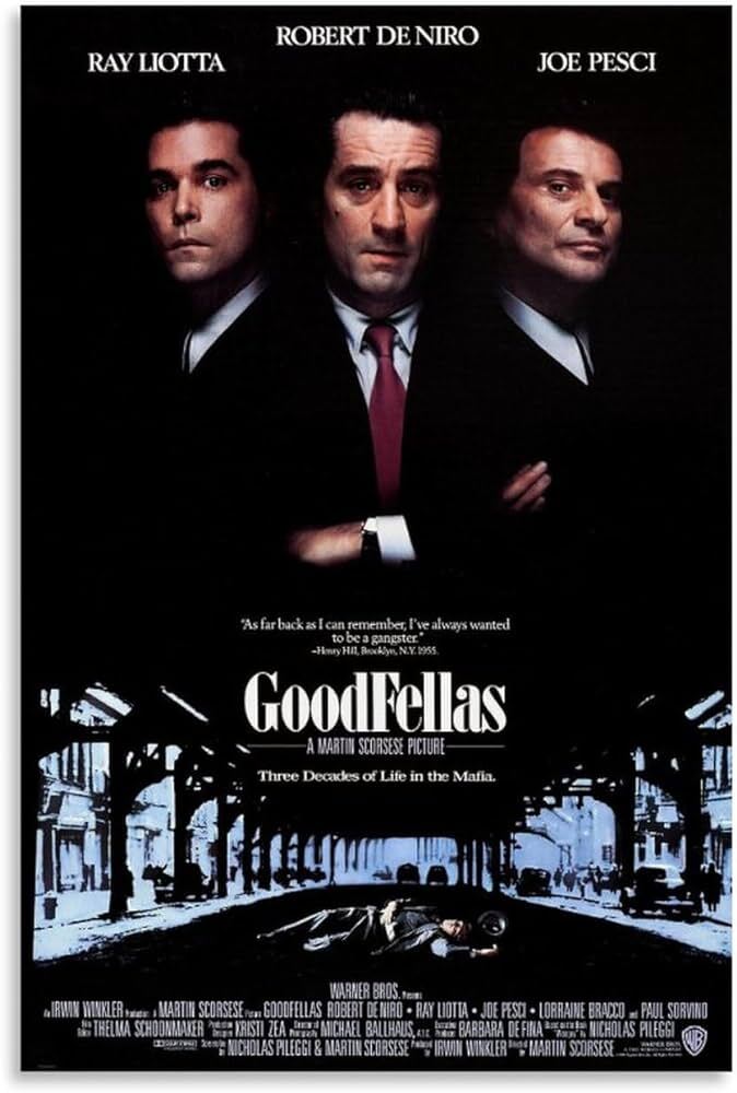
However, these are also 90s posters. They have a limited color palette, are more "moody" and uses a simple title against the black
I guess my point is you need to have your art and title complement each other.