This illustration is really great, almost flawless.
If I had to nitpick, maybe the character's reflection could use some post-processing.
Having such a clear reflection on grass does seem a bit unnatural, because grass is part of the background, so the reflection on the grass should have the same texture as the background, rather than matching the character's texture.
Of course, this might be intentional for your story purposes.
Anyway, I think it's fantastic, let's see how it looks once the text is added.
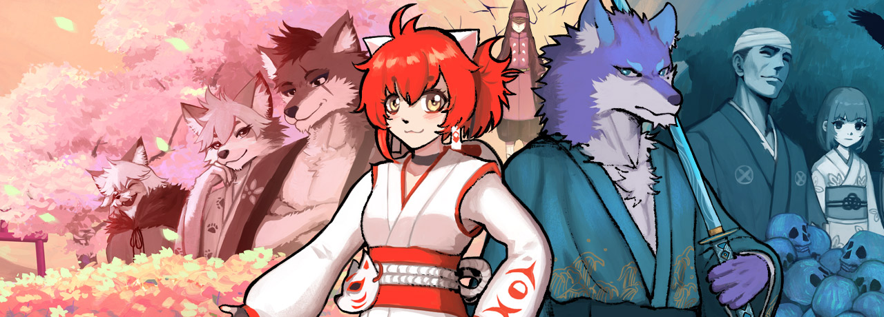
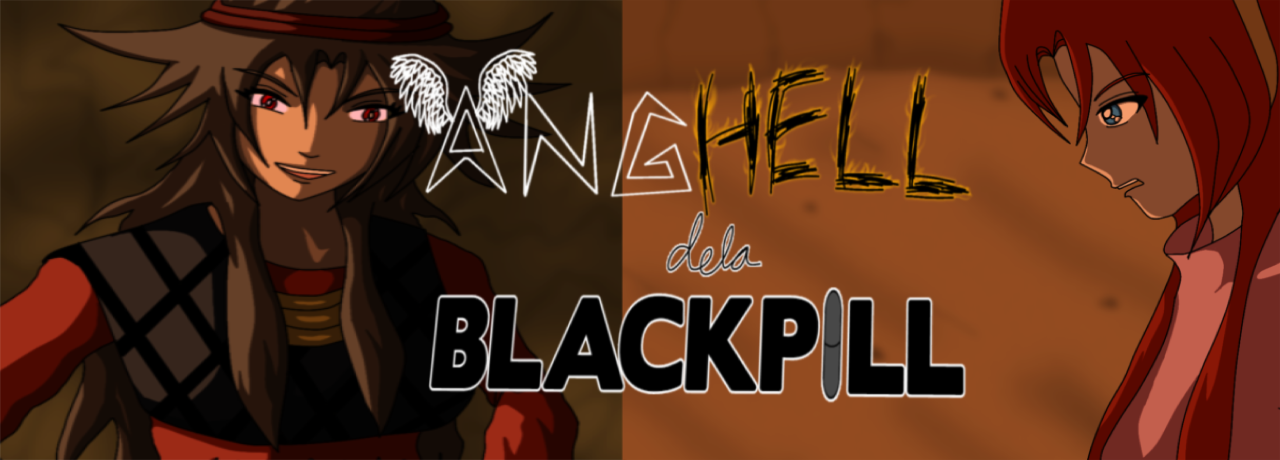
This is my comic cover. The reason it's so wide is to fit the banner sections of various websites. But the focus of the image is only in the central area.
It took me about ten days to complete it.