I use Komika! It's free for personal and commercial use, and is one of those fonts which doesn't draw attention to itself, so it doesn't pull a reader out of the story.
The biggest reason I chose it over other, more popular options though is because it has a lowercase version. That's vital for my sci-fi/fantasy, as it allows me to capitalise important places, names and such the same way I would in a novel.
I started with Anime Ace because it was free and I already had it installed on my pc, but I soon realized that it was a bit too big for my panels, which made it very difficult to fit dialogue in balloons. Also, it definitely felt too bright and bubbly. So I started to look around for alternatives and eventually ended up with two different fonts:
Meanwhile by ComicCraft for the vertical version...
...And Ames Pro for the print format version (with the occasional use of other free Blambot fonts as seen in this page):
CC Meanwhile is actually my favorite of the two: it's pointy (which I think suits my lineart style), smaller than Anime Ace and comes with quite a few variations that give that sort of "handwritten" feeling. However, what I really don't like about it is... the price XD it's free with an Adobe subscription (which I have), but for anyone else it costs a whopping $139. Since I have plans to send my comic to a publisher at some point, I figured I'd better come up with a cheaper alternative. Ames Pro looks close enough (although more rounded compared to CC Meanwhile), but costs WAY less (only $25!). Having a cheaper font with a license I could actually afford to buy also gives me more peace of mind in case for whatever reason I'm unable to pay for my Adobe Creative Cloud license in the future and I have to give up on Adobe Fonts as well.
Fun fact: I never considered using an uppercase/lowercase font for my comic because... where I live, pretty much ALL comics (translated and not) that I've seen/read came in uppercase fonts. I didn't even think other options were allowed and I was actually really surprised to find out that some Marvel comics come in uppercase/lowercase! 
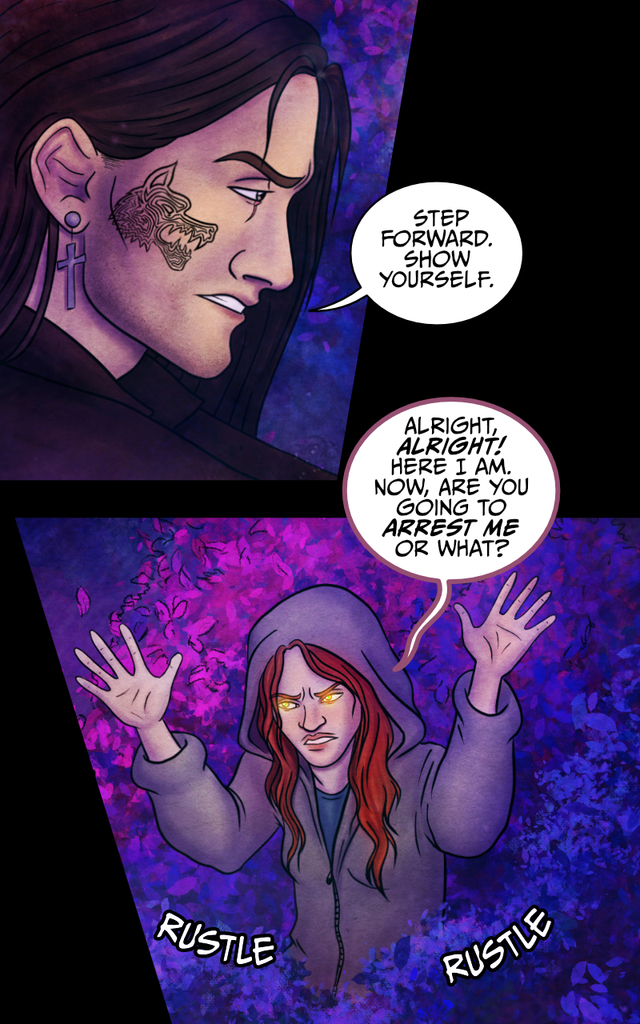
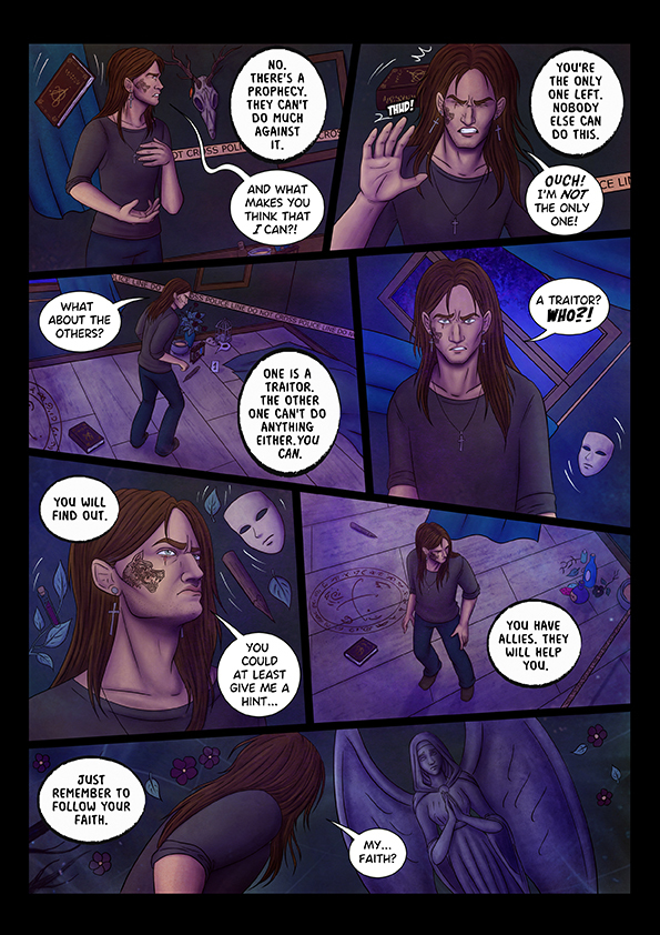
I use several fonts for my comics. This is done in order to illustrate which character is speaking in case they’re not on-panel. I plan to use as many different fonts for as many different characters as I can.
I use Ames Pro for the super complex reason that I like how it looks in my comic. This is the free version: https://purastik.net/ames/e.html13
Errant uses Blambot Casual!

I tested a bunch of fonts for Errant before settling on this one. A lot of my old comics were lettered in Creative Block:
But the very heavy, angular style didn't really fit with how Errant looks, because I'd spent several years making more cartoony work in between these and my style had become less stark and a bit softer, plus it's a colour comic, so naturally less heavy than my black and white work
I also personally felt like "Marvel style" lettering with both upper and lowercase was both more suited to my casual, rambly writing style and gave me more flexibility to go into all caps if I needed to. It does kind of surprise me that most manga are lettered DC style in all-caps, even ones with very long passages of text that'd be nicer to read in sentence-case.
My partner Shaz is a designer and fussed a lot over stuff like the font size and line spacing to make Errant as mobile-friendly as possible. It's for the best in terms of building an audience on Tapas, but did mean that the dialogue in the final comic tends to end up stripped down a lot from the script because the lettering is so much bigger than I'm used to.
Funnily I did try making a font based on my handwriting, but my handwriting is a bit too soft and cute, and I tend to reserve it for work I do on things like making tech things less intimidating, like this:

It didn't really suit an action comic with bold art, so when you see my handwriting in Errant, it's nearly always used for comedic purposes. 

I use one I made myself in Affinity Designer on my Ipad and named it A Lady Makes Comics so that it always shows up at the top of my font lists haha.
I adjusted spacing for chapter 2, but it's still the same font.
The reason I choose to use my own font was mainly flexibility to do handwritten effects and not have them look so off or awkward, but also bc I just couldn't choose what would compliment my style more and so after months of back in forth I just said fack it, I'll make one and since it's from my hand of course it will go with my comic hahah.

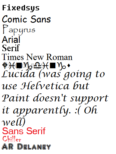
I typically use Fixedsys in an Undertale comic unless my character uses a special font, like Sans or Papyrus. And boy, there are going to be quite a few cases of that.
Here is the entire list of fonts I will use and how I will use them (all set at Paint size 24):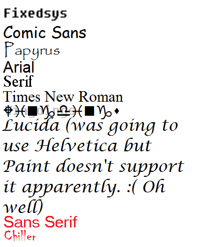
Read the comic PLEASE1
I used to hand-letter everything because I'm stubborn and (clearly) masochistic. I eventually had to concede that it was a huge time sink for not a lot of payoff, so I'm using my own handwriting as a font now.
It helps because if I have to hand-letter effects or emphasized words, they don't look out of place.

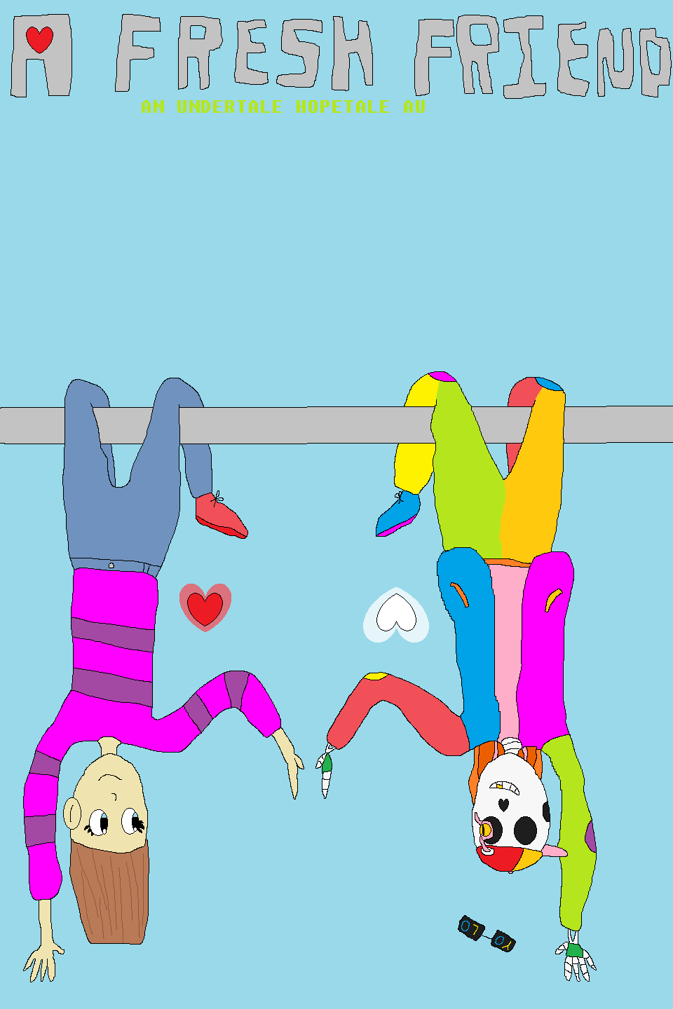
Adding another character, and thus, another font, to the roster. Meet Delaney.
Delaney is going to be as different as the Fresh Friends AU can handle. I can't wait to introduce her in Chapter Five. You guys are going to LOVE LOVE LOVE her. In a good way, I mean!
 I hope to make her a really distinctive character. No spoilers, but if you really want to see her, please subscribe to A Fresh Friend. If I get a lot of positive feedback about her, you'll see lots of Delaney. Please do DM me what you think she'll look like! OOH, that could be a fun contest...

I made my own, because I didn't want to spend eternity looking for license free and good looking one. And since there are things like effects you need more fonts, so it would take even more time. Also, if you have your own font, you can be sure it's license free and you don't have to worry about any copyright bulshit.