1 / 32
Apr 2022

For me personally I use digital strip for my comic. This is because it is a bit of a neutral font- my comic is a horror that deals with dark subject matter so I feel having this font helps keep the mood consistent.

I'd originally used anime ace but it's too bright and bubbly for my comic personally. If I were to change fonts now, I'd probably choose one with lowercase letters included but I'm too far in and too lazy to do anything about my font now oh well.


  • created

    Apr '22
  • last reply

    May '22
  • 31

    replies

  • 3.3k

    views

  • 27

    users

  • 107

    likes

  • 5

    links

I hand-letter! I sorta taught myself how early on because I didn’t have any digital tools to do it and I like to cut down on as much of the digital aspects as possible. I just hate working on my comics on screens it feels really draining to me.

I’ve been doing it for years and it only really takes me a couple of minutes to letter a page at this point AND its become an important part of my sorta “assembly line” system.

Hehehe, for now I only use Anime Ace on the recommendation of another creator in the dialogues, the truth has been my salvation, others may use much more professional fonts, but I'm not complaining.

I use different variations of Komika. Honestly, I don't love it and also wish I could've found something with undercase letters. I wanted something that would be similarly consistent, neutral, and appropriate for a more serious tone when necessary, and this was the closest I got.

Some of the letters look funky, but it does the job I guess ? :I


Wouldn't be opposed to changing it if I ever find something I like better, however far into the story I am. I've kinda resigned myself to the fact that my comic's look is going to shift over time, but as long as it's an improvement, I've decided I don't mind. It's my first comic and a learning process after all.

I use a custom font of my handwriting as my main font, I feel like it meshes with my art fairly well and it gives me the ability to occasionally hand letter a bubble without it looking out of place.

I use a font called Belizarius for my title, and for a certain character's telepathic speech.

And then the evil sword that influences people to commit murder uses a font called, appropriately, You Murderer. :joy: I try not to go overboard with using specific fonts for specific characters but this and the above felt like appropriate exceptions.

I use Crime Fighter because I wanted something that looked like the fond used in Euro comics. Tho my criticism is that I am not a fan of the numbers or Z. I will sometimes use Digitalstrip to fill in for those cases.


It also does not look good when blown up very big so I started to use Damn Noisy Kids for large dialogue

So it looks like this

Tho with Bay Be Fresh, I ended up using Digitalstip because I thought it looked better with the simple art style.

I use Komika! It's free for personal and commercial use, and is one of those fonts which doesn't draw attention to itself, so it doesn't pull a reader out of the story.

The biggest reason I chose it over other, more popular options though is because it has a lowercase version. That's vital for my sci-fi/fantasy, as it allows me to capitalise important places, names and such the same way I would in a novel.

I started with Anime Ace because it was free and I already had it installed on my pc, but I soon realized that it was a bit too big for my panels, which made it very difficult to fit dialogue in balloons. Also, it definitely felt too bright and bubbly. So I started to look around for alternatives and eventually ended up with two different fonts:

Meanwhile by ComicCraft for the vertical version...

...And Ames Pro for the print format version (with the occasional use of other free Blambot fonts as seen in this page):

CC Meanwhile is actually my favorite of the two: it's pointy (which I think suits my lineart style), smaller than Anime Ace and comes with quite a few variations that give that sort of "handwritten" feeling. However, what I really don't like about it is... the price XD it's free with an Adobe subscription (which I have), but for anyone else it costs a whopping $139. Since I have plans to send my comic to a publisher at some point, I figured I'd better come up with a cheaper alternative. Ames Pro looks close enough (although more rounded compared to CC Meanwhile), but costs WAY less (only $25!). Having a cheaper font with a license I could actually afford to buy also gives me more peace of mind in case for whatever reason I'm unable to pay for my Adobe Creative Cloud license in the future and I have to give up on Adobe Fonts as well.

Fun fact: I never considered using an uppercase/lowercase font for my comic because... where I live, pretty much ALL comics (translated and not) that I've seen/read came in uppercase fonts. I didn't even think other options were allowed and I was actually really surprised to find out that some Marvel comics come in uppercase/lowercase! :shook_01:

I use several fonts for my comics. This is done in order to illustrate which character is speaking in case they’re not on-panel. I plan to use as many different fonts for as many different characters as I can.

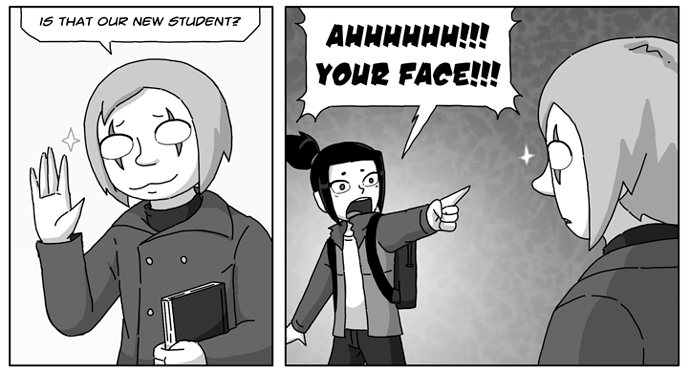
Errant uses Blambot Casual!

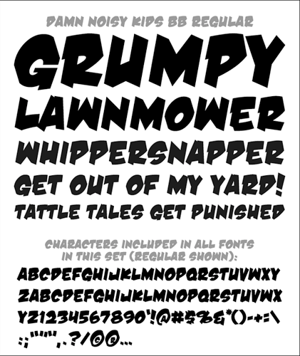
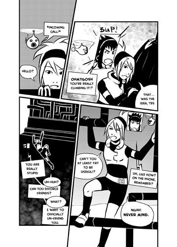
I tested a bunch of fonts for Errant before settling on this one. A lot of my old comics were lettered in Creative Block:

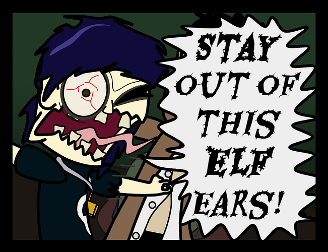
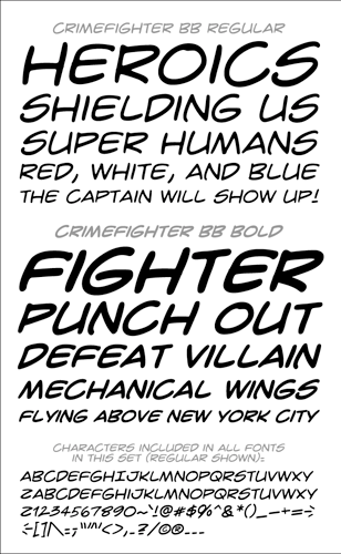
But the very heavy, angular style didn't really fit with how Errant looks, because I'd spent several years making more cartoony work in between these and my style had become less stark and a bit softer, plus it's a colour comic, so naturally less heavy than my black and white work

I also personally felt like "Marvel style" lettering with both upper and lowercase was both more suited to my casual, rambly writing style and gave me more flexibility to go into all caps if I needed to. It does kind of surprise me that most manga are lettered DC style in all-caps, even ones with very long passages of text that'd be nicer to read in sentence-case.

My partner Shaz is a designer and fussed a lot over stuff like the font size and line spacing to make Errant as mobile-friendly as possible. It's for the best in terms of building an audience on Tapas, but did mean that the dialogue in the final comic tends to end up stripped down a lot from the script because the lettering is so much bigger than I'm used to.

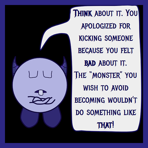
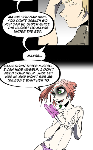
Funnily I did try making a font based on my handwriting, but my handwriting is a bit too soft and cute, and I tend to reserve it for work I do on things like making tech things less intimidating, like this:

It didn't really suit an action comic with bold art, so when you see my handwriting in Errant, it's nearly always used for comedic purposes. :sweat_02:

I use one I made myself in Affinity Designer on my Ipad and named it A Lady Makes Comics so that it always shows up at the top of my font lists haha.

I adjusted spacing for chapter 2, but it's still the same font.

The reason I choose to use my own font was mainly flexibility to do handwritten effects and not have them look so off or awkward, but also bc I just couldn't choose what would compliment my style more and so after months of back in forth I just said fack it, I'll make one and since it's from my hand of course it will go with my comic hahah.