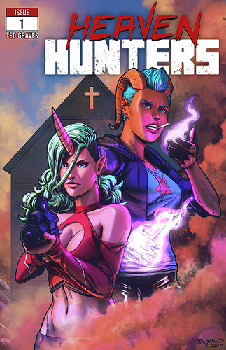
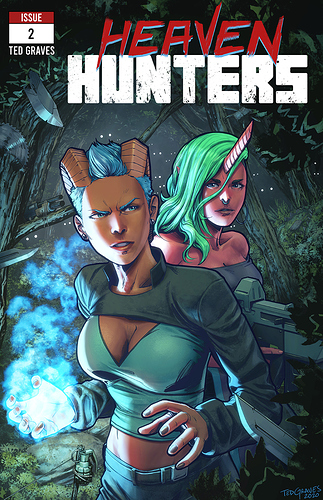
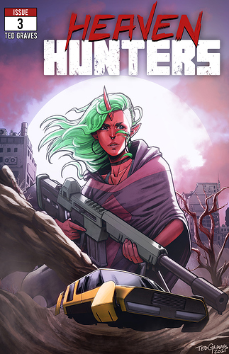
A successful cover (at least to me) gives the reader an idea of what's in store for them when they read an issue. A good cover is a promise. When I do covers I try to show as much about the story as I can in a single image, while also showcasing the characters and mood, and trying not to spoil anything. Remember that a potential reader might look at it for less than a second as they scroll, so it needs to be punchy, to the point, and have extremely clear focal points that instantly draw the reader's eye. Value and saturation shifts also pull focus, so I try to keep my focal areas brighter and more saturated in contrast with the rest of the piece. The bright yellow of the car in the third cover, for example.
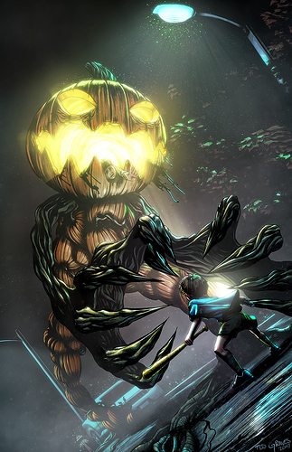
Good silhouetting helps a ton here, and carefully constructing your composition with rule of thirds, and actual vs psycic lines to literally point to a focal point helps a lot too. Here's a more extreme example of using composition to point at a focal target:
See how your eye instantly shoots to the pumpkin face and the boy?
Group shots can be tough to get right, because they can read as a jumble rather than having clearly defined focal points. Dave Dorman is a great artist to look at when drawing inspiration for cover layouts, he's always been one of my favorites.

A group shot done right:
Notice how the stormtroopers read as almost a single mass, and he's using the red of the explosions and the imperial guards to pull focus towards vader, and vader stands above them all with a very clear, black silhouette. He's telling a story with the way the piece is laid out too. Everyone in this painting is facing the same direction, representing a united force, despite the explosions going on in the background.