Though opaque overlays are handy, you shouldn't entirely rely on them to make scenes look like they're set in the evening - rather, you should focus on learning which colours to use when painting said scenes.
One tip that many have already mentioned is that you should use colours that lean more towards bluish or purple colours, as they are very prominent during the evening or the dusk.
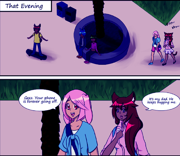
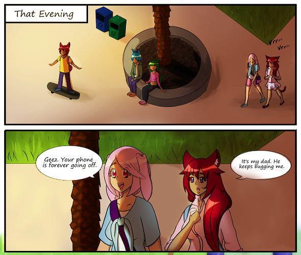
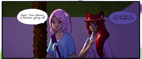
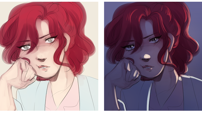
For example, the first two panels of your first link - while you may have attempted to seem darker - is difficult to parse as an evening scene, as bluish colours aren't very present within the scene. This is something you can fix up with just a colour correction filter, like I have done so here:
As you can see here, just by pushing the colours towards more bluish colours, the impression of evening in the scene is a lot stronger.
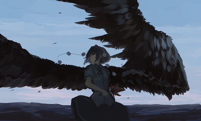
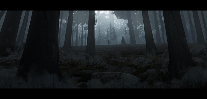
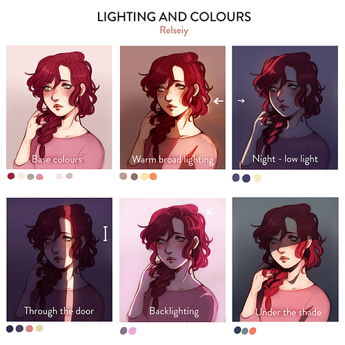
Another consideration you'll want to have during evening/dusk scenes is that there is less contrast on the objects depicted in the image:
As seen in the above examples, while tree surfaces are feathers are generally known to be very detailed things to paint, the fact that their many textures are cast under darkness and melded together serves to push the idea of these scenes being set sometime in the evening.
Good luck, I hope you find your way.