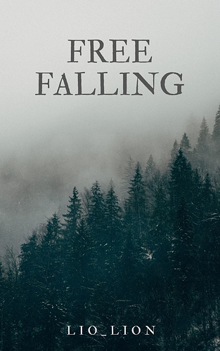
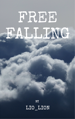
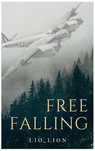
I know a lot of people voted on the first one. But it does look a lot more generic and distant from the title of the story. If being a professional in marketing has taught me anything, it's that less is more, and to follow the scent. Free Falling coupled with a mist obscured forest doesn't convey much to me, and this is just me personally. At the same time, I'm also lending perspective in terms of a general reader here. Cover #3 also works in much the same way. Basically, #1 and #3 give me nothing in terms of the story.
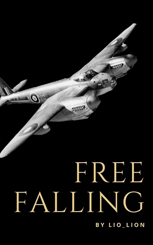
Now, onto #2. Remember, less is more. I'm drawn to the contrast immediately. There isn't a lot of distractions, and that works well when you're going for an early, bare bones cover. It's an old, fighter jet. The background is black, indicative of something bleak and the jet itself is grayed, which fits well with the model. Free Falling finally makes a little sense now. It's got something to do with a soldier perhaps, a war even, and maybe a crash.
This was my conclusion from just looking at Cover #2. I then took the liberty to walk on over to your page to see if that serves your story well, which is did to a decent degree.
My recommendation: #2.
--
Now onto business! 
I wouldn't mind if you gave my work a shot. Would love your eyes on something more tuned to the fantastical.