created
 Oct '20
last reply
 Oct '20
- 10
replies
- 811
views
- 5
users
- 11
likes
- 1
link
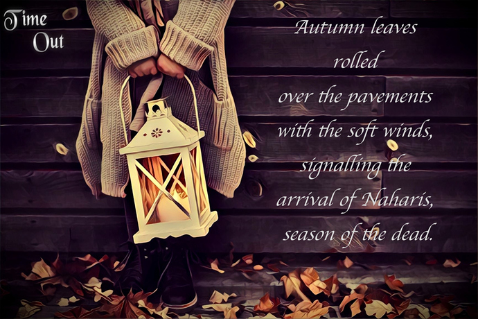
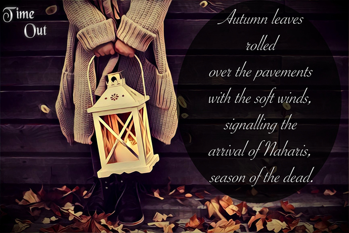
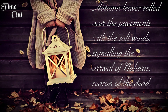
At a glance... none of them. The font, the color choice, the stock photo... it looks like something a Christian Facebook mom made for the fall - not at all like it's your fantasy series or supposed to be at all spooky. The vibes are very "Live, Laugh, Love", not Time Out.
I would recommend toying with photoshop some and trying to photobash something more setting-appropriate. Also, be SUPER careful about your font choice!!! It can influence the mood way more than you think.
...Honestly, I thought that's what it was. ^^; I didn't realize that it was supposed to be a promo for the linked series until you pointed it out...
Anyway, yeah, it really doesn't seem to fit the mood of the story...I get it, mysterious lantern, leaves, dark edges on the photo, but those things simply being there isn't enough to make the image feel foreboding.
For one thing, the figure is standing against what looks like the wall of a house, which gives it an aspect of 'safety'. Now if she were standing in front of the backdrop of a foggy mountain or a dark forest, then it might be a different story...
Also, the size/placement of the letters matters as well as the font...the title is so tiny and tucked away, I thought it was like a brand name or something, like maybe the site you got the stockphoto from. It doesn't look like the title of a story.
It's not actually a promo. I'm still experimenting.
Based on the sentence, what elements do you expect in the picture? The colour tone included?
As for the text, should I go for something 𝔳𝔦𝔠𝔱𝔬𝔯𝔦𝔞𝔫 𝔤𝔬𝔱𝔥𝔦𝔠? (sorry, couldn't help it) 
That's interesting. She is in the safety of her house when things come crashing down. I can't figure out how to improve on that.
Thank you for that. I'll make it more prominent. 
I don't really know; the sentence is kind of vague. I just assumed you wanted 'foreboding' based on the image, but if you think about the sentence all by itself you could interpret it any number of ways.
Is the 'Naharis' supposed to be a scary thing, or just a sort of grim thing? Or maybe just a darkly peaceful thing, like the mood of a cemetery...? If you think about it in a Dia de Muertos sense, you could even interpret it as a happy thing; a celebration on the way, perhaps?
Rather than asking people what they think when they read your sentence, I think you should ask yourself what you want them to think, and then maybe ask how to achieve that.
Personally, I think gothic font might be a bit overkill; maybe ask @somekh what they think?
There is no such thing as "too far". Often, doing a literal 1:1 representation of your story gives the wrong idea, and you have to do some exaggeration in the form of imagery.
Imagery is important! Try to add harsh cast shadows, or fog, or whatever else helps set the mood! Don't be shy when adding imagery.
When someone presents me with something and asks me what I think of the choices, I look at the choices and pick from that. I don't go into what it is supposed to be or what I think it might be or any other thing... I look at what is in front of me and make the choices... that's what you asked for. Also, that's how I was trained to review and critique, you look at what is before you. If the person asking wants opinions other than that, I'm happy to give them.
Thus you'll get no comment from me about what I thought it was or anything else, (except for one small personal choice below)
Here are the reasons I choose #1:
I don't like #2 because the font is too skinny and busy. Also if "Time Out" is the title t should be, in my opinion, the larger text otherwise it seems a little like an afterthought.
I don't like #3 because the font is too big and overwhelming. And again the "Time Out" reason.
The reason I like #1 of the three is the font has a good weight to it and is not difficult to read. Again, however, I have the same issue with the "Time Out." Is that the title?
If you want to go deeper into the picture/font etc. and how it relates to your story, etc. I'm happy to offer thoughts.
The personal thing I mentioned was the use of the word "pavements." It stopped me from reading further wondering if it should be "pavement" instead. Now, that's just me, I'm sure, but it feels awkward.
But for just looking at the picture as it is, those are my thoughts.
Suggested Topics
| Topic | Category | Replies | Views | Activity |
|---|---|---|---|---|
| 🌹Sub 4 Sub, Like 4 Like, Comment 4 Comment🌹 | Promotions | 24 | 540 | 10d |
| My romcom story is out now! | Promotions | 5 | 207 | Sep '24 |
| Underrated gems promotion | Promotions | 12 | 360 | Oct '24 |
| New Lizards Comics Episode (Like and subscribe and we also give you like and sub too) | Promotions | 8 | 224 | Oct '24 |
| Lets help each other to get to 100 subs | Promotions | 24 | 717 | Jul '24 |


