I'm a huge fan of talking about color theory. I highly, highly, highly recommend James Gurney's book "Color and Light" https://jamesgurney.com/site/213/color-and-light-a-guide-for-the-realist-painter (he has digital downloads right now because of coronavirus, in case you want to purchase it. I've bought a lot of art books, but this is my favorite one about color and how and when to use it)
I think that a lot of color theory is learning your own personal aesthetic--which is great--but again means that any and all advice is just...advice. In color theory especially, rules are made to be broken, so I can't say there are any things that should "never" be done.
But, here's my advice with a grain of salt. And it's to plan a palate
1.) Gamut Masking: It's easier to do realistic paintings if you have a color palate already decided with as few colors as possible (using a range in between them to give the impression that you used a ton of color.)
James Gurney describes that range like this
It's called "Gamut Masking" and is hardly the only way to color a piece, but gives you pretty great results every time. The points labeled "P" are your 3 main colors, and that triangle is the range of colors in between you can safely use and make it look really cohesive. You can do the same thing by using 4 points and making a square, or you can use 2 point and make a line. It works every time.
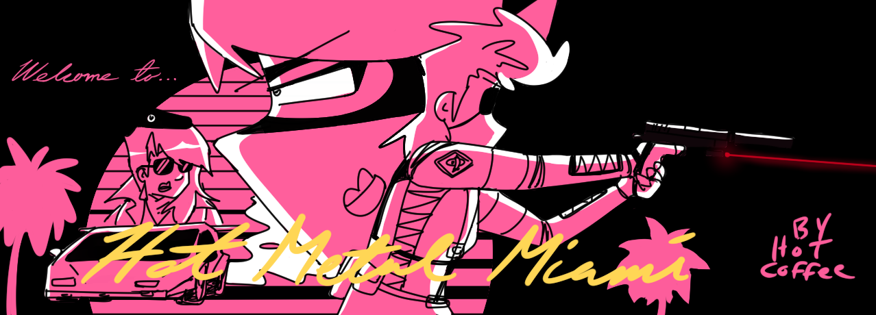
And here's an example of where I've used it for a twitter thing a while back. Forgive the yugioh fanart. You guys always get my Yugioh fanart and I swear I draw other things (I don't) I put him in shadows on purpose but this also works for paintings in full light.
So my four points are on the left of Marik here--that very saturated yellow, blue, and then muted green and brown (it's faint but you can see the diamond I drew above it.) I ramp up and down on those colors by adding white or adding black. This gives me a good range of colors to safely use and I can access them with my color picker as I paint digitally. (this is a traditional technique as well, to make a color palate with only these ramped colors to mix with)
What's crazy about Gamut Masking is just how it Always Works. It works So Well. Like this was a piece in difficult muted lighting with grey skin tones and...it still worked. It is nuts how well Gamut Masking works, and everyone should try it out at least once.
2.) The second best advice I was ever given about color theory is that it's important to rely on the fact that colors appear to change depending on what's around them. This is where stylizing our color palates can really help us solve problems when it comes to art and help us cheat. Our eyes will see red as redder if it's next to something with green in it. Gray will look like a skin color when placed next to the right color. A lot of color theory is learning that color is only what it is next to, and that color is a figment of our weird ass broken brain, and must always been seen in context of what it's around.
So, when I plan colors for a piece I always start with choosing the color palate. Usually I'll only choose 2-3 colors for standalone illustrations. So in this one I only use blue and red because it was simple and didn't need anything more than that (versus the Marik illustration which needed a whole 4 point masked range).
The color serves the composition, so it does not need to be realistic. The background recedes because the red pulls us forward (red tends to come forward in illustration, cool colors like blue tend to recede) Our brain does the rest.
but for a comic that has a lot of complex objects, I'll make a bigger palate. So here's what my palate looks like for a comic I'm currently making for the webtoon contest. It has over 150 panels, so to keep it consistent, I'm going to use this palate, which is a lot bigger.
(And for this palate I didn't use Gamut Masking, actually--instead I just went with what I thought was cool at the time.) Having a palate is way quicker than reinventing color each time you go to fill. Just use your palate and every time you're good.
If I need to push things to the background I can use a screen layer with the light blue, if I need to bump things to the foreground I can use warm colors. The red is only for symbolic accents. And, overall--it's a comic, which is stylistic by nature, so I don't need to worry about realism, I can use color to instead solve my problems.
So a problem I'm dealing with right now is that I have this really overwhelming complicated building in the background a lot. To fix that issue, I decided to make it mostly pink. Is that realistic? Nah. In reality that building would have tons of different colors on it that would clash with everything else around it, taking away interest from my main character. So I make it pink so it flows into one mass into the background. And of course there's the added plus that I think the pink looks cool against that blue. Here's an example.
While ordinarily I'd want to put in way more detail than this--it's a comic, and I have to make like 100+ more illustrations, and so I just don't have the time. Color theory saves me by allowing me to just color block and use gradients for atmosphere. Done and done.
I could go forever on this subject, but I can tell this post is long, so for more good examples of stylistic colors in comics I hiiiighly recommend Mobius. He knew what he was doing and used just WILD colors. So good.