Edit: tl;Dr ; I just want to say, I LOVE color theory. Colors are vital to my work and so getting an understanding of them was also vital to me. I have the basics of it here along with my thoughts. I hope it helps.
There's a wide array of things under the umbrella of color theory discussed here and I'm not sure I followed all of it.
But my personal understanding is that there's a misunderstanding that Color Theory is some kind of rule set.
It's just a set of guidelines about the relationships colors have to one another. The color relationships and methods of Application are two distinct things.
The former are the "rules": yellow and purple are complementary, additively red and blue make purple, etc.
The latter are subjective to how you set up color to define mood in your given story/illustration. No color palette has a definitive meaning to it BUT there are,in society, general concensus about certain things: Very bright saturated colors hurt the eyes, muddy desaturated colors can make an image unclear, yellow is happy, blue is sad.
You see how my list gets more subjective.
If in my story I made it so the background or clothing or the protagonist is blue when they are happy then within the context of my story, blue and perhaps cool colors get associated with that subconsiously. And if I put him in more yellow/orange (complementary and near complementary colors to blue) then I can make those colors "feel" sadder or more negative *In the context of my story".
That's one way to apply color theory.
I feel people mistake how others apply color theory as color theory itself when that's not the case.
Color theory, at the basics, is the 12 part color wheel and the relationships colors have that help you build color pallettes based on your goal for the art.
Basics:
Primary colors: Red, Yellow, Blue
Secondary colors: mixes of Primaries: orange, Green, Purple
Tertiary colors: Mixes of Primary and secondary colors: Yellow-green, Blue-green and so on.
Vocabulary basics:
Hue: a distinct color - pure hue is the fully saturated color
value: the lightness or darkness of the hue
Tint: hue with different amounts of white added, increasing lightness. -- High Value
Shade: Hue with different amounts of black added to it, increasing darkness.-- Low Value
Saturation/intensity: The brightness (not lightness) of a given hue.
So it's a combination of Hue, Value, and Intensity that gives us our full array of colors.
Basic color relationships:
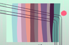
Monochromatic:Single color (in application you would use tints and shades of the same hue at different saturation levels to create contrast for an image)
Complementary: Hues directly opposite of each other on the color wheel: Highest possible contrast at full saturation. Popular for color schemes because of this. Our eyes like contrast.
Analogous; Hues directly next to one another on the color wheel. Eg. Red-orange-yellow are analogous and create "warm" compositions due to how our eyes read the color vibration and associate it, I assume, with sunlight to create the "warm" concept associated with it--generally.
Split complementary: Color scheme made from one set of analogous hues and the central hue's complementary color -- My personal favorite method as it combines Complementary and Analogous relationships.
Triad: Any set of three colors at the ends of an equilateral triangle on the color wheel or 120 degrees apart. Eg. the three primary colors (which is why this combo is used a lot for protagonists, it's the boldest and basic set)
Quad: any set of four hours that are 90 degrees apart.
Come to think of it a lot of geometric shapes can be used to inspire color palettes this way, I'm gonna have to try Pentagons haha ^^
Please remember: Color theory doesn't dictate this is the only way you can use colors, it simply gives you their relationships. How it's applied is as varied as the artists themselves and how you perceive color and the meanings you associate with them.
--
Final point on OP's wanting to know about BG color and focal points.
This relies on Composition of the shot first. Then color scheme. Composition is the sister topic to Color and is a whole other thing xD but I hope primer I provided above is helpful. It only discusses the relationship among hues BUT you can use that as a jumping off point.
For example you now know complementary has high contrast from the get go. So now it's a matter of choosing the right combination of tints and hues of the complementary colors so that the focal pops out in contrast to the BG and that has to do with the Value of the Hue.
And in the end it take practice and experimentation with finished works. Dark characters on a light background, visa versa. If you do want a muddled mood, bring the values closer together and see how much you can push it. It's this sort of experimentation that is "breaking" the rules. But really the "rules" being broken are the conventions society agrees on at a given time.
It's not possible to make a blue-yellow composition and call it complementary even if it's high contrast and a combo that works because the two hues are on a triad. But that's just classification, not rules of use.
If you understand color theory AND societal agreements of color perception, you can use color with mastery.