I use colour in my art for a few reasons:
First, I like the look of it, and I like challenging myself with shading, lighting, etc. My colours are usually quite rich (or saturated, I guess the proper term would be) because I try to make the drawings look somewhat photorealistic.
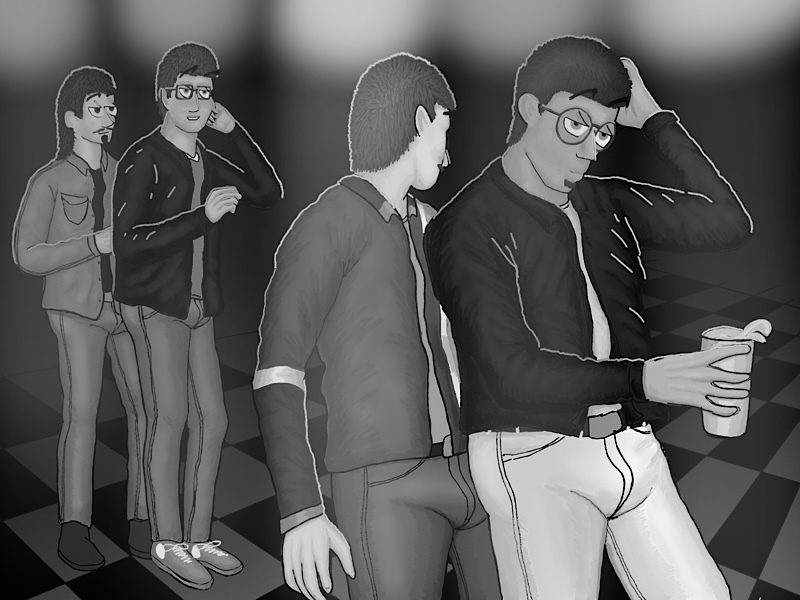
Here’s an example. I don’t think something like this (a bunch of guys in a gay bar in the year 1999) would have looked right in B&W:

Here(if I did this right) is the same image stripped of colour. It just doesn’t “pop” to me, and looks like it would have been 1955 instead of 1999.

Second, because I am creating with online presentation and not print in mind, I think colour simply fits the media better. With print, especially with my rich colouring, expensive high quality, glossy paper would be required in order to keep the detail (or even to retain legibility). Imagine the image above printed on normal book paper. It wouldn’t be pretty. This is not a problem with digital media, where colour is “free”.