@CAOMouse there are a few things that come to mind when reading yours.
The colors are a bit intense, perhaps you could try lowering the saturation a bit? I think that would work especially for the backgrounds.
My biggest issue though is a lack of story or plot. It has comedy tagged under it so i wasn't expecting a major dramatic story but it doesn't feel like i really got to know the character's personalities except for the mc. Perhaps a small plot would make things more interesting?
@KidJake i think the colour version is an improvement from the earlier version. I do agree with @JRHoch though: try trimming your text so the text balloons are a bit more comfortable to read.
I also recommend maybe using a somewhat more rectangular text balloon instead of a ellipse one. They look better in my opinion and they'll also give you more space for your text. I think Darthmongoose did a tutorial for them here:
@SoftRainfall i think the art style is good. I did notice that the text does overlap your characters occasionally making the panel feel crammed.
Perhaps when filling in the panels try to leave some space for text bubbles, but not too much so that the characters themselves still have space in the panels.
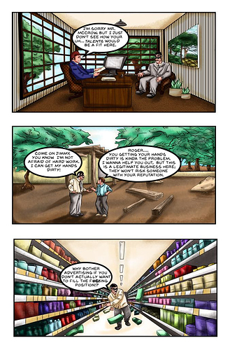
Well here's mine:
You don't have to hold back because i already know it isn't that good and the beginning especially is rough and bad.
Never mind nobody even replies to mine, i'm done with this topic. Good for nothing.